![]()
pandago - Scheduled Orders
Enabled scheduled ordering in an on-demand delivery service to support business scale, improve rider efficiency, and meet user needs for flexible timing — resulting in a seamless experience that shifted demand beyond peak hours and unlocked more sustainable growth across markets.
My Role: Design Lead, UX/UI Design, User Research
Product Manager: Khaled Syfullah
Product Analyst: Bernard Yeo
Product Operation: Yvonne Ong
Business Lead: Clarissa Chan
Year: 2021—2023
What is pandago?
pandago is foodpanda’s on-demand delivery service for sending and receiving parcels, as well as same-day essentials and grocery delivery. Built for speed and convenience, it operates across urban areas with a growing user base of individuals and small businesses.
Why Scheduled Order?
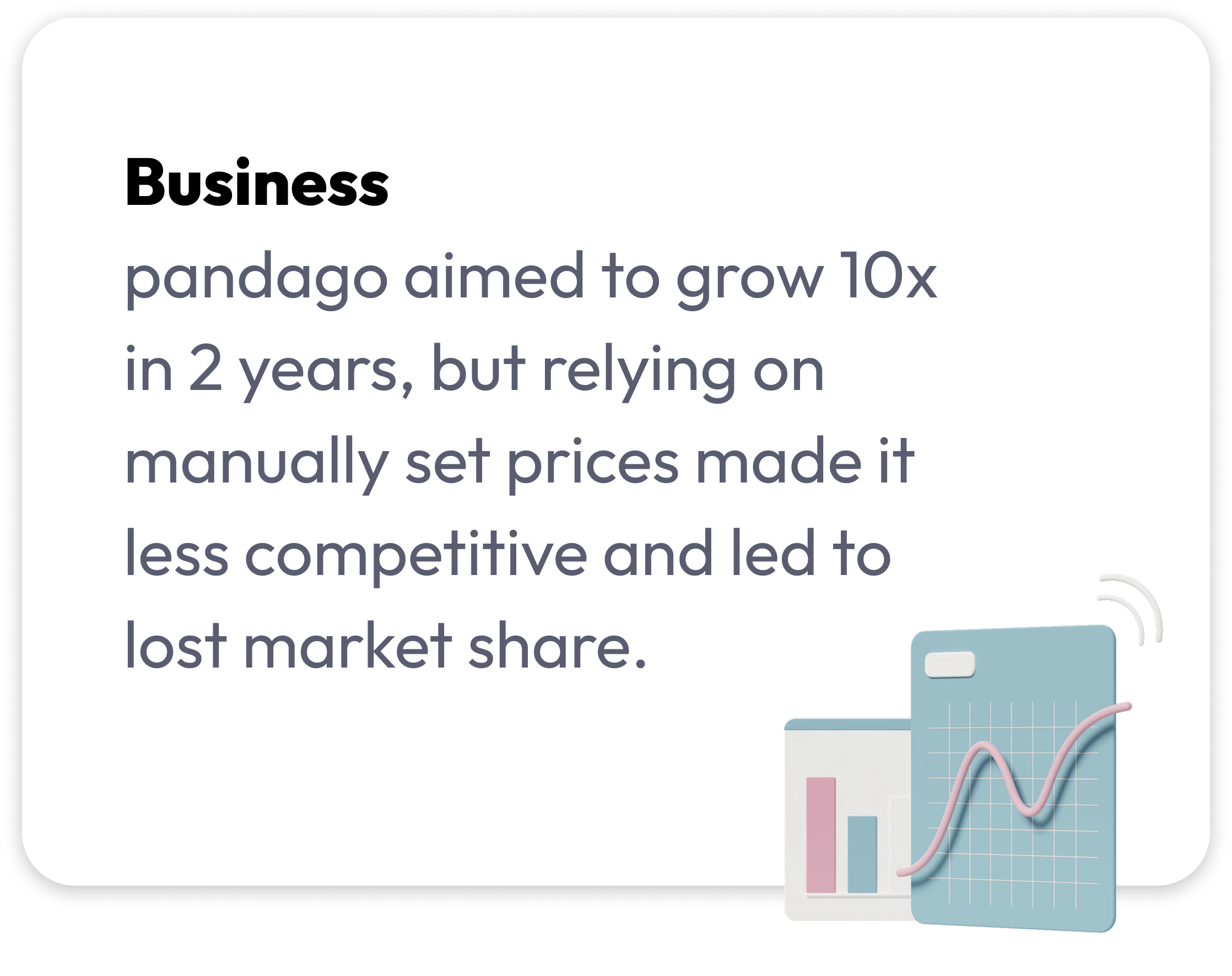
While pandago thrived on instant delivery, we saw an opportunity to offer scheduled delivery to meet rising user needs and address operational inefficiencies.

User feedback
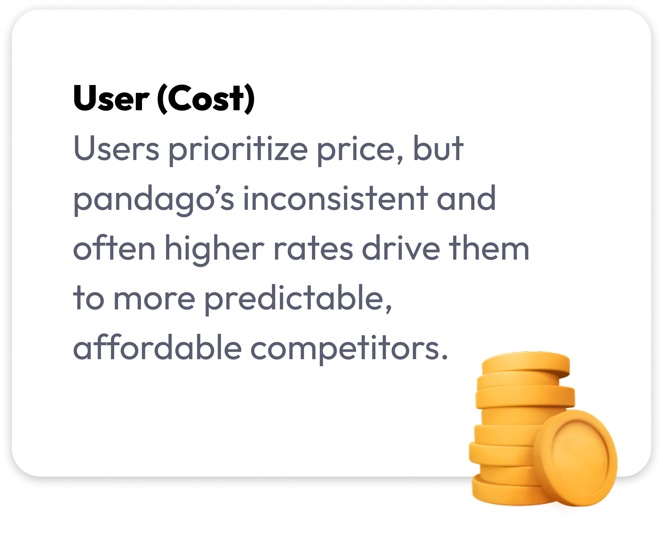
Through moderated studies and feedback sessions, we learned that users didn’t just want faster deliveries — they wanted more control and clarity. In fact, 92% of participants said they would prefer to schedule their deliveries to better fit their daily routines.
Design Opportunity
How might we help users find better prices through flexible delivery timing — while improving rider efficiency and supporting business growth?
Benchmark Insights & Key Learnings
Our research across global delivery and parcel platforms uncovered more than UI conventions — it revealed behavioral cues and user expectations around time, cost, and control.
-
Scheduling is perceived as a smart choice, not a compromise. Platforms that presented time options early — especially with price context — helped frame scheduling as a value-driven decision.
- Placement influences behavior.
When scheduling appeared late in the flow, it often felt secondary. Platforms that placed it near location input made it feel essential and worth considering.
-
Transparency builds trust.
Users were more confident when platforms showed estimated pickup and delivery windows clearly and early in the flow.
-
Language and icons shape understanding.
Familiar terms like “Pick up” and recognizable visuals like calendar icons helped users quickly grasp options without additional guidance.
These patterns reinforced that users aren’t just looking for speed — they’re looking for clarity, savings, and a sense of control. This understanding shaped how we approached the experience.
Design Goals
With those behavioral insights in mind, we focused our design efforts around four clear experience goals:
-
Make scheduling options easy to find
Integrate them naturally into the booking flow without adding friction.
-
Guide users toward off-peak pricing
Use visual cues or quick filter to highlight cheaper time slots and encourage smarter choices.
-
Set clear expectations
Show estimated pickup and delivery times early in the flow to build confidence.
-
Keep it simple and intuitive
Minimize effort and decision-making — especially for repeat users who value speed and predictability.
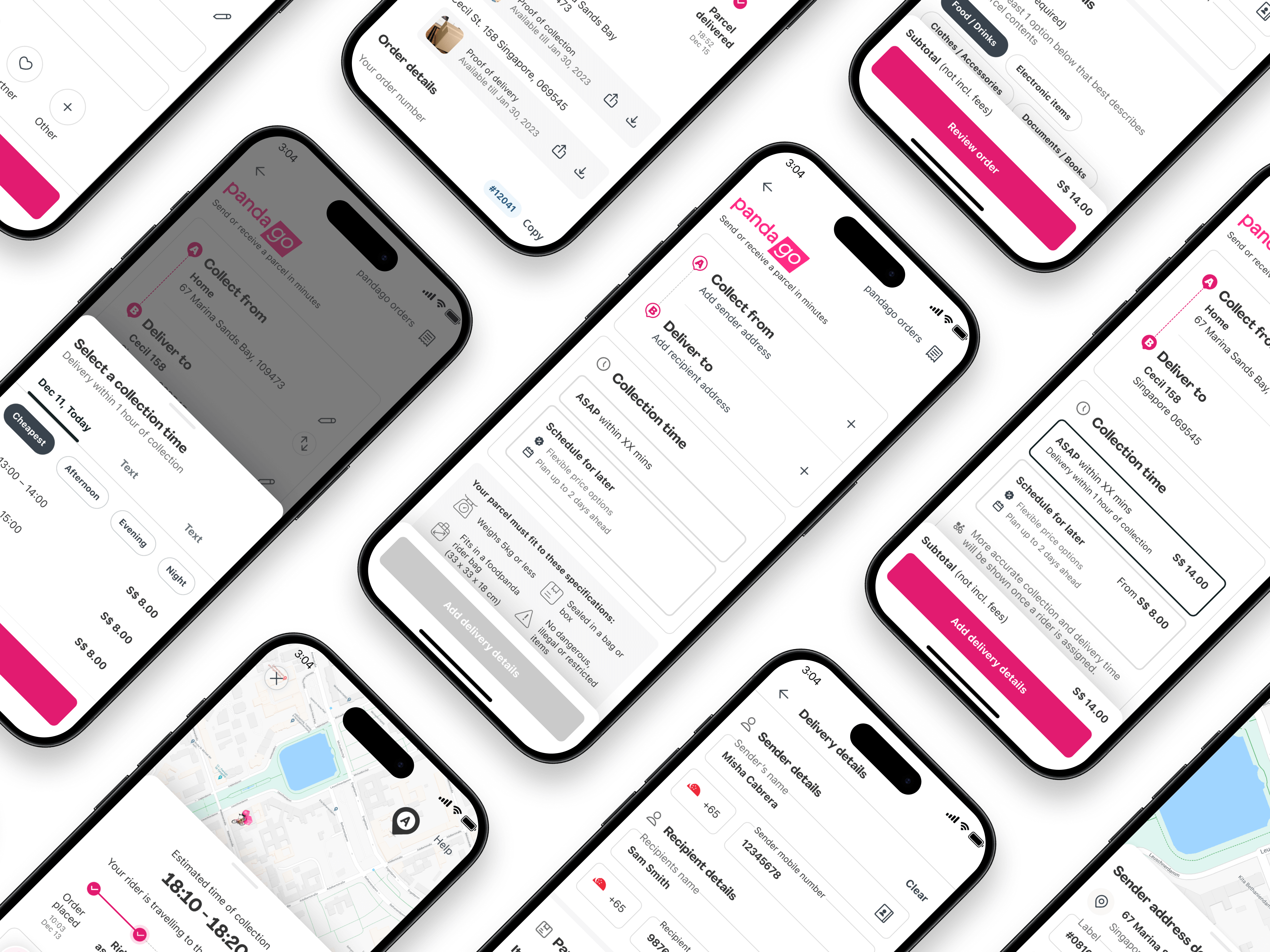
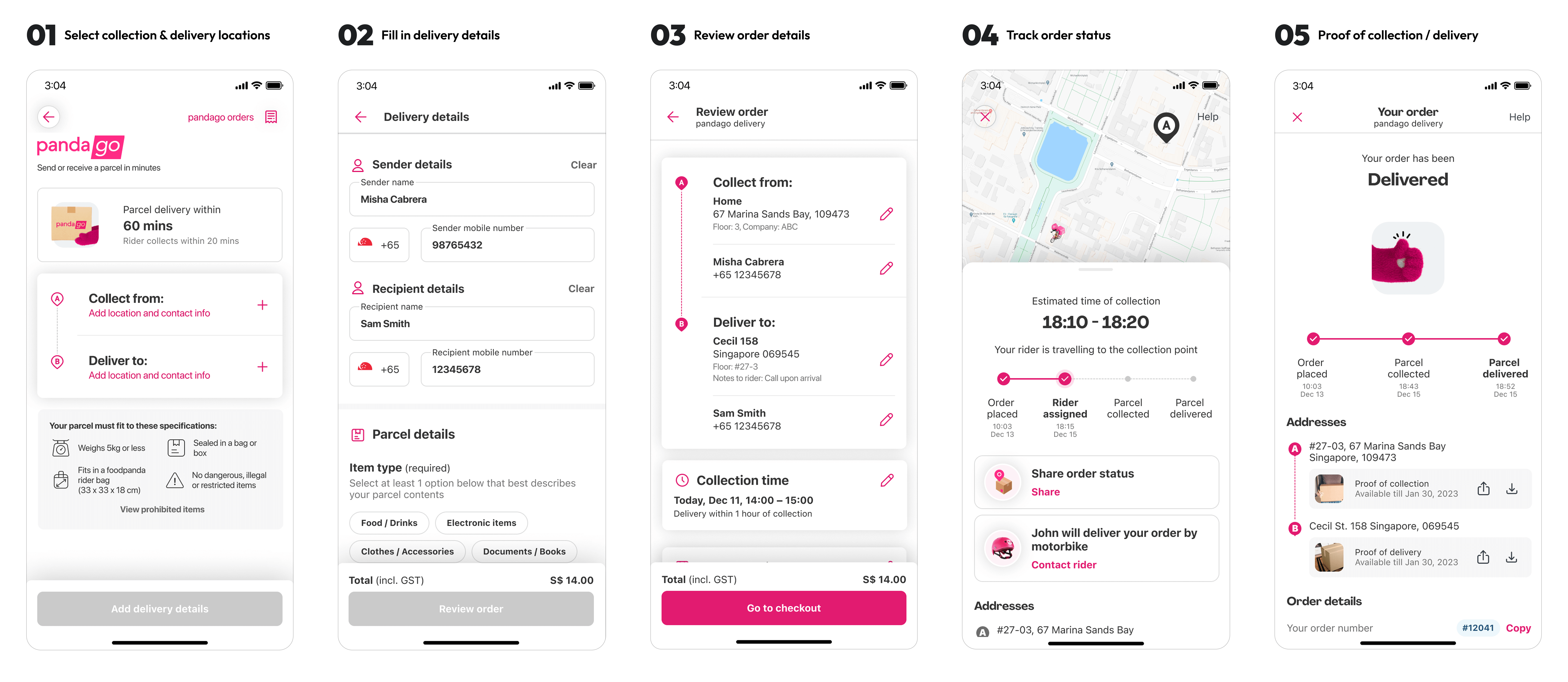
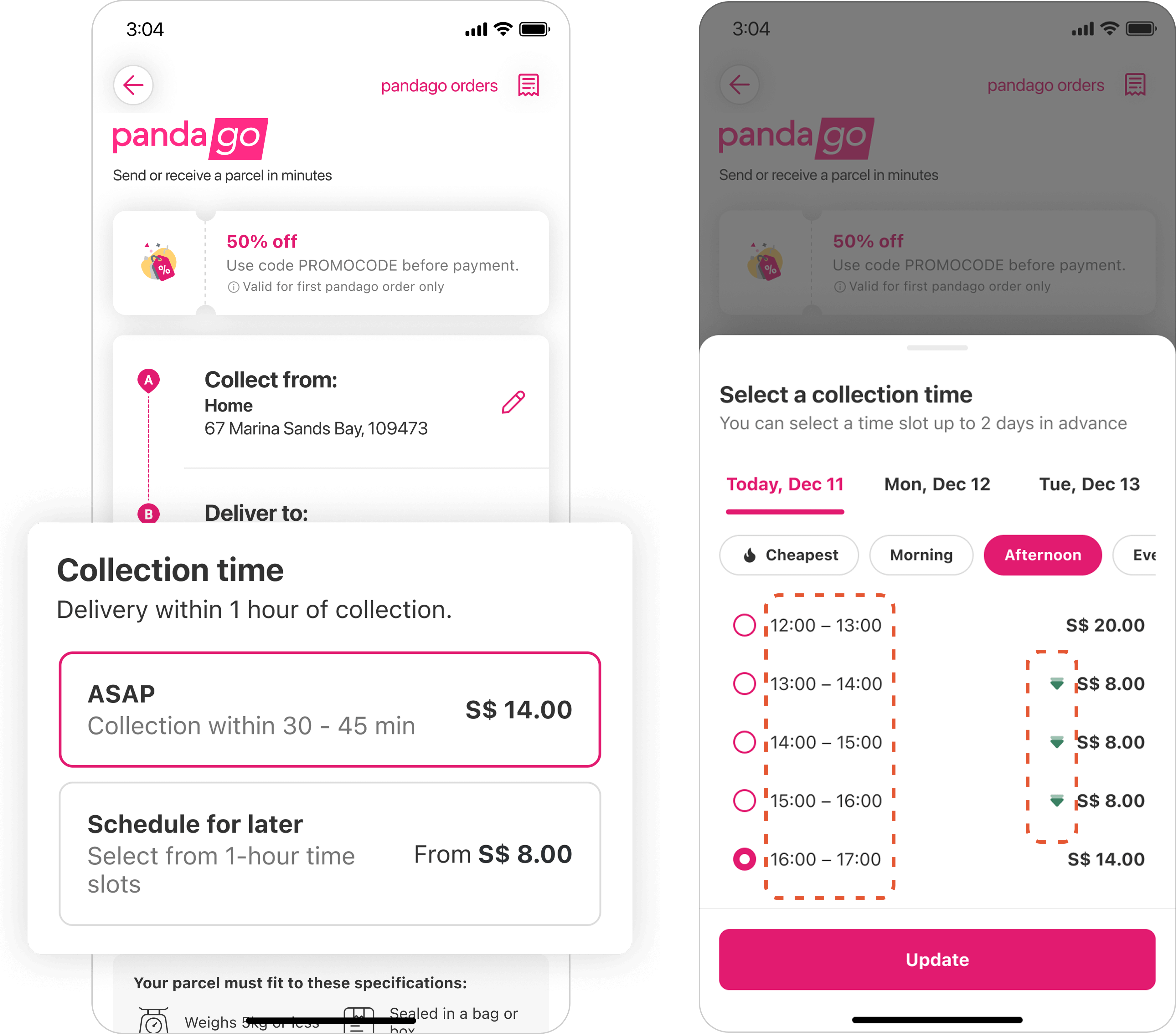
Testing Two Flows: Balancing Simplicity and Control
We tested two scheduling flows to understand how users respond to different levels of guidance and visibility.
Flow A — Simple but Easy to Miss
In Flow A, ASAP is selected by default to reduce friction. Tapping the “Edit” icon opens a bottom sheet showing both ASAP and Scheduled Ahead options. After selecting “Scheduled Ahead,” available time slots and prices appear below. Once a time is confirmed, the scheduled time and estimated delivery are shown in the respective section.
✅ Low cognitive load
🚨 But makes scheduled options harder to explore

Flow B — Clearer Value, More to Process
Flow B begins with ASAP selected, but both ASAP and Schedule for later options are presented upfront, with visible pricing differences to encourage comparison. When users tap “Schedule for later,” time slots and filters appear immediately. The cheapest option under today is preselected by default. Once a time is confirmed, the scheduled time and estimated delivery are shown in the respective section.
✅ Simplifies price comparison
🚨 Increases cognitive load

We also iterated on component-level interactions — from calendar pickers to time slot dropdowns — to find the right balance between visibility, flexibility, and ease of use.

User Feedback – What We Heard
Users responded positively to the overall experience, highlighting:
-
Easy discovery of scheduled order options
-
Clear distinction between ASAP and scheduled deliveries
-
Good understanding of available date range
- Pre-selecting “cheapest” filter was well-received
However, we also uncovered key areas for improvement:
-
Shorter time slots were preferred — one-hour windows felt too long
-
Surge pricing icons were often missed, though overall price clarity was sufficient
- Users expected to see estimated delivery times paired with scheduled pickup
What We’ll Improve
Based on user insights, our next steps focus on refining clarity, flexibility, and visibility. These improvements aim to create a more intuitive, transparent experience while increasing user confidence and conversion.


What We’ve Achieved — and What’s Next
We’ve helped reduce rider shortages, enabled dynamic pricing across markets, and laid the groundwork for scaling through ongoing optimization and user insight.


Key Learnings — Designing for Flexibility, Clarity, and Balance
Introducing scheduled orders into an on-demand delivery service meant more than adding a feature — it meant carefully balancing user expectations with business goals and operational realities.
⏱ Timing is value — for users and the business
Users didn’t just want to pick a time; they wanted to understand why one slot was better than another. Highlighting off-peak savings and showing estimated delivery windows helped guide smarter choices — while also encouraging demand to shift away from peak hours.
📍 Clarity drives engagement, but placement drives outcomes
Scheduling options placed early — right after location input — captured user attention and boosted engagement. Simple language like “cheapest” and clean defaults reduced hesitation and made value easier to act on.
🤝 Balancing user needs with operational flow
This wasn’t just about UX. The feature’s success depended on close collaboration with operations, rider logistics, and pricing teams — ensuring that user flexibility didn’t come at the cost of delivery reliability or resource strain.
© 2025 Iris Wu. All rights reserved.