

ilovegain.ca
Role: Art Direction, UI Design
Creative Directors: Heather Chambers, Josh Budd
Copywriter: Josh Budd
Agency: Leo Burnett Toronto
Client: Gain Laundry Detergent (P&G)
Year: 2014
Bringing Gain’s Playful Personality into a Digital Framework
As one of P&G’s leading laundry detergent brands, Gain needed a refreshed e-commerce site that could bring its playful, colorful personality into the digital space — all while streamlining the shopping experience and aligning with brand-wide template standards.
Balancing Strategic Priorities with Brand Personality
The project had to satisfy three key goals: align with newly established brand templates, organize content around strategic business priorities, and infuse the joyful, vibrant spirit that defines Gain.
We worked closely with an external UX team and remote developers, all while navigating a rigid templated system with limited room for customization. From a design standpoint, the challenge was to translate creative vision into a modular framework — one that prioritized clarity and performance, yet still felt expressive, human, and unmistakably on-brand.
Despite the constraints, we found opportunities to bring personality into the details — from color and illustration choices to how content hierarchy supported product storytelling and advocacy.
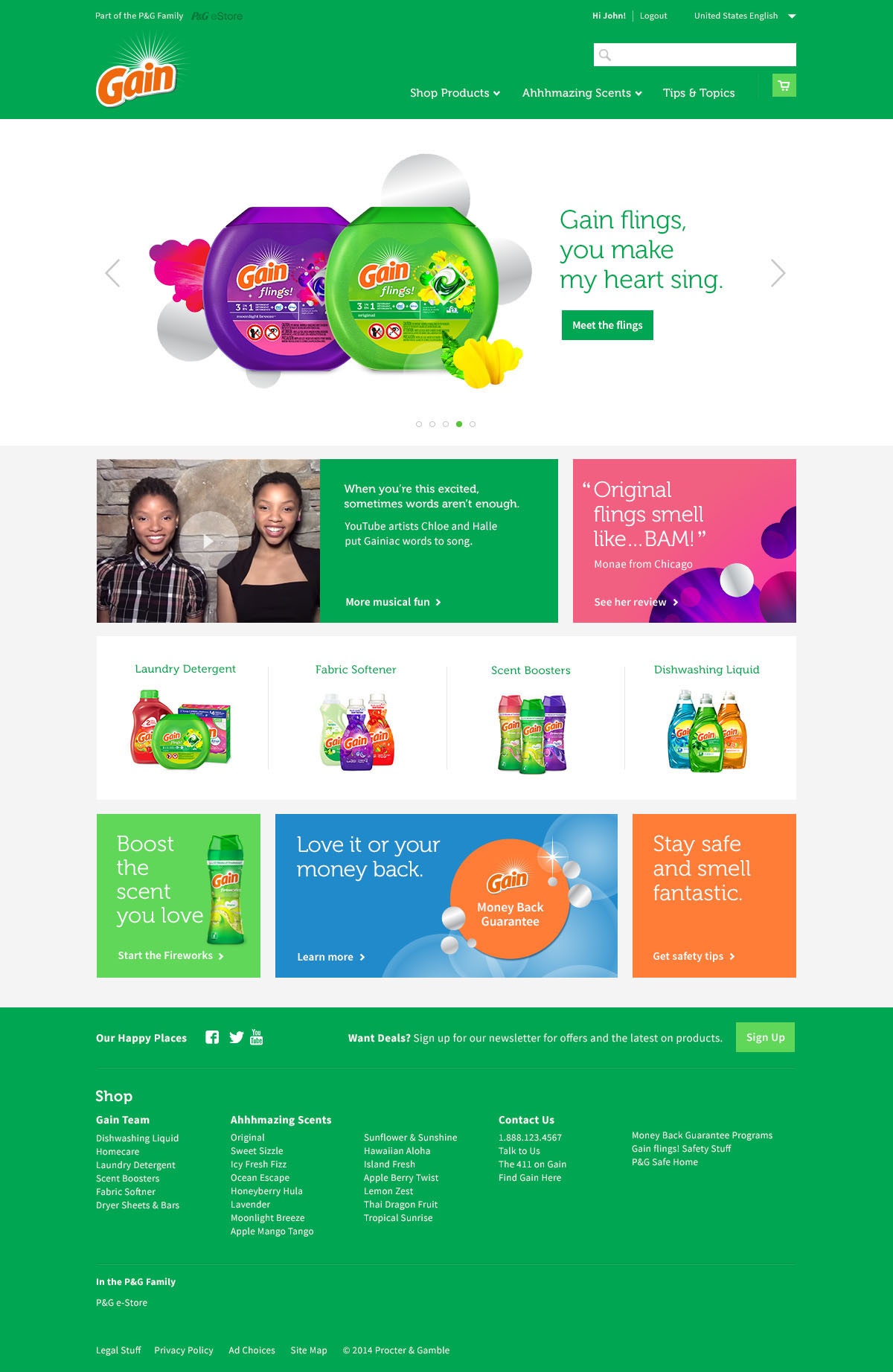
Homepage — Creating Continuity Between Campaigns and Commerce
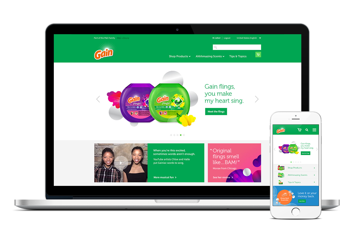
The homepage was designed to bridge in-market communication with the digital store, ensuring a consistent and holistic brand experience. Content was strategically structured to prioritize:
-
New product launches
-
Megabrand presence
-
Social proof and advocacy
We featured a social tout area highlighting influencer reviews and user-generated content, creating a more dynamic and relatable experience for consumers.
Product Pages & Search — Clarity First: Simplifying the Shopping Journey
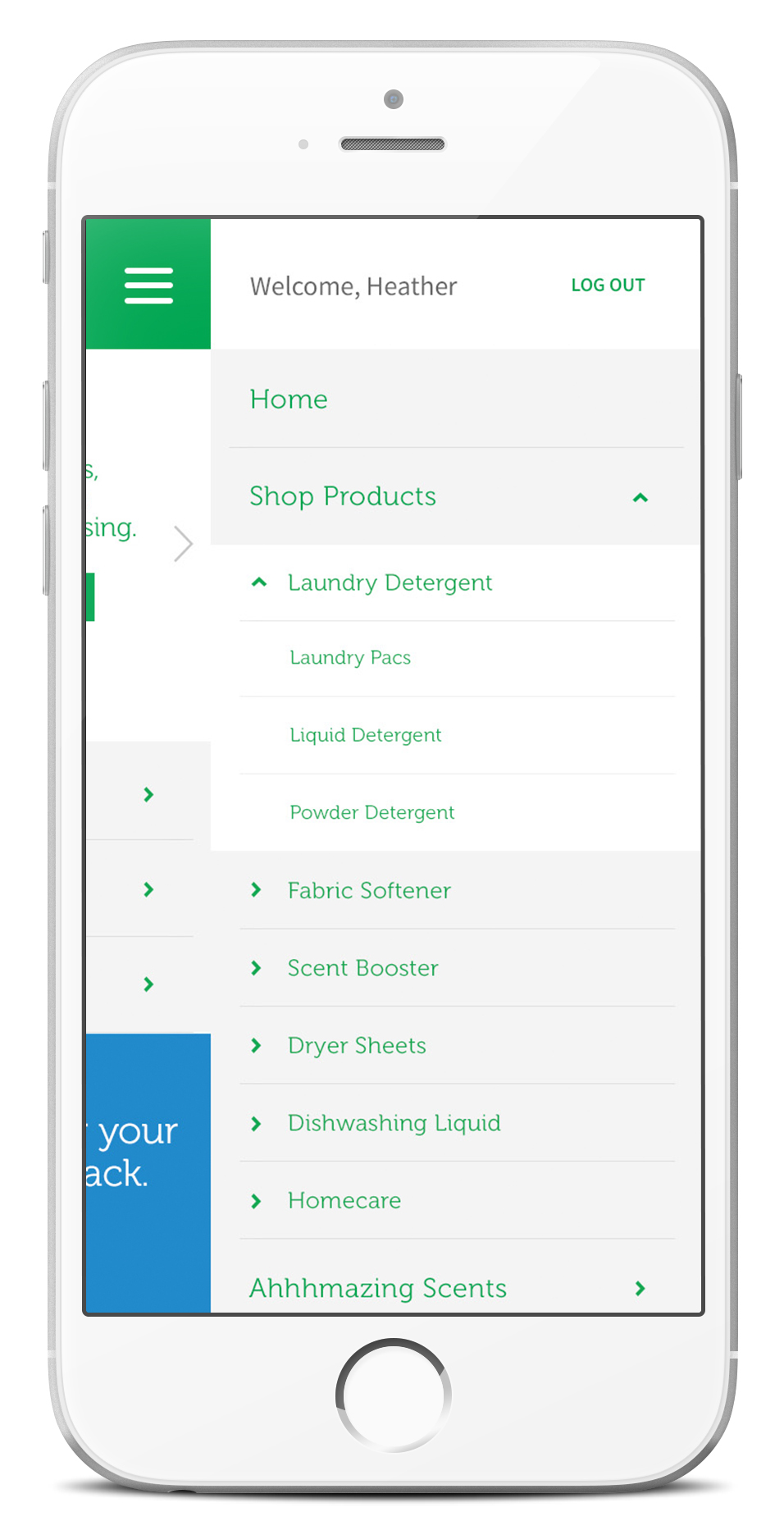
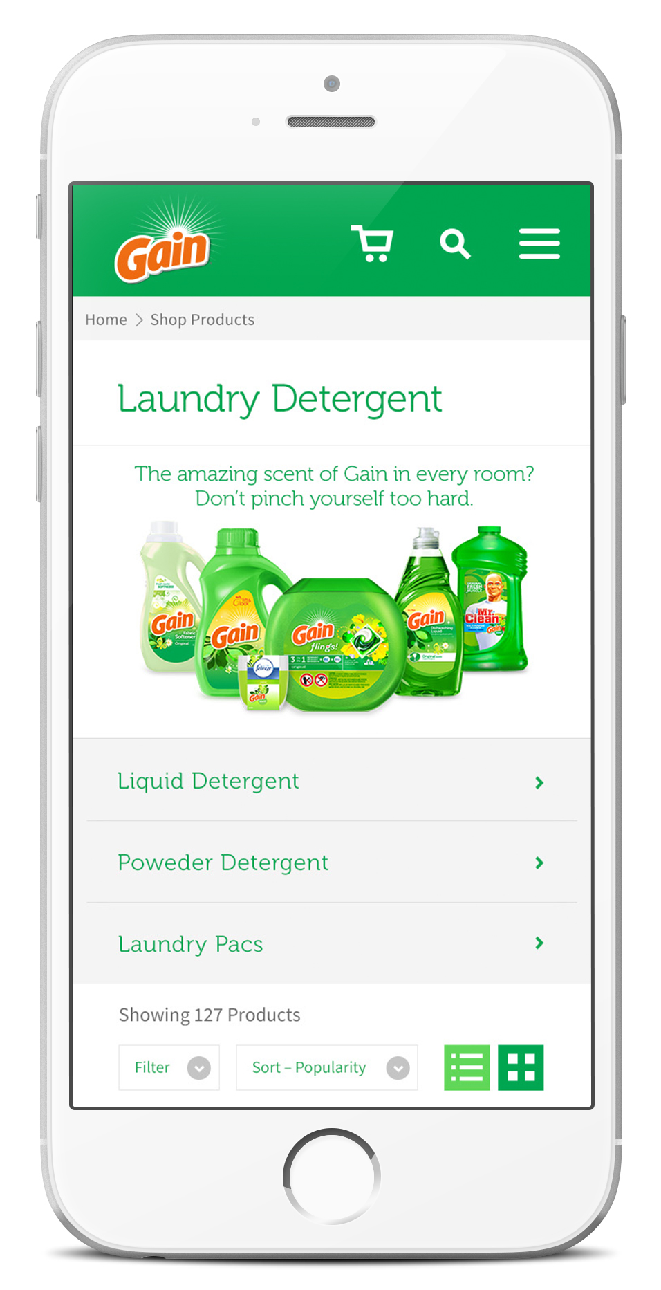
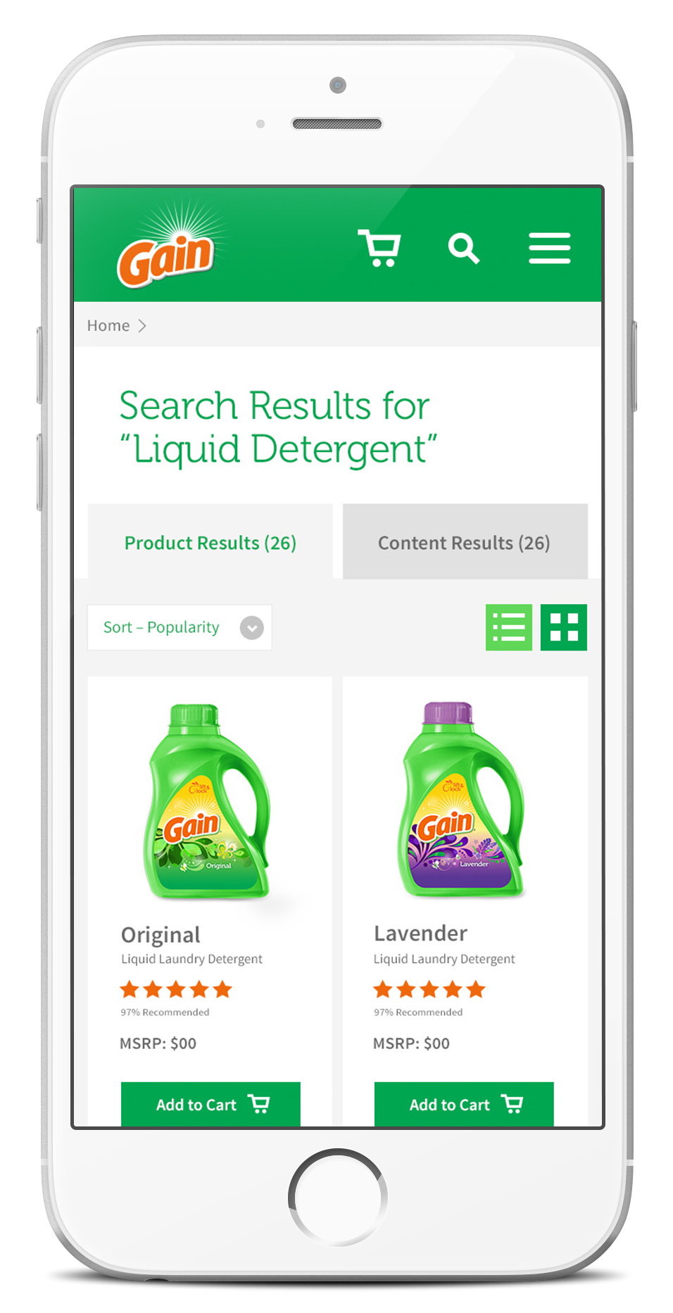
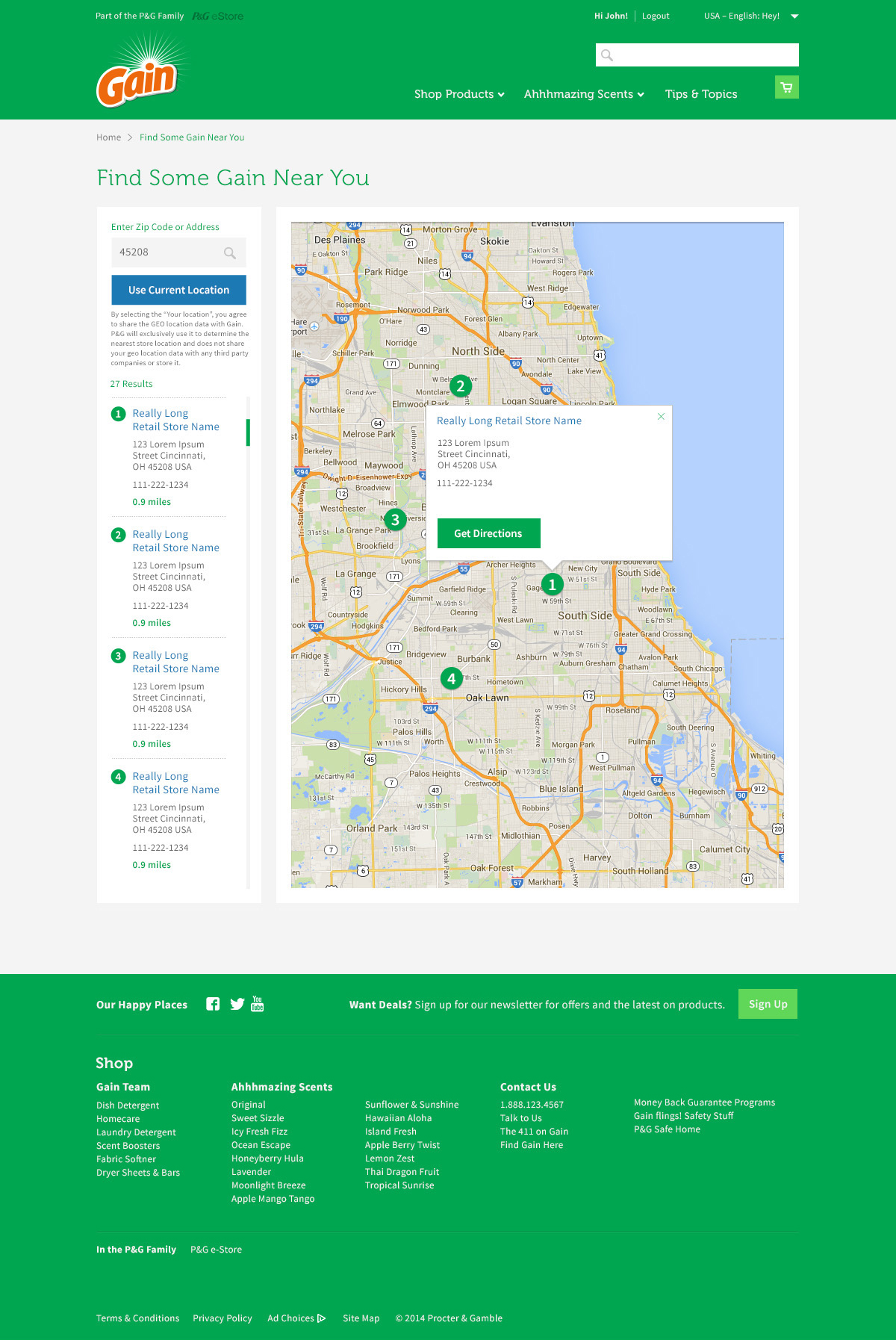
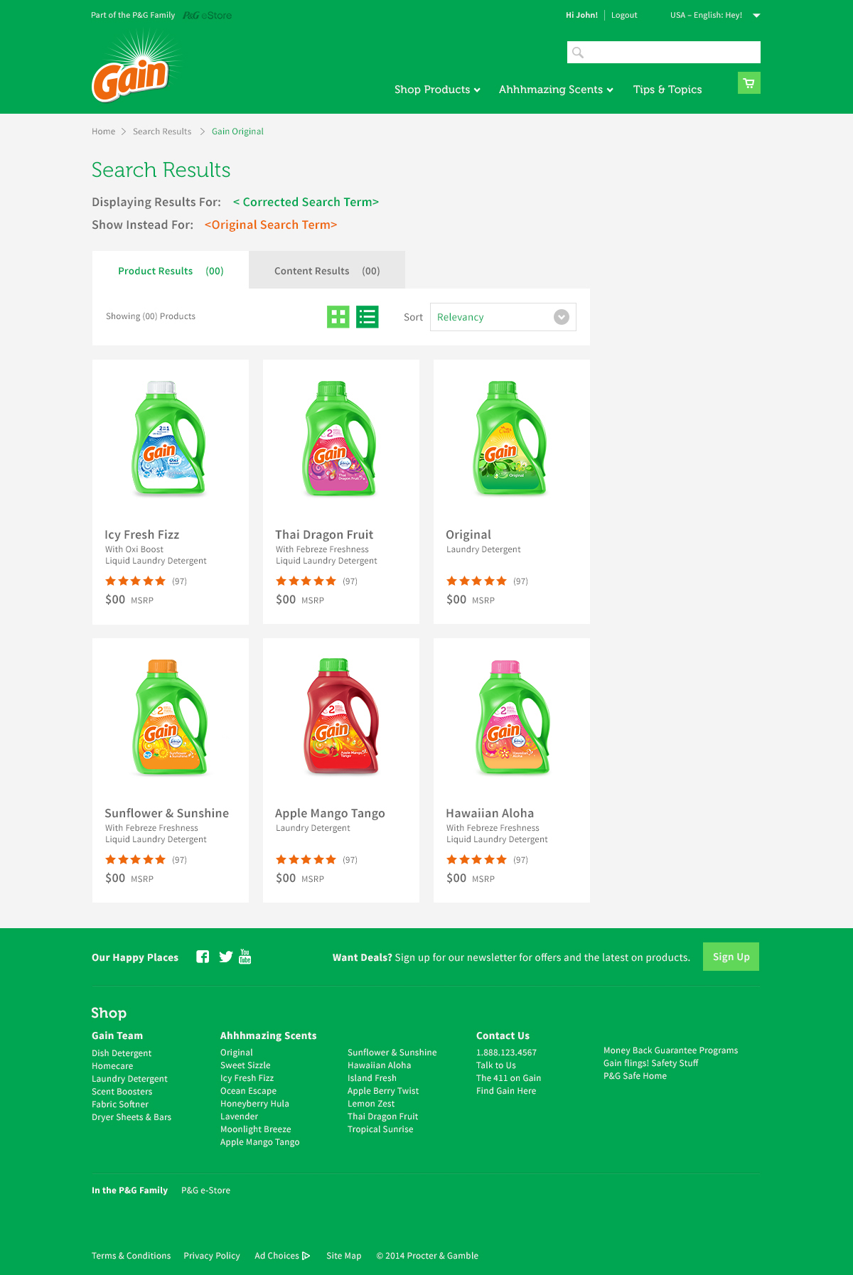
To avoid visual clutter, we deliberately limited the UI color palette, allowing the wide range of Gain products — and their scent-driven personalities — to shine. This created a cleaner shopping flow and helped focus users on product selection rather than unnecessary visual noise.


Restraining UI to Let the Brand’s Color Shine
Gain’s product line is known for bold, varied colors inspired by its scent range. For the digital interface, however, we intentionally restricted the use of color in UI elements to enhance clarity and usability. The vibrant, expressive visual storytelling was preserved in brand content, imagery, and illustrations — striking a balance between joyful and functional.

© 2025 Iris Wu. All rights reserved.