Supply Chain Management Dashboard
Translated logistics complexity into intuitive workflows led to improved usability, cross-functional collaboration, and scalable design — resulting in a modular platform that enabled end-to-end shipment visibility across diverse user roles.
Role: UX/UI Design, Design Research, Design Management
Creative Lead: Bradley Harris
Designers: Jessi Queen, Miho Tomiyama, Iris Wu
Agency: Publicis Sapient
Client: UPS
Year: 2020—2021
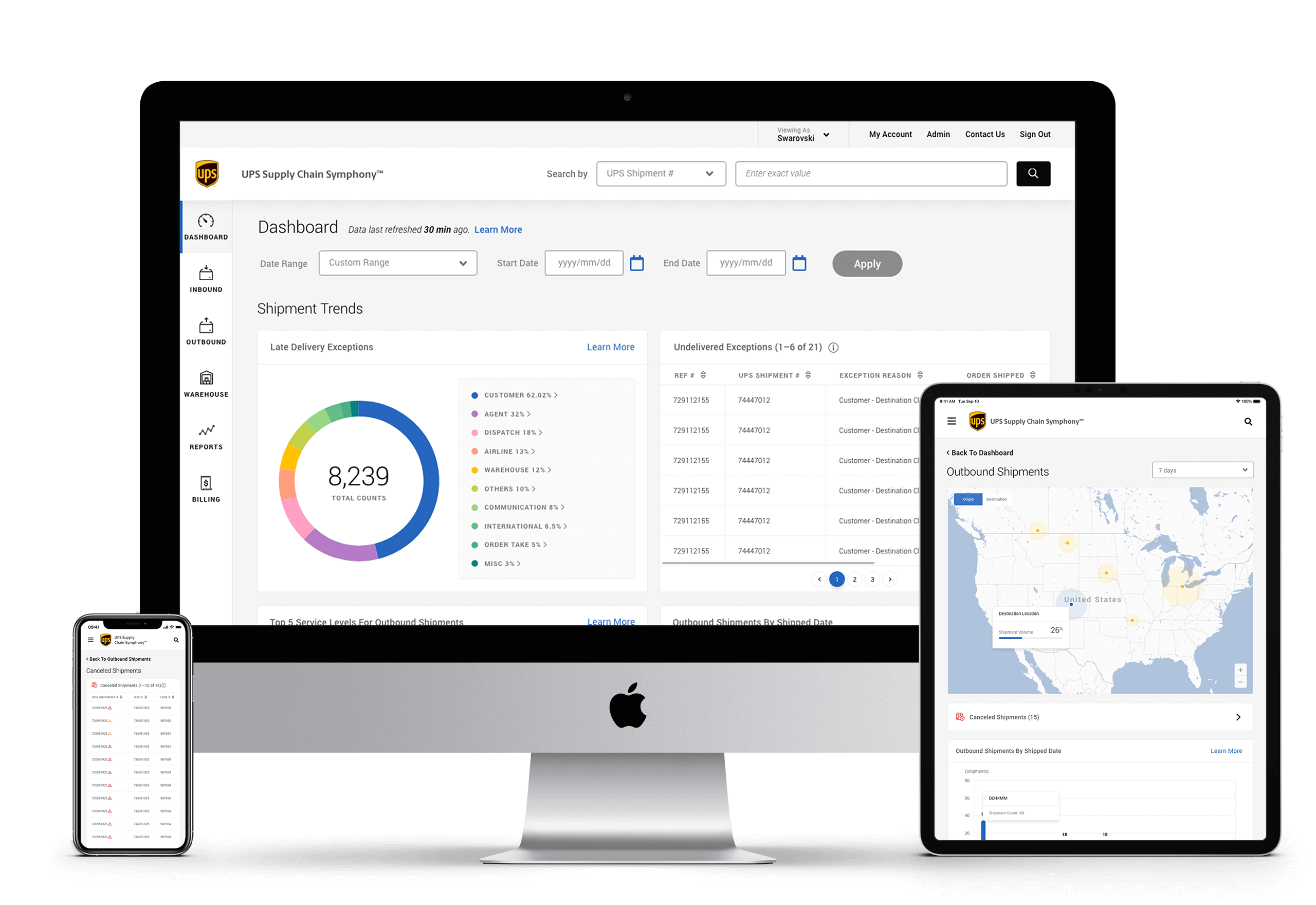
Bringing Transparency to Global Logistics
UPS Supply Chain Symphony was built to provide end-to-end visibility across one of the world’s most complex delivery networks. The platform collects, manages, and integrates supply chain data — giving clients and partners the clarity they need to make confident, informed decisions.
Our goal was to design a shipment visibility platform that not only helps users manage exceptions and reduce risk, but also encourages deeper adoption of UPS services — supporting a more connected and resilient supply chain.
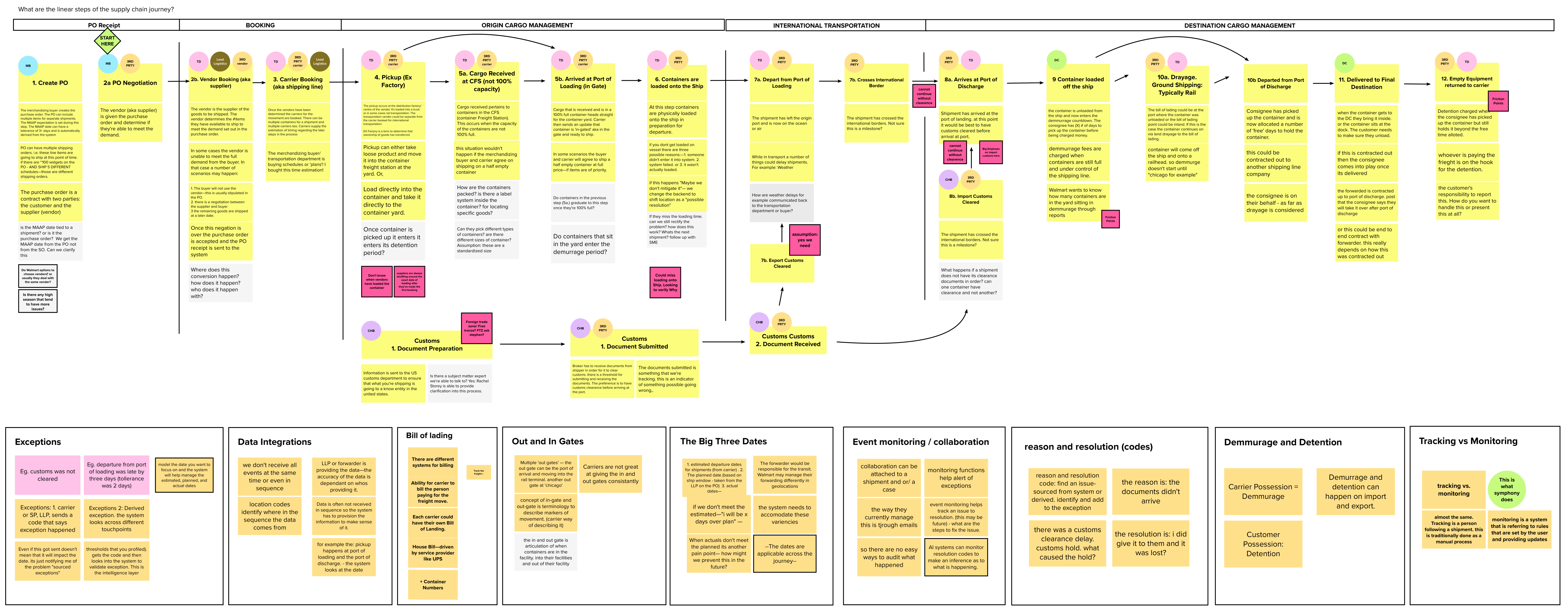
Defining the Product by Understanding the Ecosystem
Our first task was to understand the scope and complexity of the supply chain journey. Through desk research and stakeholder interviews, we mapped out the product’s context — uncovering both business goals and user requirements. This helped define the scope and purpose of the platform from both user and organizational perspectives.
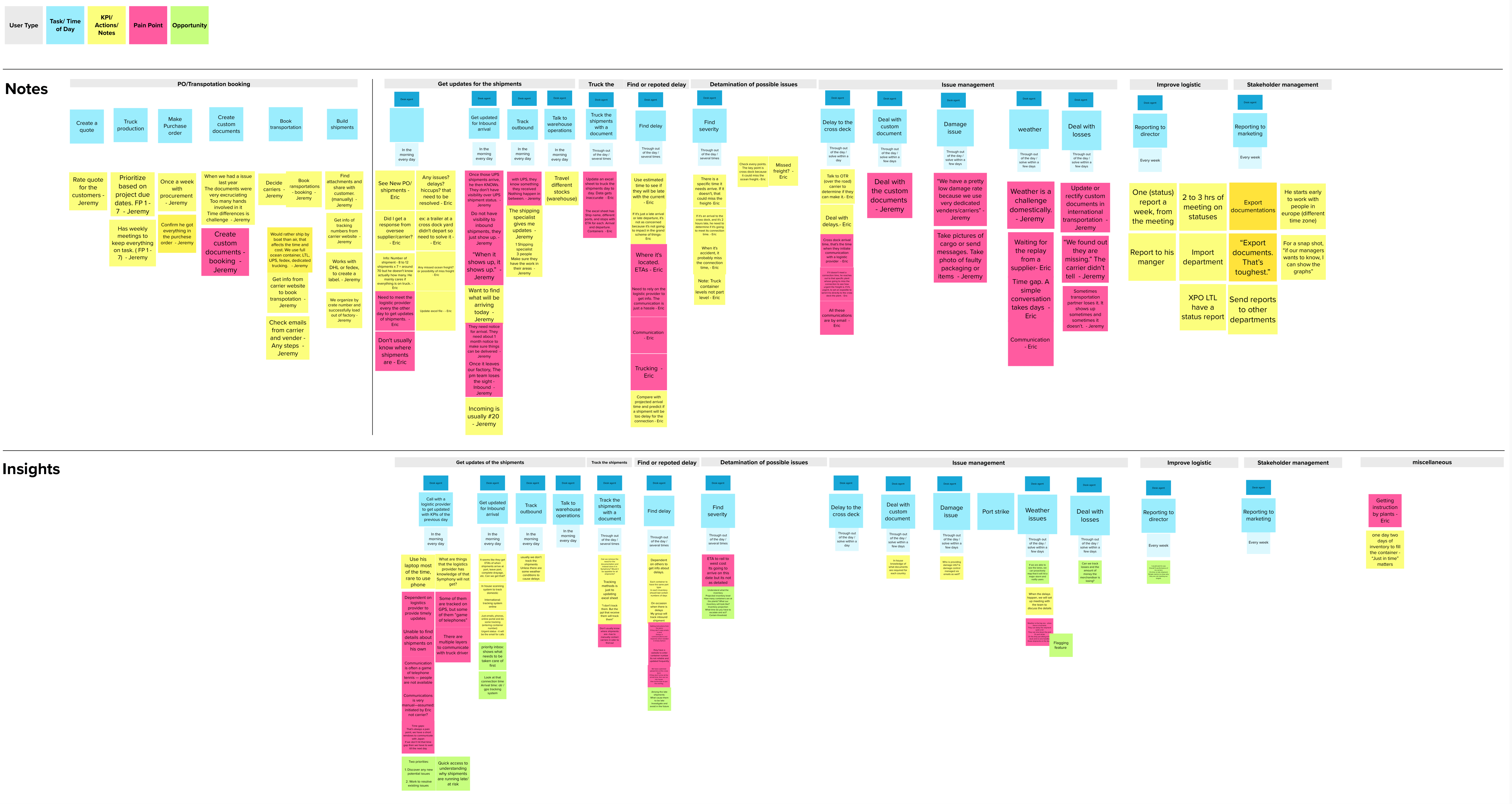
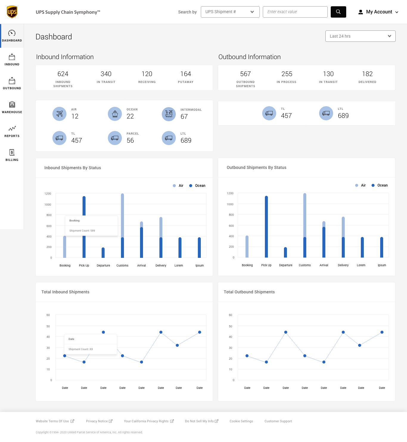
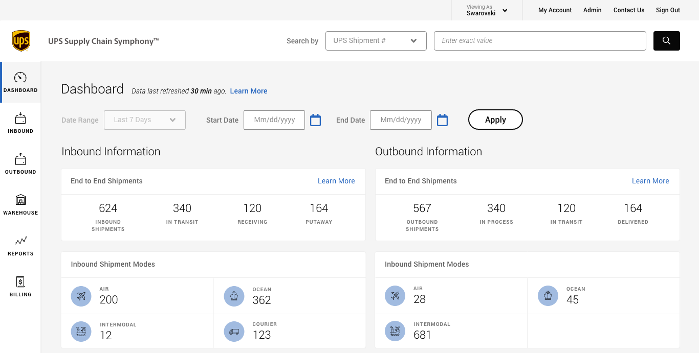
Mapping Data Through the Lens of Time, Role, and Location
Shipment data is the backbone of the system — powering status updates and performance metrics. We created a shipment journey map to understand how data flows through the system across time, location, and roles. This clarified how different users interact with the same data and helped us define multiple information hierarchies and tailored views.
Creating Proto-Personas to Align Teams Around Real Needs
Before conducting user interviews, we ran internal workshops with stakeholders familiar with the product. Together, we mapped out key user types and created proto-personas by identifying common patterns. This alignment helped the team adopt a user-centered mindset early in the process and build empathy for real user needs.

(A set of proto-personas created to highlight common patterns and needs among key user groups)
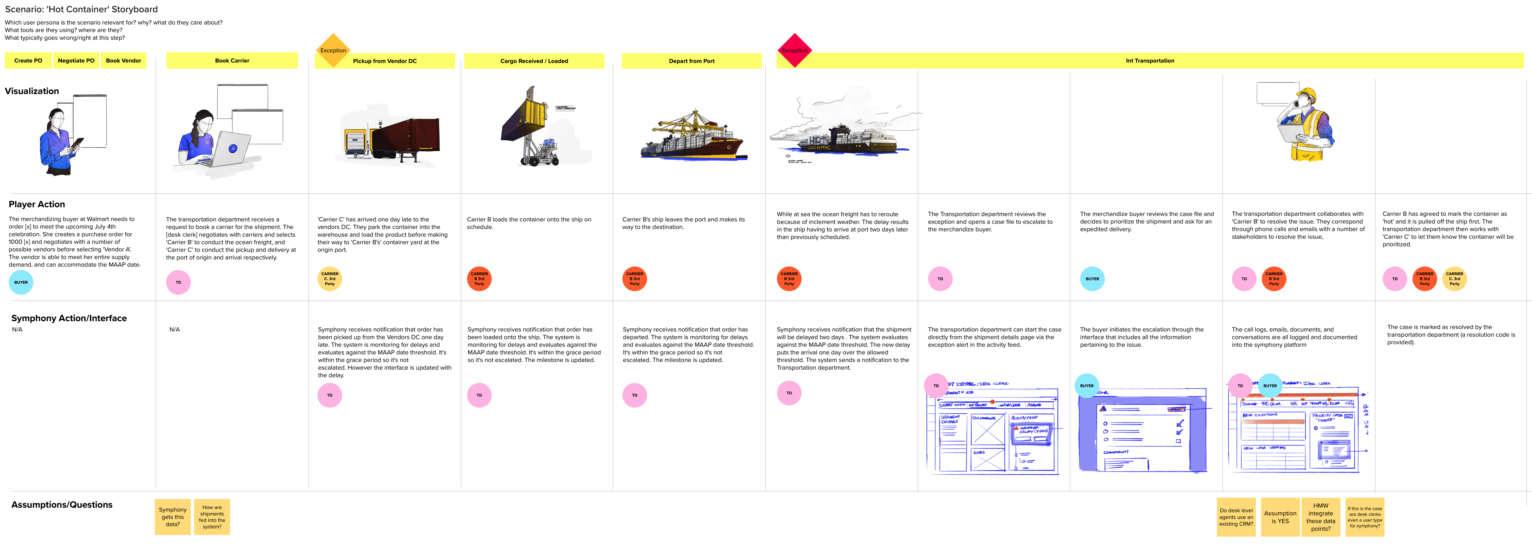
Validating Assumptions with Real Users and Real Pain Points
After identifying the Desk Agent as our primary persona, we developed a journey map to guide our interview structure. Through direct conversations with users, we uncovered valuable insights, pain points, and opportunities. Many of our early assumptions were validated — while others were challenged.
We quickly built prototypes for usability testing, which allowed us to validate complex design ideas and iterate based on real user feedback. These sessions were key to refining interaction patterns and prioritizing improvements.
Early Wins and Lessons From the First Launch
The first MVP received positive feedback for its cleaner and more modern UI. However, it lacked a clear design rationale supported by data. Users pointed out missing features, confusing navigation, and underutilized pages. While the interface looked polished, usability still had gaps.
With research insights, tagging analysis, and stakeholder interviews, we were able to pinpoint the most critical issues and prioritize improvements based on user and business impact.

What Didn’t Work — and How We Adapted
The initial goal was to build a single platform to increase visibility across the supply chain. However, as we dove deeper into the logistics workflow, we discovered distinct user needs at each stage. It became clear that one solution couldn’t serve everyone. Moving forward, we focused on identifying specific user groups the platform could best support.
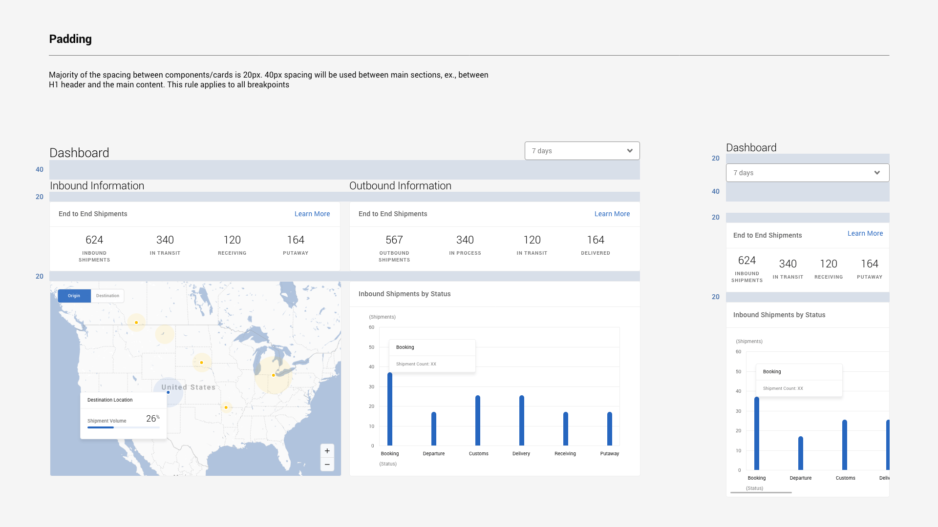
Streamlining Structure to Support Growth
After the MVP launch, it became clear that much of the platform’s content was redundant. Similar tables and graphs appeared across multiple pages — for example, shipment data surfaced on both the homepage and inbound pages, with only slight variations. Without a clear mapping between user roles and data needs, the experience felt cluttered and inefficient.
We revisited the site architecture to define clearer page relationships, reduce duplication, and streamline navigation based on actual user priorities.


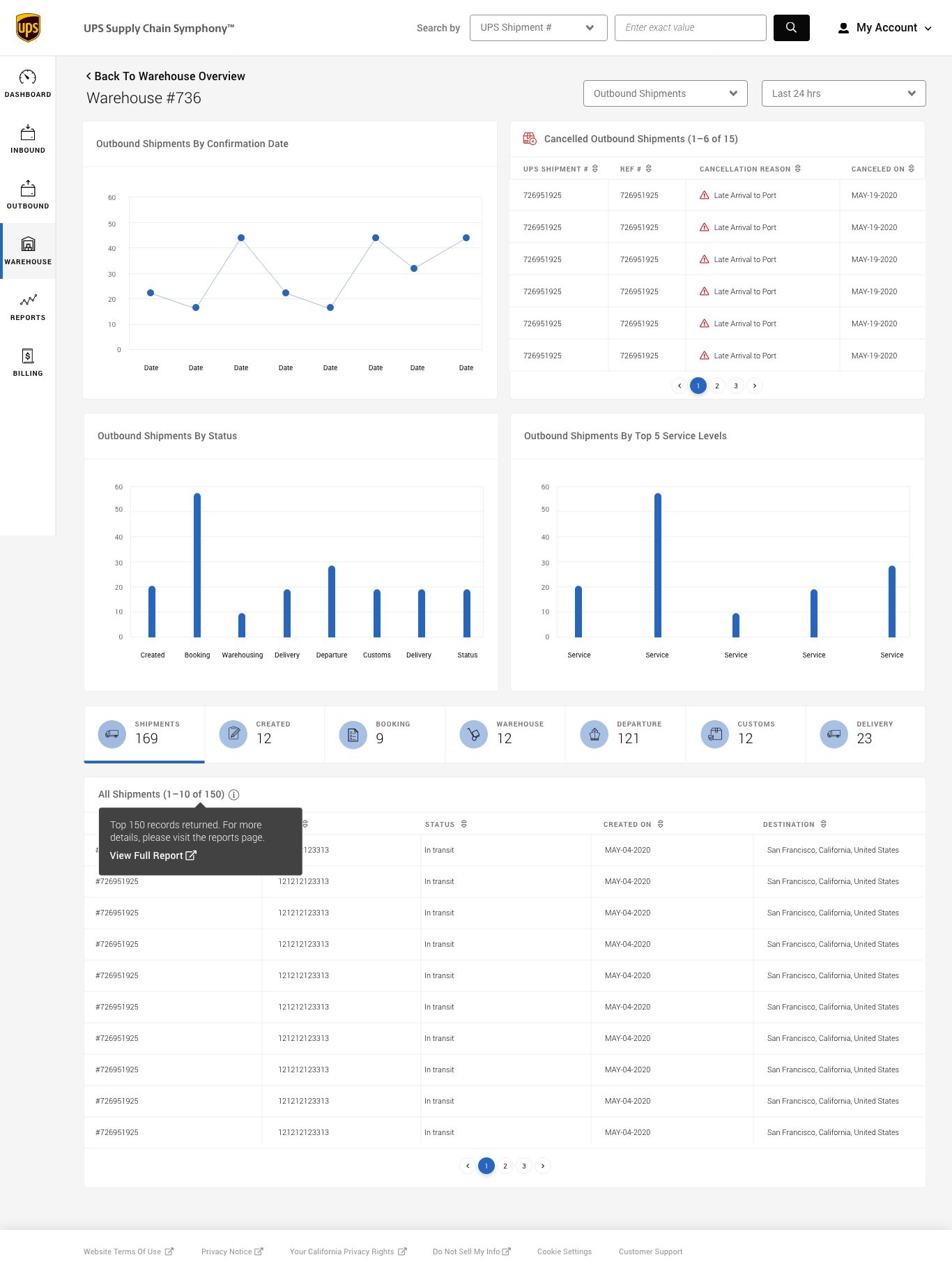
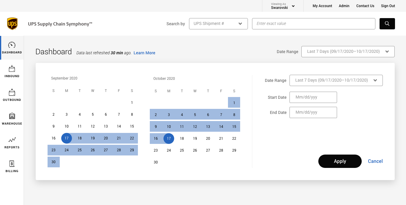
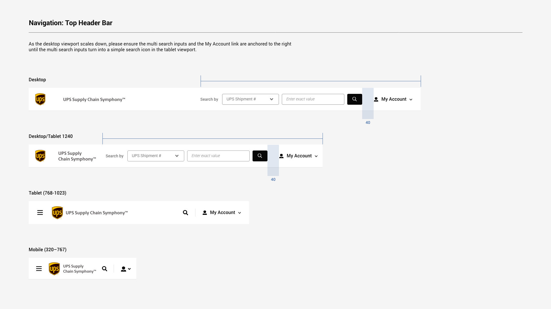
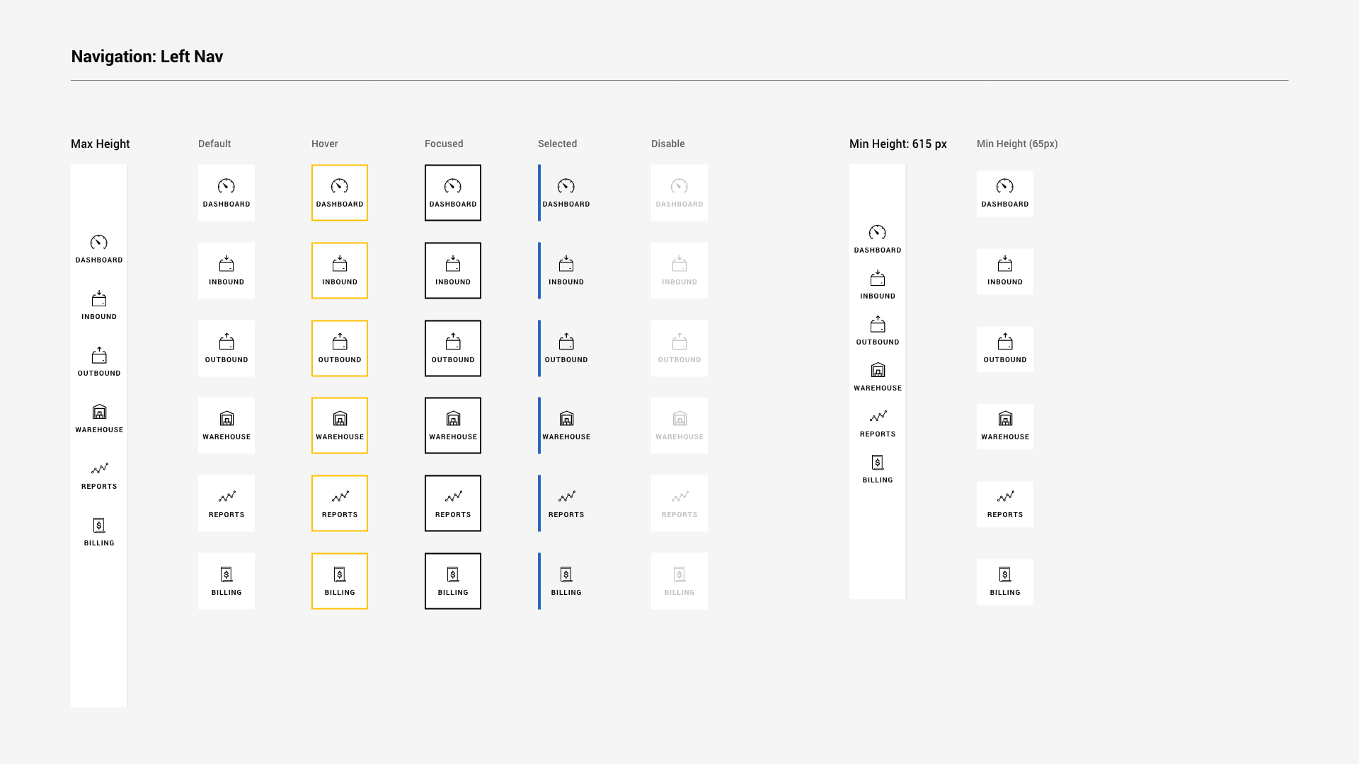
At the component level, two critical tools — the Shipment Milestone and Date Picker — were hitting scalability limits. Their original horizontal layouts couldn’t accommodate the increasing number of shipment statuses or filter ranges. We redesigned them as vertically scrollable modules and flexible range selectors, making the interface future-proof while preserving clarity and control.


(Left: Shipment statues are hidden with the limited space of horizontal navigation. Right: The revised iteration uses vertical navigation to accommodate more items vertically.)


Creating a Shared Language Between Design and Dev
To streamline collaboration and improve consistency, I developed a lightweight design system with the team. Before this, designers spent up to 4–6 hours daily resolving spec questions with dev and QA teams. With the new style guide — covering typography, colors, grid, icons, components, and interaction rules — we cut that time down to 1–2 hours.
We also referenced best practices from design systems like Material Design and Spectrum, adapting them to our specific needs. The guide not only improved visual consistency but also ensured a more seamless user experience across devices and teams.


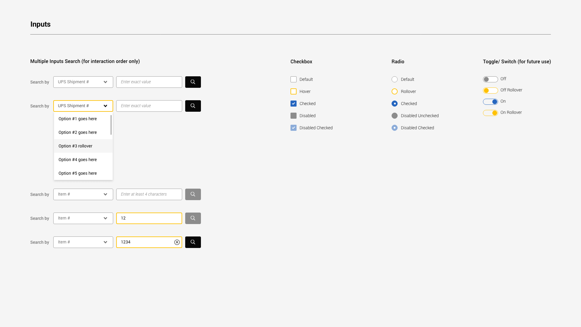

(Style extract: Colours, Typography, Grid, Icons, Spacing, Components, Modules, Elements, etc.)
Building Systems That Grow With the Team
As our team scaled, our workflows began to show strain. We ran into challenges with version control, file sharing, handoffs, and review cycles. After two major releases, I led an internal review to map out our current ways of working and uncover areas for improvement.
Through collaborative sessions, we identified the most pressing pain points and prioritized solutions. One key focus was optimizing our file structure and naming conventions — simple changes that had a big impact. These improvements helped reduce daily friction, improve alignment, and free up space for deeper design work.
The visual below illustrates team feedback from those sessions — covering our rituals, file organization, pros and cons of current systems, and the gaps we experienced. Laying it all out helped us better understand how we work together and gave us a clearer picture of how to move forward more efficiently and meaningfully as a team..
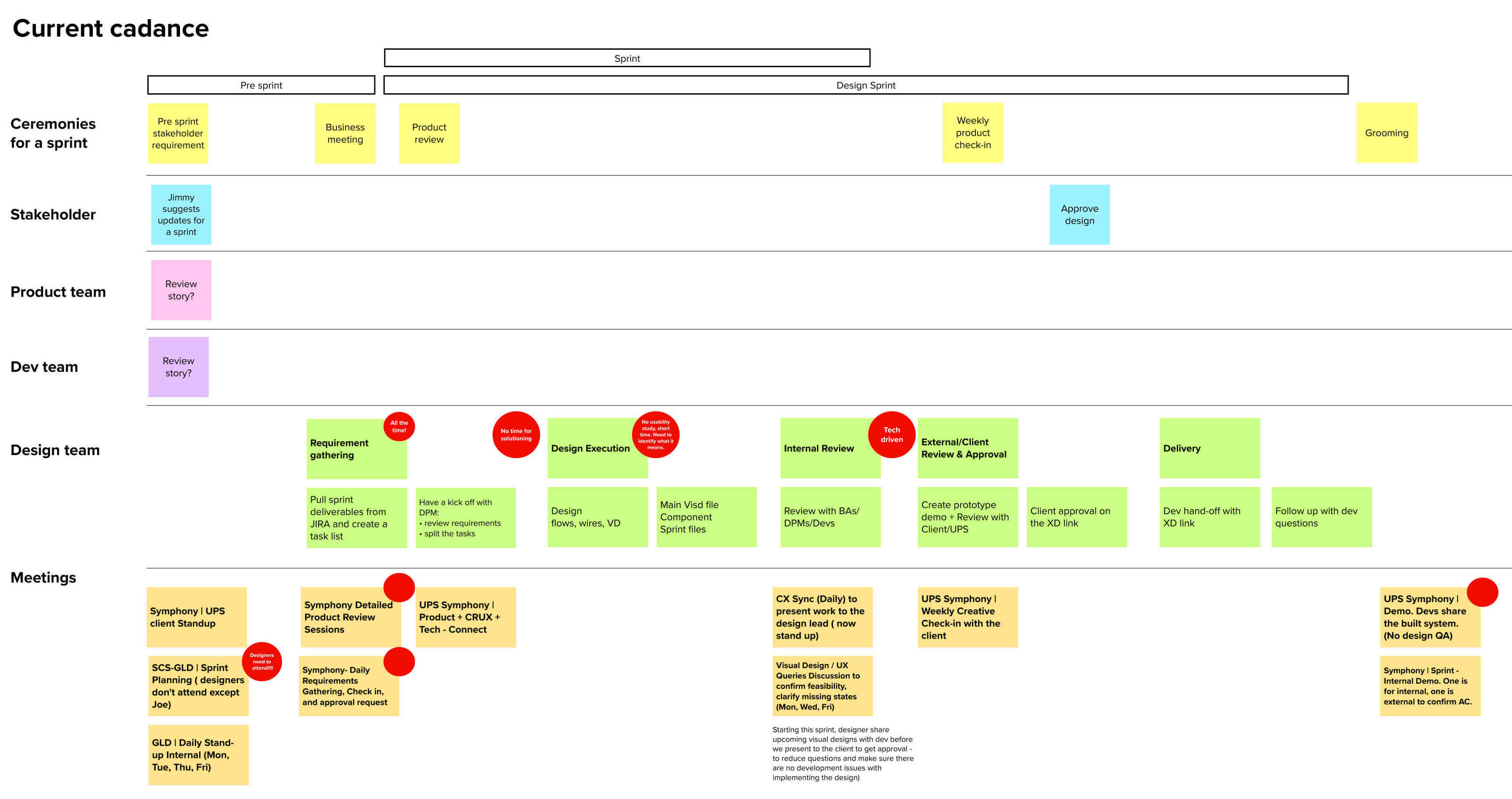
(Mapping out recurring meeting cadences and their purpose helped us eliminate unnecessary meetings and bring more focus to the ones that mattered.)
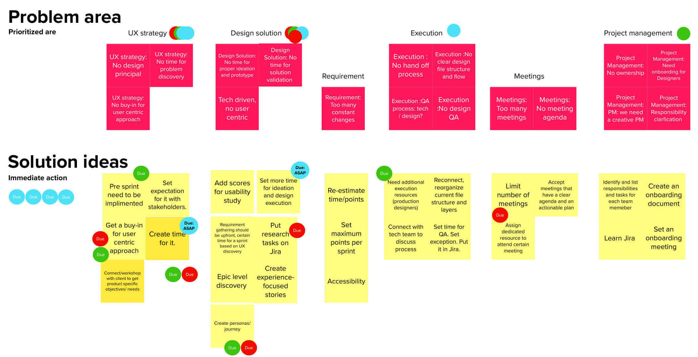
(Through discussions with internal designers, design leadership, and product managers, we gathered insights on key pain points, immediate quick wins, and larger challenges requiring long-term planning and alignment.)
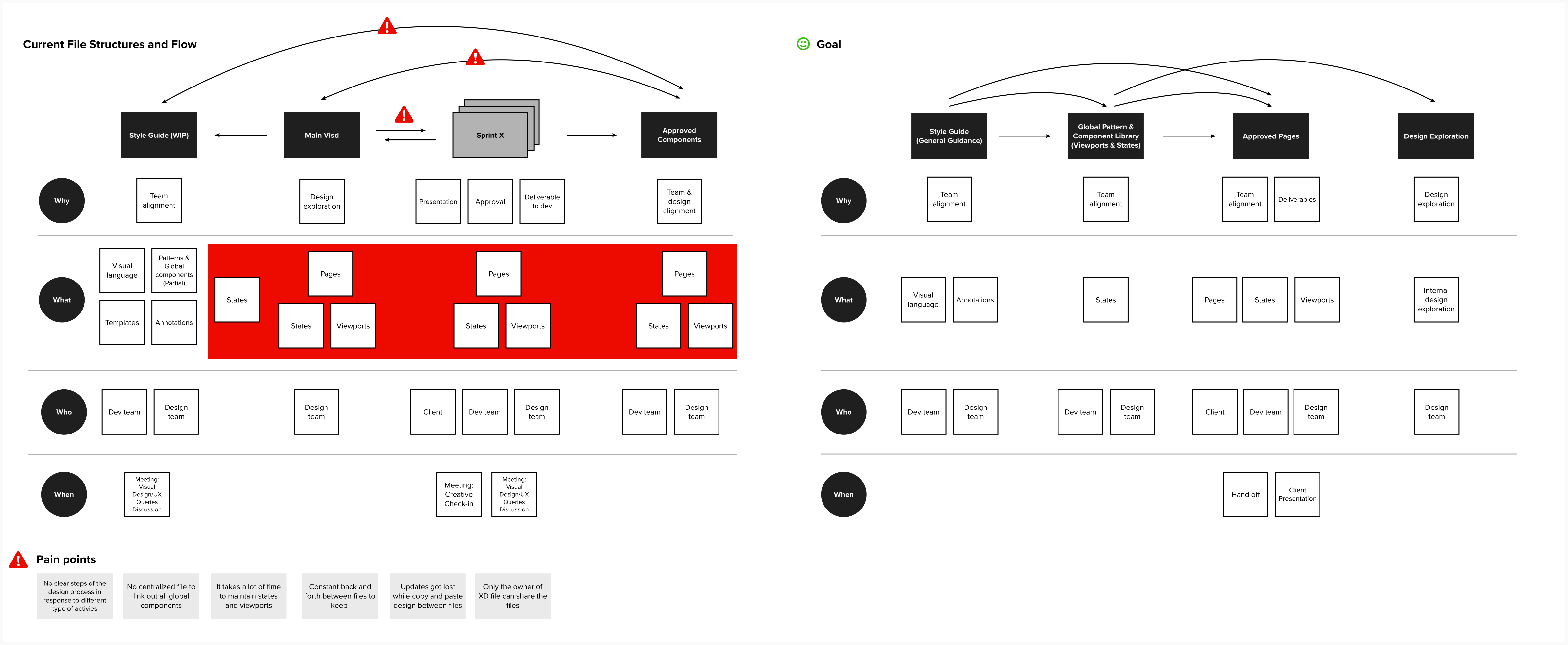
(From current file structure to future state — identifying gaps and setting a clearer system)
Key Learnings
🔍 Research revealed what different users actually needed
Talking to desk agents and running stakeholder workshops made it clear: a single dashboard wouldn’t work for everyone. Their goals and mental models varied, so we pivoted toward a modular, role-based experience — flexible enough to adapt to each user type.
📊 Structure brings clarity
Mapping the data flow exposed overlaps, redundancy, and unclear hierarchies. By reworking the information architecture, we helped users focus on what mattered — reducing noise and enabling quicker decisions.
⚙️ Scalable components unlock scalable systems
Tools like the shipment milestone selector weren’t built for scale. As complexity increased, they created friction. We redesigned them to support growth — both in volume and functionality — without overwhelming the UI.
🤝 Cross-functional alignment was key to progress
With competing needs across business, ops, design, and dev, alignment wasn’t a nice-to-have — it was critical. Through interviews and workshops, we built shared understanding and defined a living design process that made collaboration smoother and delivery faster.
© 2025 Iris Wu. All rights reserved.