Shaw.ca e-Commerce Redesign
The new Shaw.ca website was an iterative design exercise informed by data and user testing analysis.
Background
Site Releases & Design Phases
During my time on the Shaw team, we’ve delivered at least 4 releases, including Beta Shaw.ca, New Shaw.ca, Bundle Strategy, and BlueCurve Strategy, which encompassed a full platform release evolution from refreshing the look and feel, improving user experience and narrative, expanding product and service offers, consolidating and elevating overall brand strategy.


(Above left: Above left: Old Shaw.ca co-existed as we used the Beta Shaw.ca to test performance and gain customer insights. Above right: Beta Shaw.ca focused on selling internet plans and related benefits.)
Beta Shaw.ca represented the concept of a simple product offer (Internet plans only) and a quick add-to-cart experience. This site co-existed with the old Shaw.ca for almost a year. The team used it as an A/B test opportunity to see how the market responded to minimal product offers versus the conventional full product lineup. We gained a lot of insights such as how certain components and page layouts generate more conversion. However, it was challenging to compare its full potential against the old site due to the lack of having a holistic strategy in place.
![]()
![]()
![]()
(Above left: New Shaw.ca launched with a new art direction and the hard push for the BlueCurve bundle concept. Customers and users were often confused about what BlueCurve is.
Above middle: We toned down the BlueCurve bundle perception and started to think more holistically about the entire product offers and its connection with BlueCurve. We worked with the content strategists to tell better stories and product benefits. In return, it successfully increased brand and product awareness and bundle sales by almost 50%.
Above right: Although it was a success in increasing customer's product knowledge and willingness to upgrade to bundles. From the heat map study, we noticed the narrative could be more concise and targeted. We introduced the quick comparison plan cards, tested them on different placements and pages, and we saw an increase in conversion and cart start rate.)
After a year of preparation, research, test and planning, we finally launched the New Shaw.ca with richer product offers using BlueCurve Bundles as the main drive. Since then, the team has been closely monitoring the performance and analyzing its data. All that information enabled us and the stakeholders to learn, generate insight, make better decisions and strategically plan towards the future roadmap.

Quick Tests & Optimization
With one of the main goals being educating and helping customers differentiate products and services, we work with the data analytic team and Optimizely team to understand the respective data and user testing results to helped inform and improve the overall site experience.
Test Exemple: Plan Card Study
Plan Cards/Pages are some of the hot components and pages to be tested and analyzed during the feature prioritization exercise. They are the key indicators of conversion rate. From 2018–2020, we ran frequent and multiple A/B testings on the old and New Shaw.ca sites. The results allowed us to understand how certain page layouts or Plan Card elements helped increase cart start rate and digital sales.
Vertical vs. Horizontal Plan Cards/ Layouts
Plan cards can be presented in either a horizontal or vertical fashion and both look elegant. We wanted to find out which one can drive a higher cart start rate and orders. From the results, we saw that Vertical Plan Cards overall had better performance in conversion rate, and we assumed that it allowed easy comparison of the different products.
 (Vertical cards performed better than horizontal cards possibly because users can easily compare the information on the cards.)
Plan Card Combinations
After learning that the Vertical Plan Card was the winning option. We then wanted to look at how the Plan Card arrangement has a direct impact on click-through and conversion rate. We used Multivariate Testing to see how descriptions, bullet points, and "View More Detail" CTA perform.
 (Winning combination drive +11% increase in cart start, which translates into +500 submitted RGU per month.)
Exploring New Designs
As the site evolved, we did further iteration on the Plan Cards by adding various design elements to test efficacy. Adding icons and brief descriptions significantly increased the RGU conversation rate by +18%. However, the click-through decrease by 7%. It implied the icons and description educated the users leading to a decrease in clicks, but when they did click they were more likely to go ahead with the purchase.

(We did the test on various plan cards including Internet, Bundle and TV plans.)
Outcome
July 2019 Release: New Shaw.ca
For the first week post-launch, the new site achieved 26% of the monthly Internet Posted Sales target.
Oct 2019 Release: BlueCurve Total (Bundle)
For the first 2 weeks post-launch, the distribution of
Bundle RGU orders has increased by +52% of total
RGU orders. Pages per visit have increased
+35% vs benchmark.
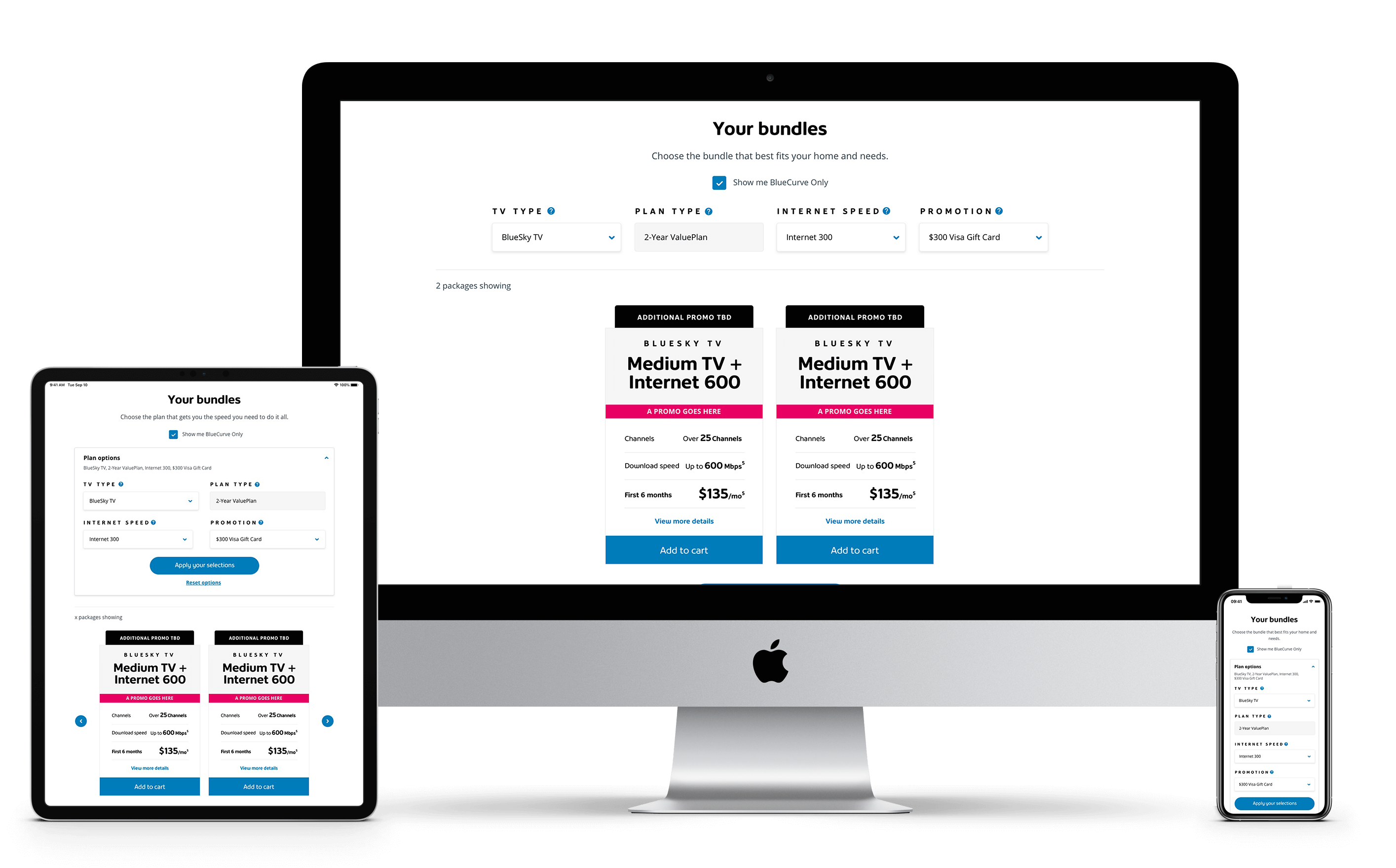
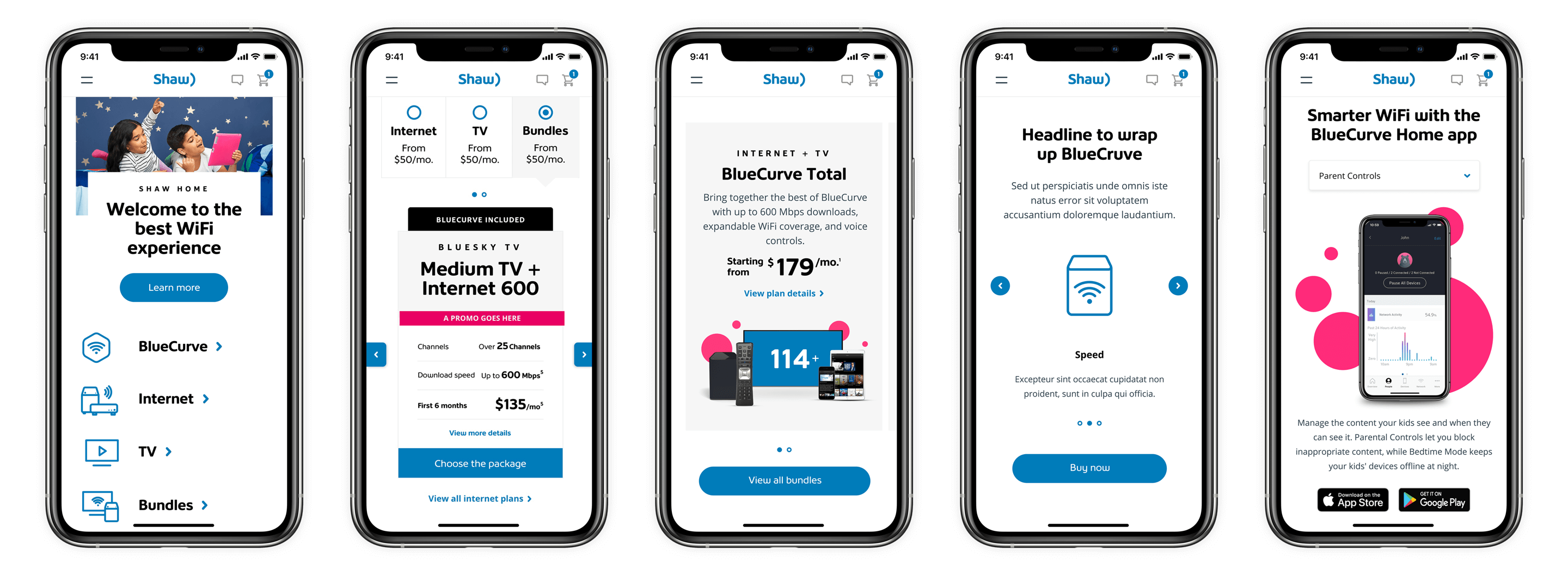
Scalabe & Responsive
The new Shaw.ca renders well on a variety of devices and window. All the components and modules are fluid and adapts to the size of the screen.
The design output of the new Shaw.ca is backed by a flexible design system that focuses on providing a mobile-friendly, responsive, personalized and accessible user experience.
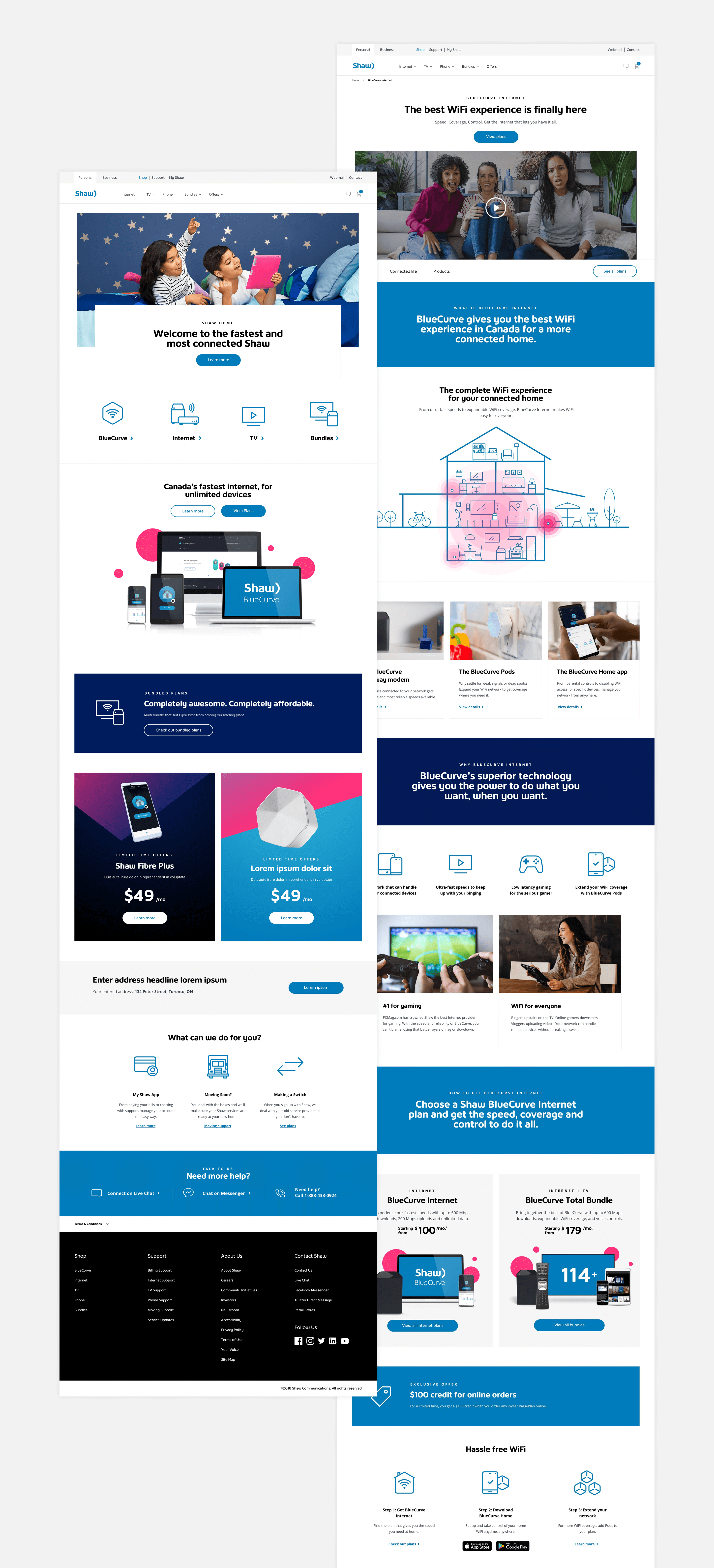
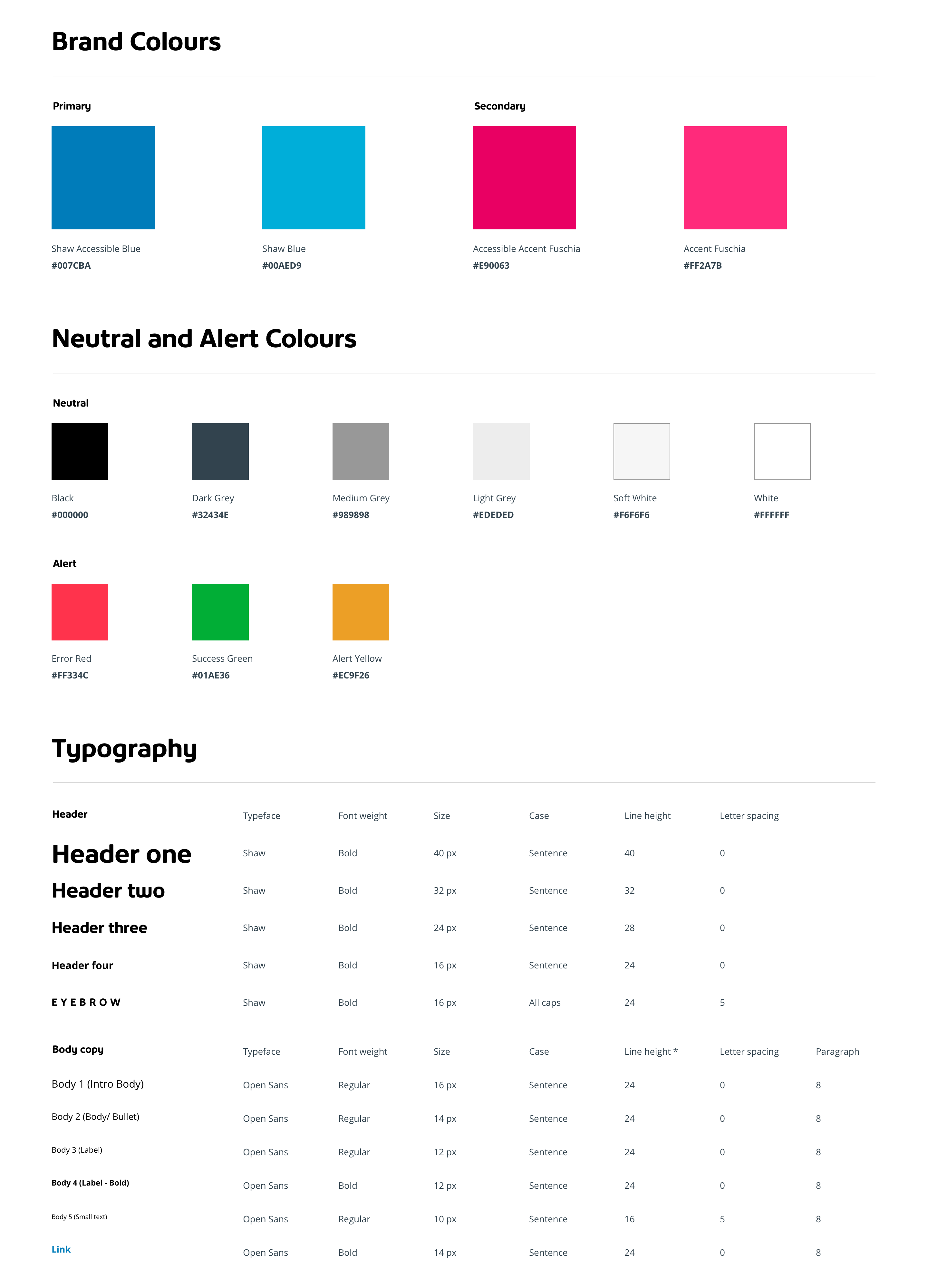
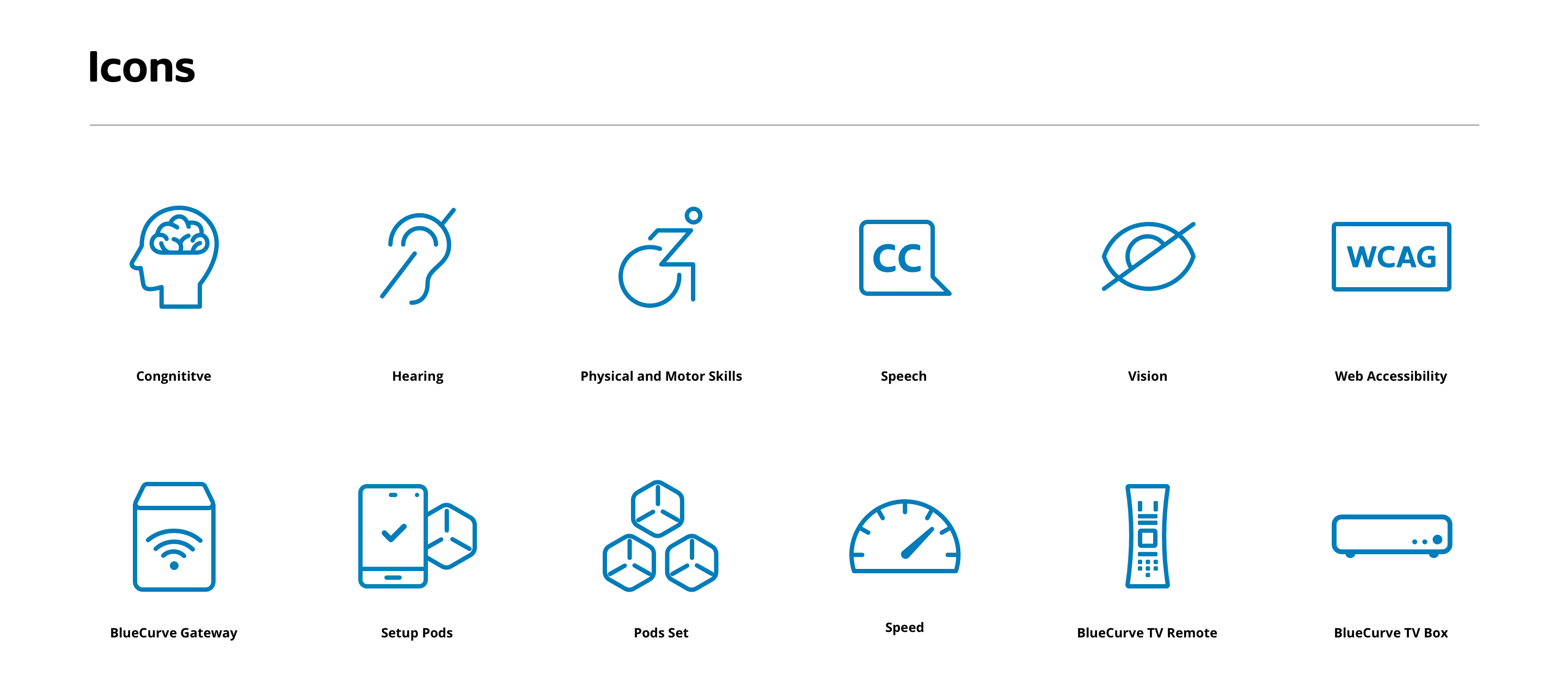
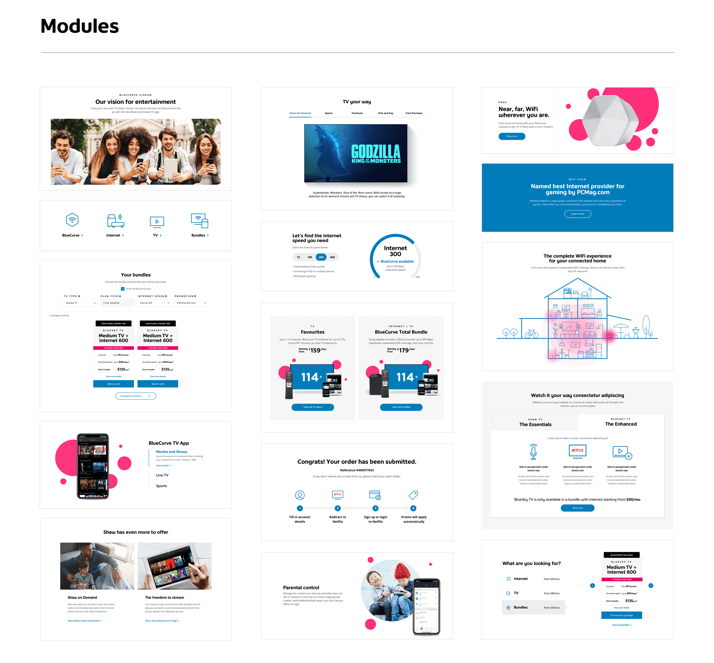
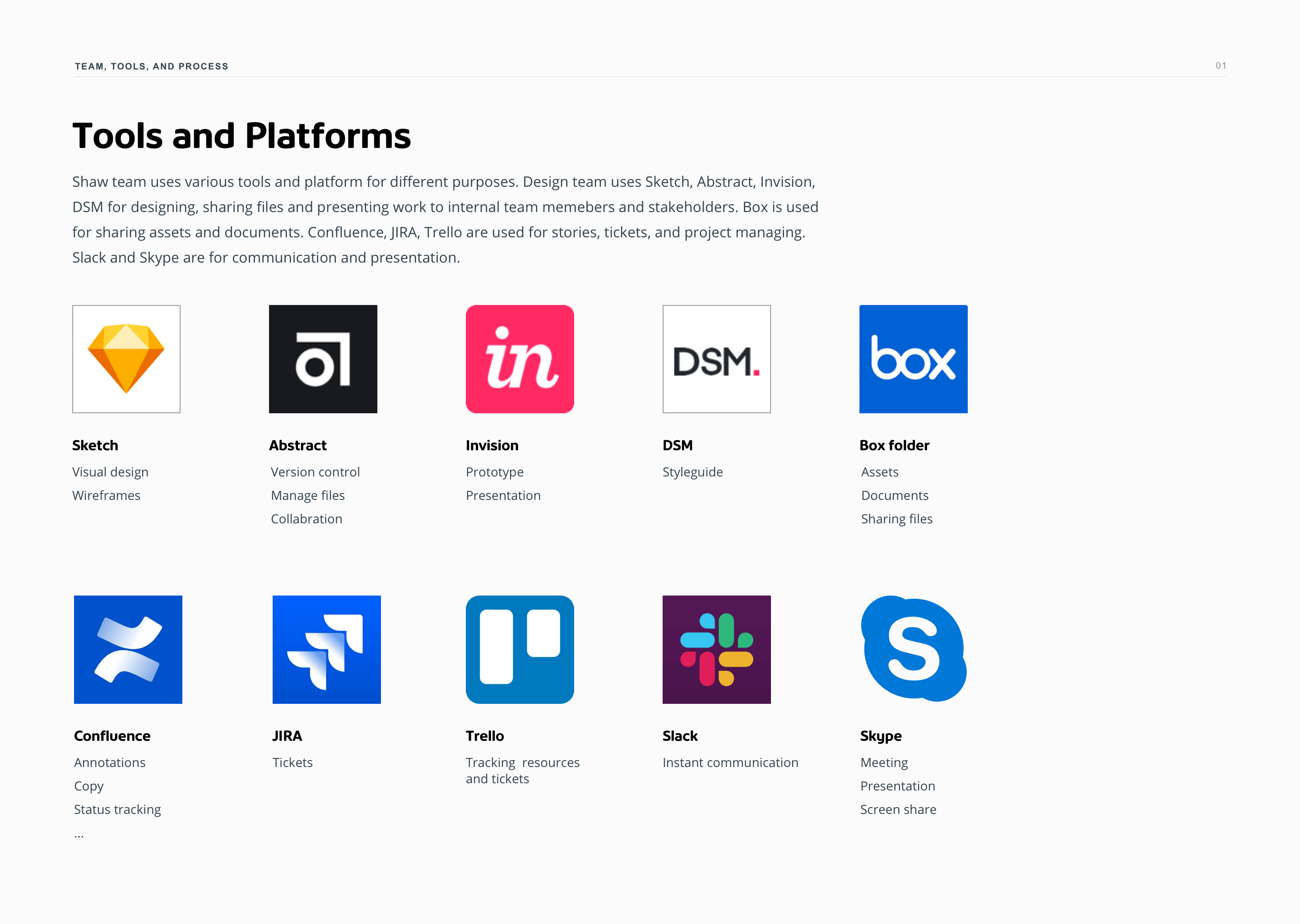
Design System
To ensure the new look and feel properly applies to the digital space in a beautiful and meaningful way, we did multiple rounds of visual exploration, creating numerous new design components and modules. Eventually, we’ve upgraded the design system to be flexible, rich and comprehensive.

Design Management
Establishing a meaningful design process is a crucial part of the design management for this project. As the business expanded, the project also became more complex. The design process then needs to change to be more adaptable and flexible to encompass future growth and complication.
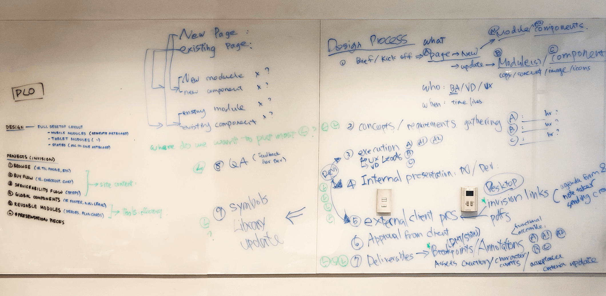
I got the team together to share their experiences, discuss each step of the process, and documented our findings. We found that the process in place was too limiting and rigid. There were gaps and grey areas which cause unnecessary redundancy and confusion. Some tasks that can be streamlined were too intricate, causing the roles that can be more powerful to spend too much energy caused by distraction.

To help guide team members to maximize their capabilities and minimize overlapping resources, a design process document was created and continuously updated. It outlines three key things: the team, the tools, and the process — and what they mean to each other. It provides both an overview as well as detailed context to our evolving project and team structure.