Shaw.ca e-Commerce Redesign
Redesigned Shaw.ca across multiple phases to evolve it from a static site into a responsive platform centered on bundle strategy and digital sales — resulting in a +26% increase in internet sales in week one and +52% uplift in bundle RGUs, proving how storytelling and UX optimization drive measurable business impact.Role: UX/UI Design, Design Management
Creative Leads: Karen Hawkins, Marcelo Mariano Dias
Experience Designers: Kimberly Wright, Natasha Johnson, Cheryl Wong, Iris Wu
Agency: Publicis Sapient
Client: Shaw Communications
Year: 2018—2020
Evolving Shaw.ca into a Scalable, Insight-Driven Experience
Shaw.ca underwent a multi-phase redesign to modernize its digital experience, improve conversion, and support a more strategic bundling narrative. Over the course of two years, we delivered four major releases — from Beta Shaw.ca to a full brand and platform evolution — iterating based on user feedback, data insights, and changing business goals.
Where It Started: Beta Shaw.ca
Our first major step was launching Beta Shaw.ca — a lean site focused on selling internet-only plans with a simplified, add-to-cart experience. It was released alongside the existing Shaw.ca to test how a minimal product offer would perform in the real world.
The goal wasn’t just visual refresh — it was to understand how layout, content hierarchy, and interaction affected user behavior and conversion. While Beta taught us a lot about what worked (and what didn’t), it also revealed the limits of designing without a cohesive long-term strategy. It was a starting point — not the solution.


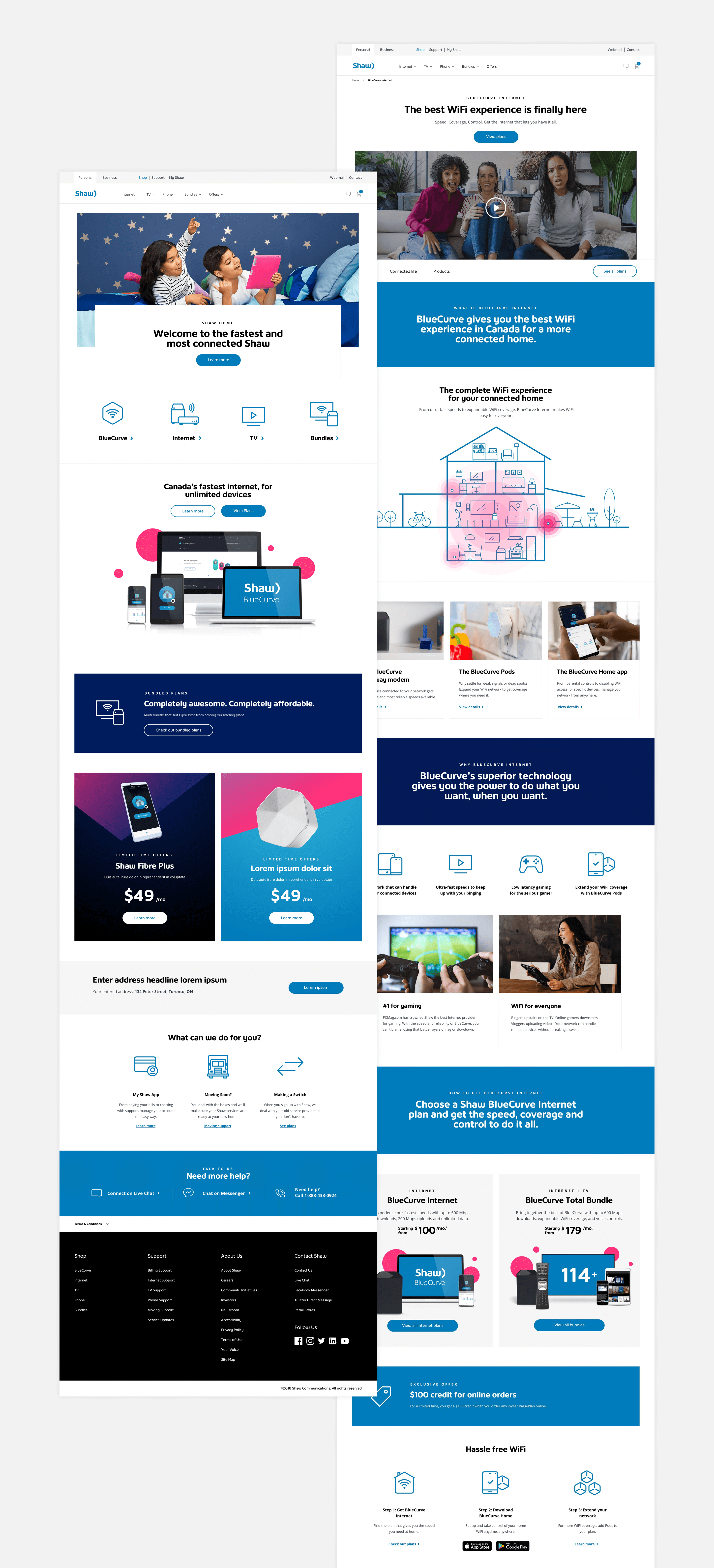
(Above left: Above left: Old Shaw.ca co-existed as we used the Beta Shaw.ca to test performance and gain customer insights. Above right: Beta Shaw.ca focused on selling internet plans and related benefits.)
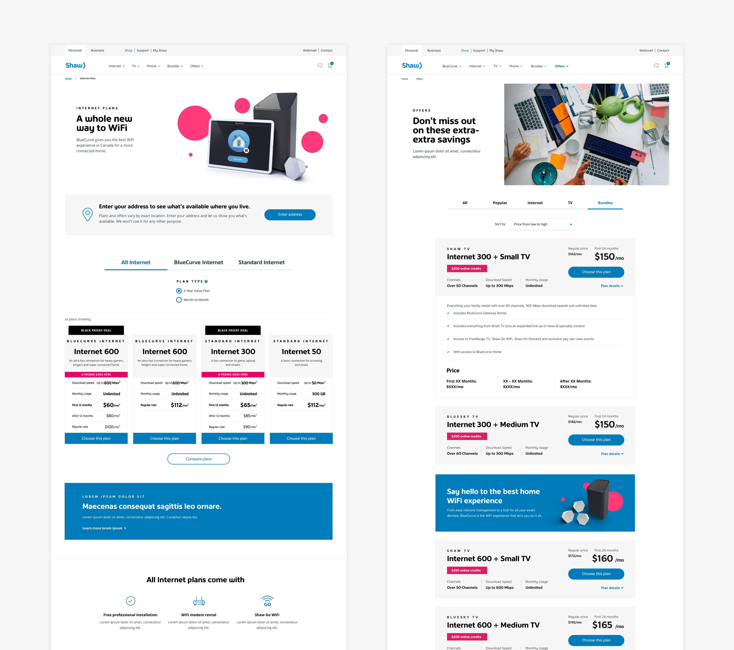
From Beta to Strategy: The New Shaw.ca
After a year of experimentation and learning, we launched the new Shaw.ca — a more fully realized platform that introduced richer product offerings and repositioned BlueCurve as a central concept. But with that came new challenges: users didn’t understand what BlueCurve meant.
To solve this, we worked with content strategists to shift from a sales-heavy push to a more story-driven approach. We clarified product benefits, made the concept more relatable, and saw a direct impact: bundle sales increased by nearly 50%.
But the work didn’t stop there. Heatmaps and behavioral data showed us where users were dropping off, where copy could be tighter, and which pages underperformed. We introduced quick comparison plan cards, tested placement and content variations, and gradually increased both conversion rate and cart starts.

(Above left: New Shaw.ca launched with a new art direction and the hard push for the BlueCurve bundle concept. Customers and users were often confused about what BlueCurve is.
Above middle: We toned down the BlueCurve bundle perception and started to think more holistically about the entire product offers and its connection with BlueCurve. We worked with the content strategists to tell better stories and product benefits. In return, it successfully increased brand and product awareness and bundle sales by almost 50%.
Above right: Although it was a success in increasing customer's product knowledge and willingness to upgrade to bundles. From the heat map study, we noticed the narrative could be more concise and targeted. We introduced the quick comparison plan cards, tested them on different placements and pages, and we saw an increase in conversion and cart start rate.)
Letting Data Guide Every Design Decision
With a focus on educating users and differentiating offerings, we collaborated with the analytics and Optimizely teams to run iterative tests that informed ongoing enhancements.
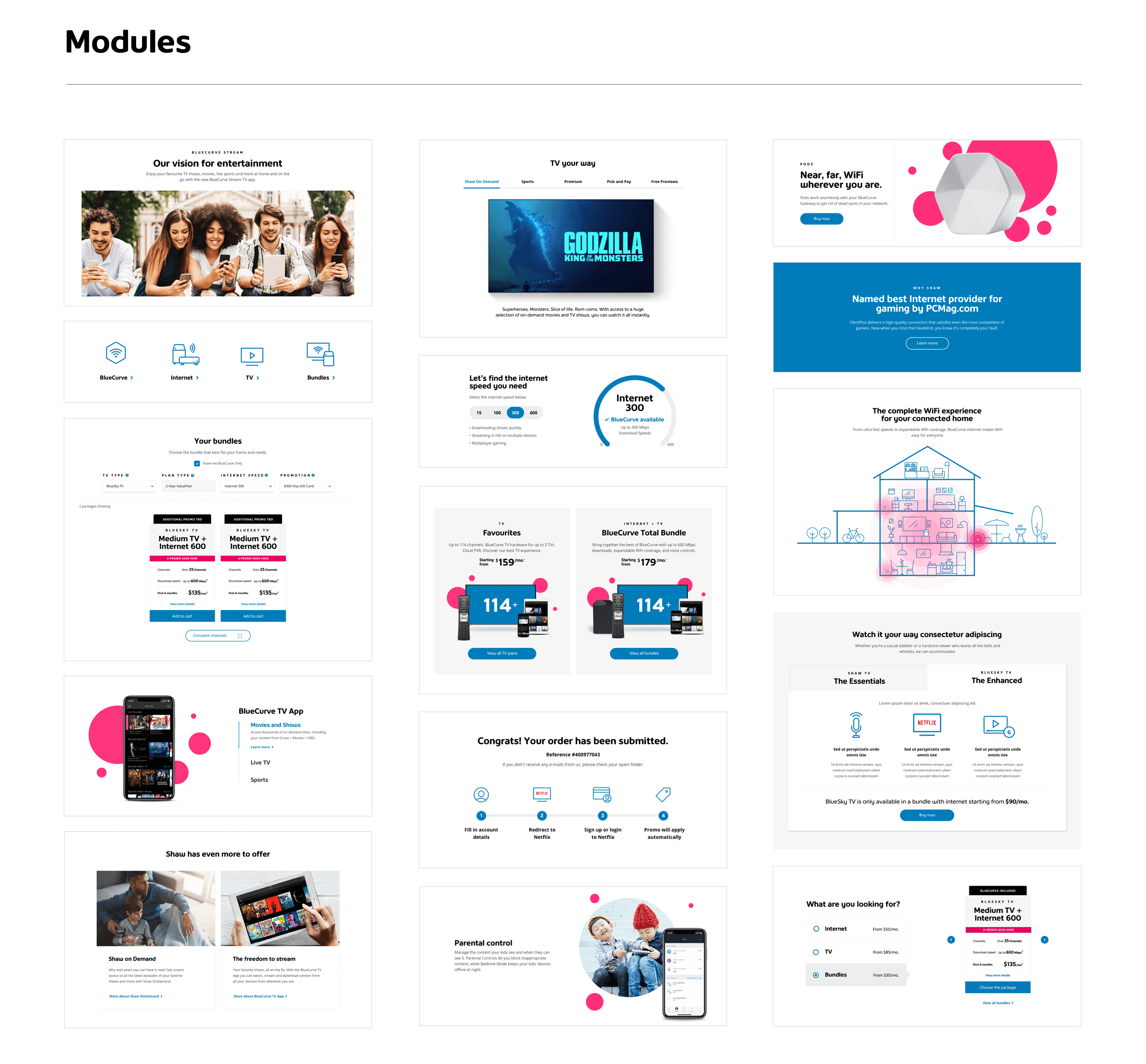
Test 1: Vertical vs. Horizontal Plan Cards
We tested both vertical and horizontal layouts to see which drove higher engagement. Vertical cards performed better in terms of conversion, likely due to easier side-by-side comparison.
Test 2: Plan Card Combinations
Multivariate testing of CTA types, bullet points, and content layout led to a +11% increase in cart starts, translating to over 500 submitted RGUs/month.
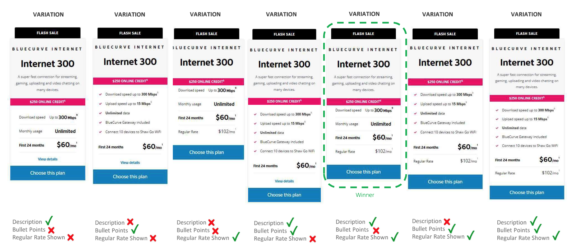
Test 3: Visual Enhancements
Adding icons and concise descriptions boosted conversion by +18%, though it slightly reduced clicks — suggesting better-informed users needed fewer interactions to complete their purchase.

What Changed — and Why It Mattered
The redesign wasn’t just aesthetic — it drove real results:
-
+26% of the monthly Internet sales target hit within 1 week of launch
-
+52% increase in bundle orders after the BlueCurve Total release
- +35% increase in pages per visit, indicating deeper engagement
Designing for Growth, Not Just Launch
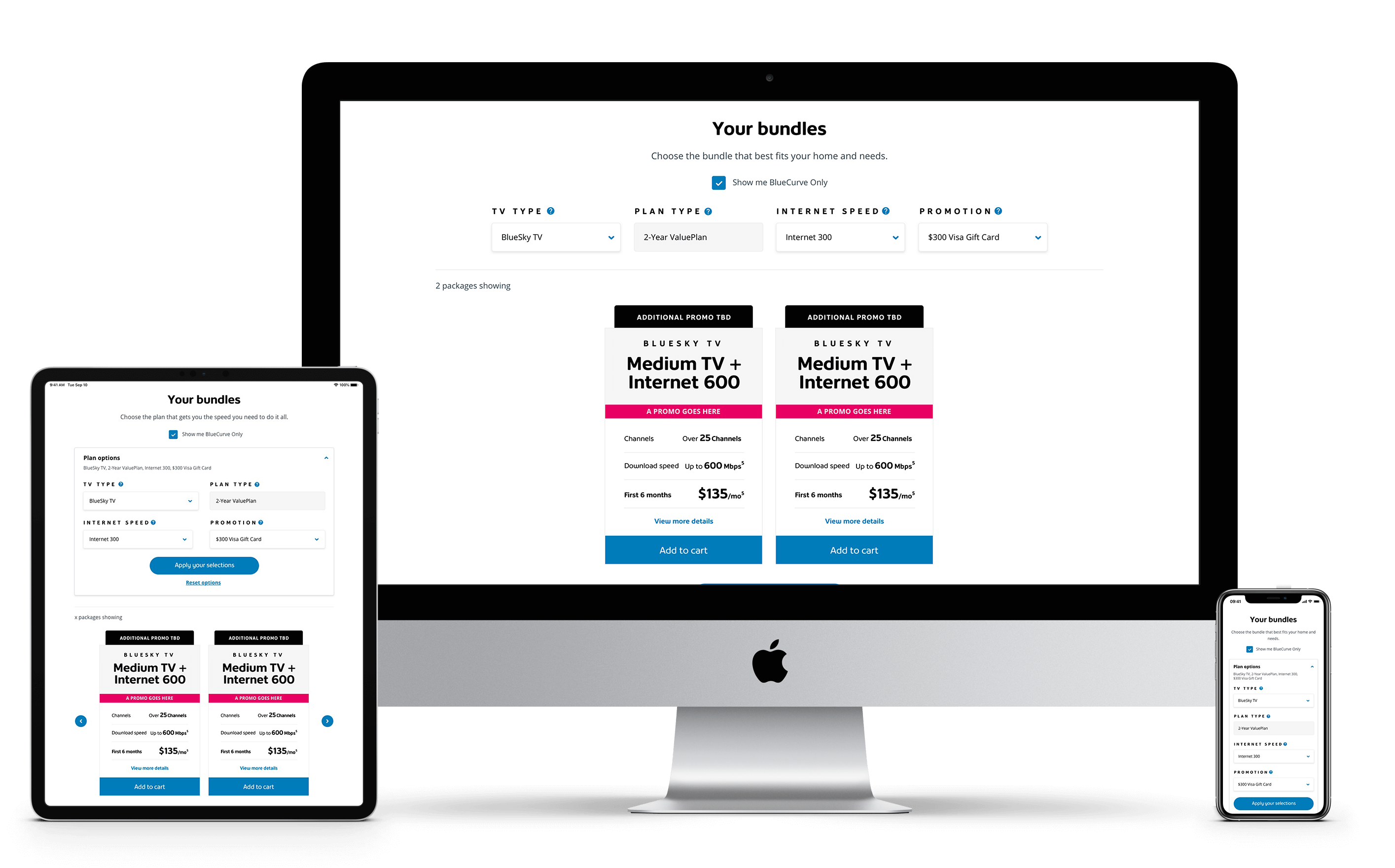
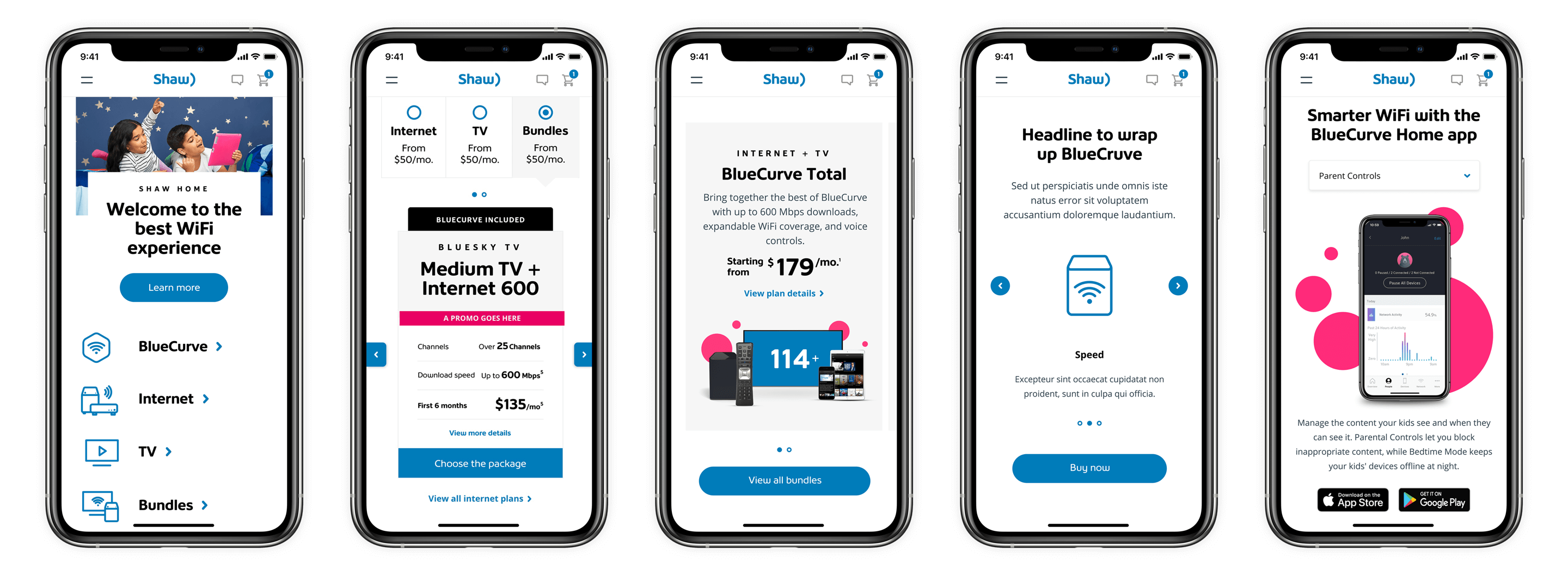
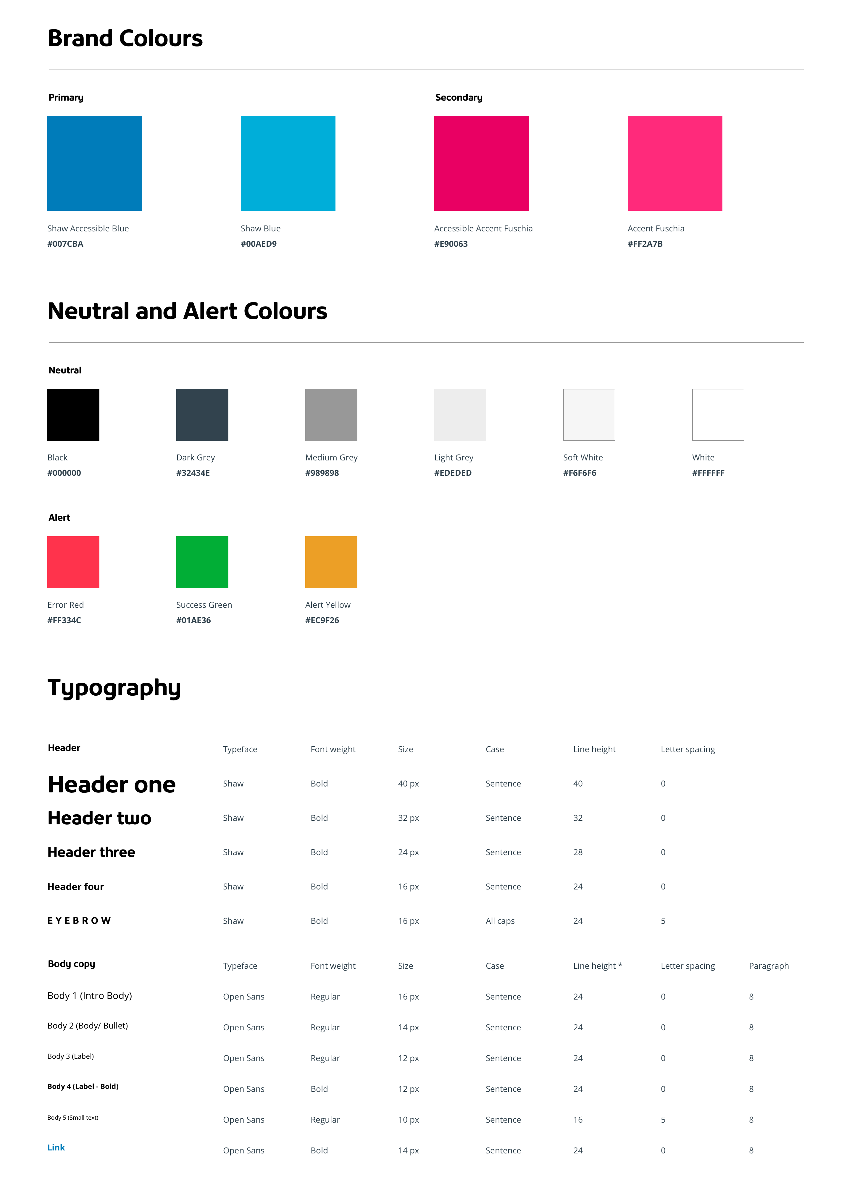
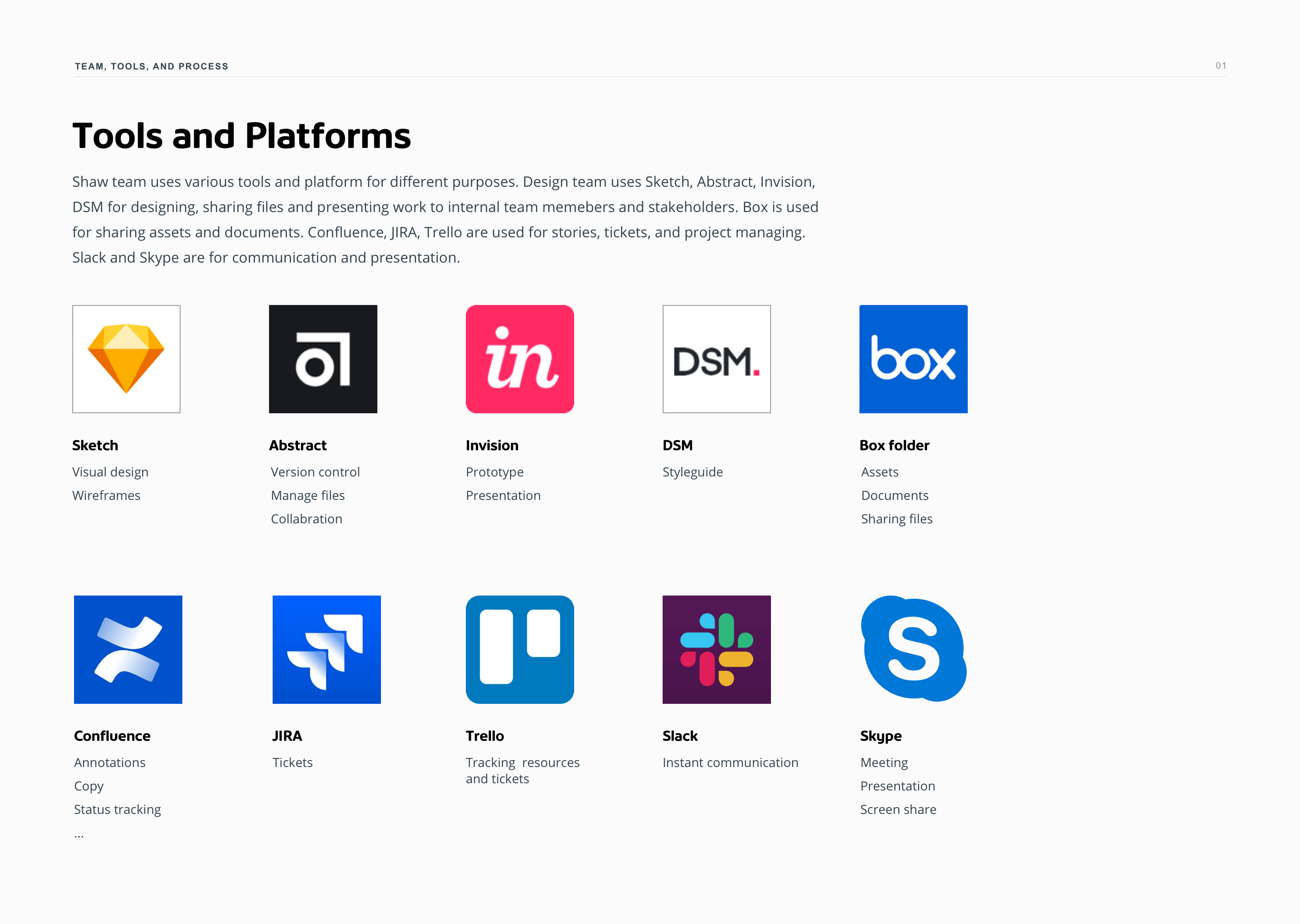
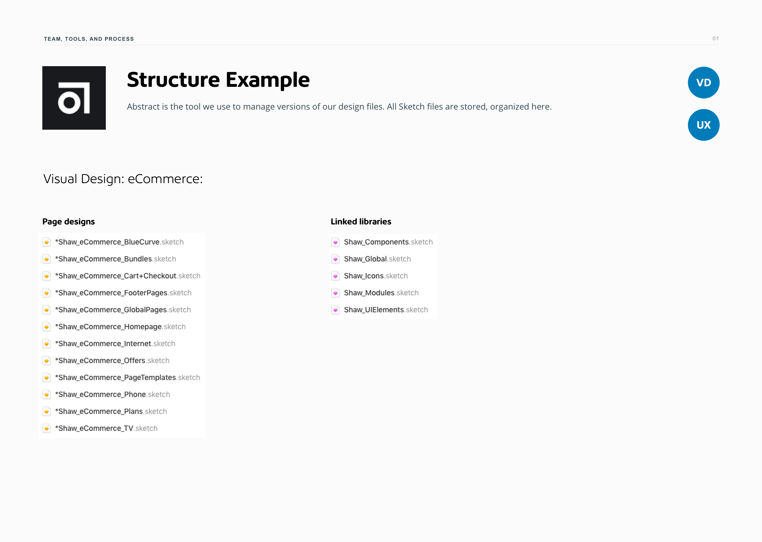
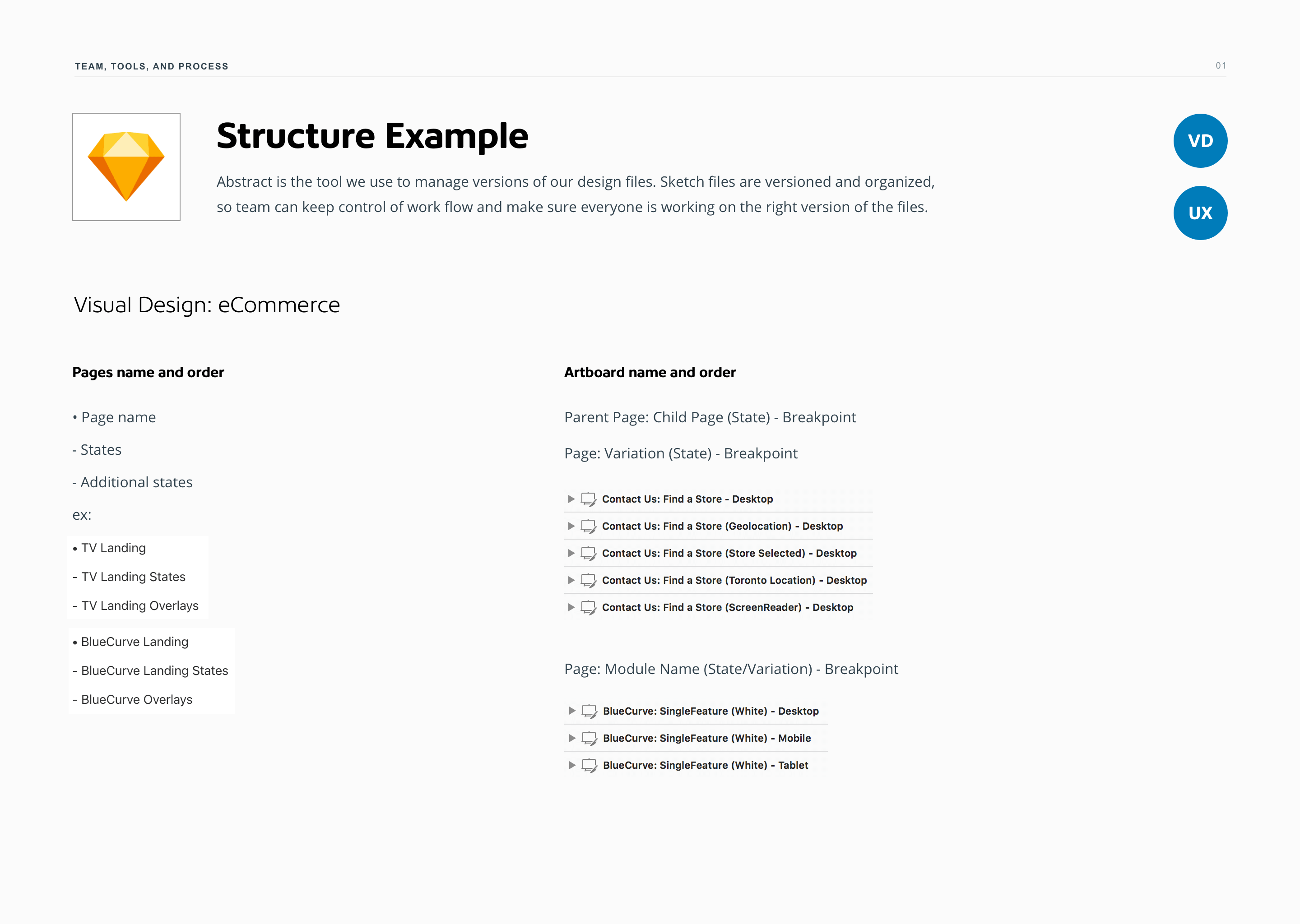
As the product grew, consistency became essential. We developed a responsive design system that made it easier to build, test, and scale across devices.

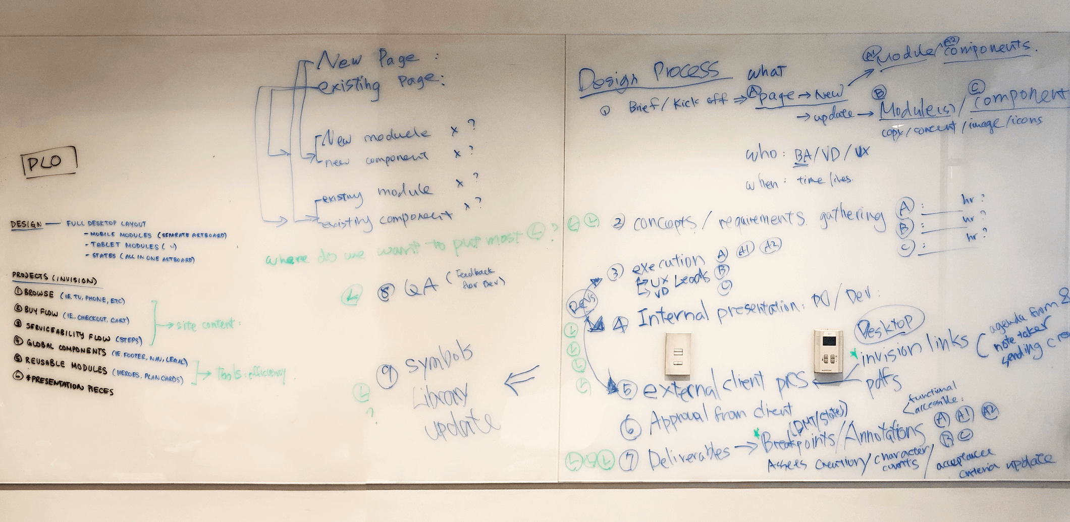
Taming Complexity Through Team Workflow
The growing complexity of the platform demanded a more structured workflow. File management, reviews, and handoffs were becoming inefficient.
I initiated a retrospective with the design team to identify friction points and uncover where we could improve. We mapped out roles, tools, and pain points — then created a living process document to guide how we collaborate. It helped reduce redundancy, clarify ownership, and streamline the way we worked across design and dev.

Key Learnings
Big redesigns don’t always need a big reveal. What truly drove progress was a commitment to continuous iteration, using data and testing to guide each phase of decision-making — from homepage narratives to tiny UI elements like plan cards.
I learned that content strategy and design must go hand in hand to tell a clearer, more compelling product story. And perhaps most importantly, A/B testing doesn’t just validate designs — it earns trust, bringing stakeholders along the journey with real, measurable insight.
Shaping a digital experience at scale meant letting go of perfection in favor of progress — and making space for the product to grow with its users.
© 2025 Iris Wu. All rights reserved.