Shaw.ca e-Commerce Redesign
The new Shaw.ca website was an iterative design exercise informed by data and user testing analysis.
Background
Site Releases & Design Phases
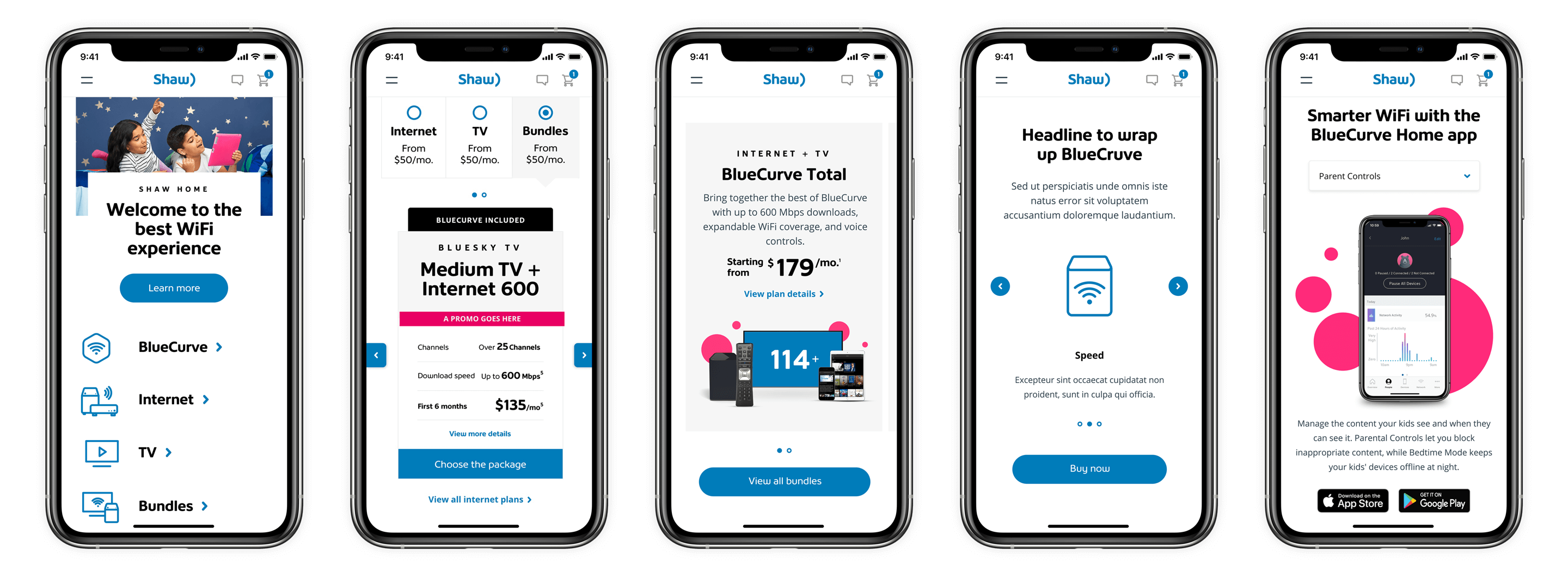
During my time on the Shaw team, we’ve delivered at least 4 releases, including Beta Shaw.ca, New Shaw.ca, Bundle Strategy, and BlueCurve Strategy, which encompassed a full platform release evolution from refreshing the look and feel, improving user experience and narrative, expanding product and service offers, consolidating and elevating overall brand strategy.


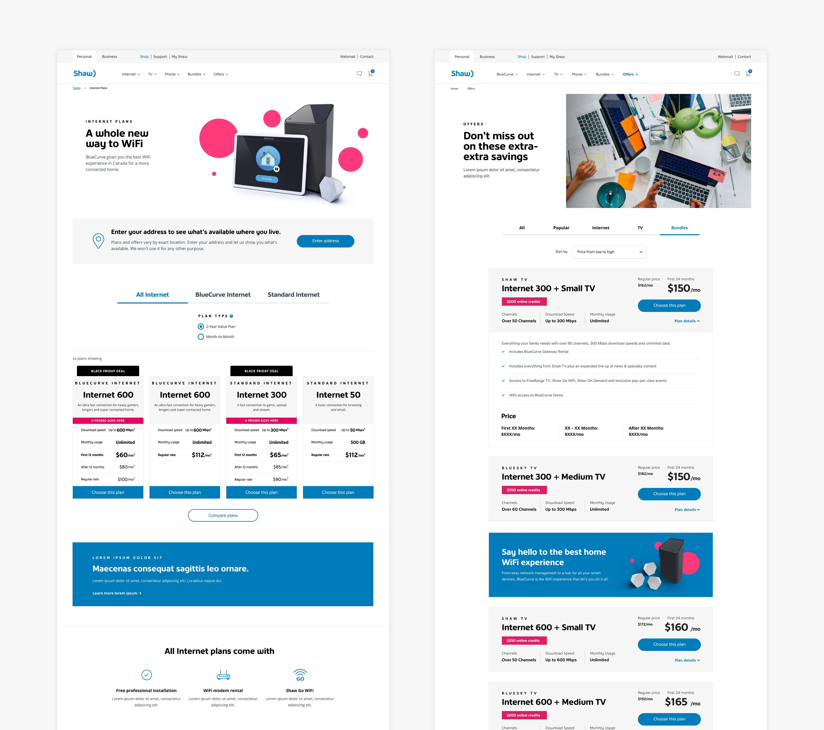
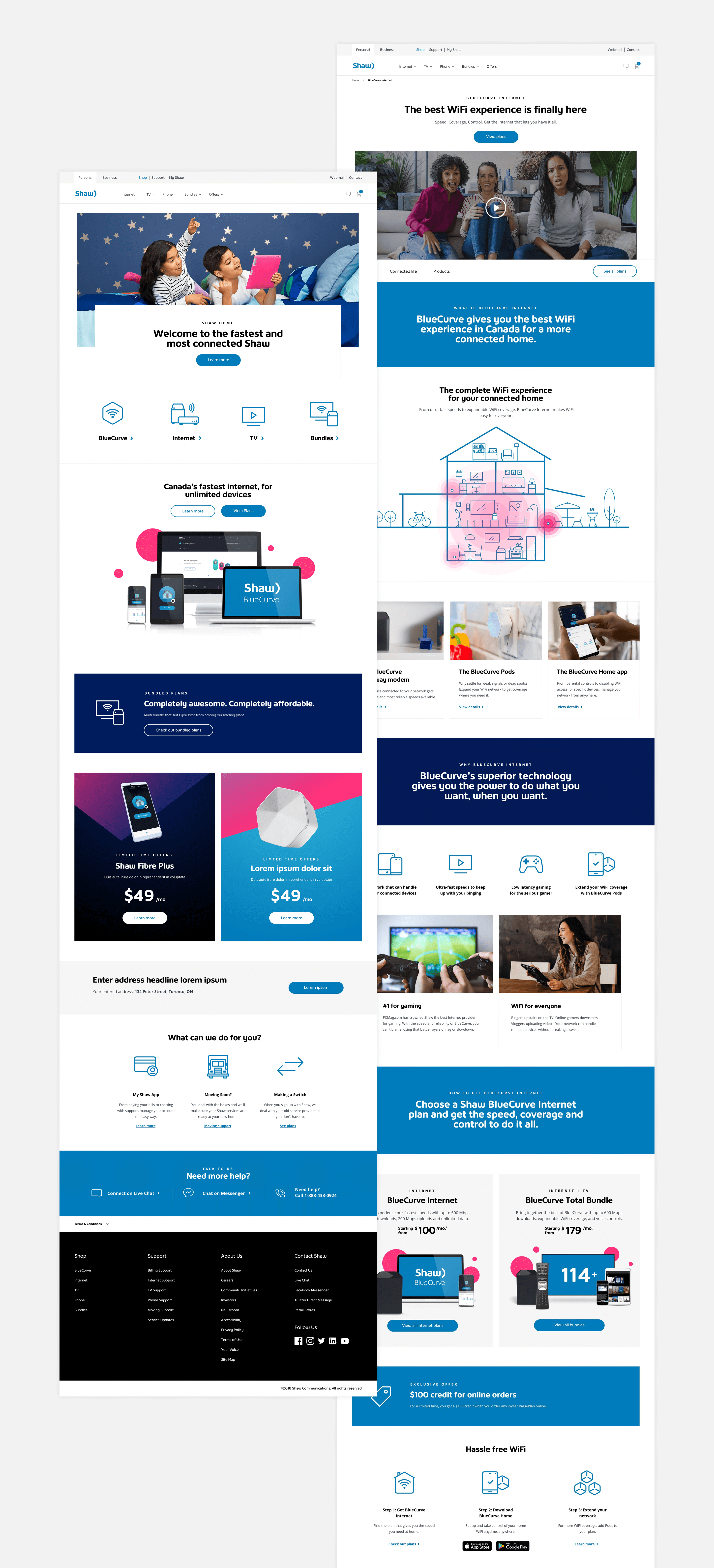
(Above left: Above left: Old Shaw.ca co-existed as we used the Beta Shaw.ca to test performance and gain customer insights. Above right: Beta Shaw.ca focused on selling internet plans and related benefits.)
Beta Shaw.ca represented the concept of a simple product offer (Internet plans only) and a quick add-to-cart experience. This site co-existed with the old Shaw.ca for almost a year. The team used it as an A/B test opportunity to see how the market responded to minimal product offers versus the conventional full product lineup. We gained a lot of insights such as how certain components and page layouts generate more conversion. However, it was challenging to compare its full potential against the old site due to the lack of having a holistic strategy in place.
![]()
![]()
![]()
(Above left: New Shaw.ca launched with a new art direction and the hard push for the BlueCurve bundle concept. Customers and users were often confused about what BlueCurve is.
Above middle: We toned down the BlueCurve bundle perception and started to think more holistically about the entire product offers and its connection with BlueCurve. We worked with the content strategists to tell better stories and product benefits. In return, it successfully increased brand and product awareness and bundle sales by almost 50%.
Above right: Although it was a success in increasing customer's product knowledge and willingness to upgrade to bundles. From the heat map study, we noticed the narrative could be more concise and targeted. We introduced the quick comparison plan cards, tested them on different placements and pages, and we saw an increase in conversion and cart start rate.)
After a year of preparation, research, test and planning, we finally launched the New Shaw.ca with richer product offers using BlueCurve Bundles as the main drive. Since then, the team has been closely monitoring the performance and analyzing its data. All that information enabled us and the stakeholders to learn, generate insight, make better decisions and strategically plan towards the future roadmap.

Quick Tests & Optimization
With one of the main goals being educating and helping customers differentiate products and services, we work with the data analytic team and Optimizely team to understand the respective data and user testing results to helped inform and improve the overall site experience.
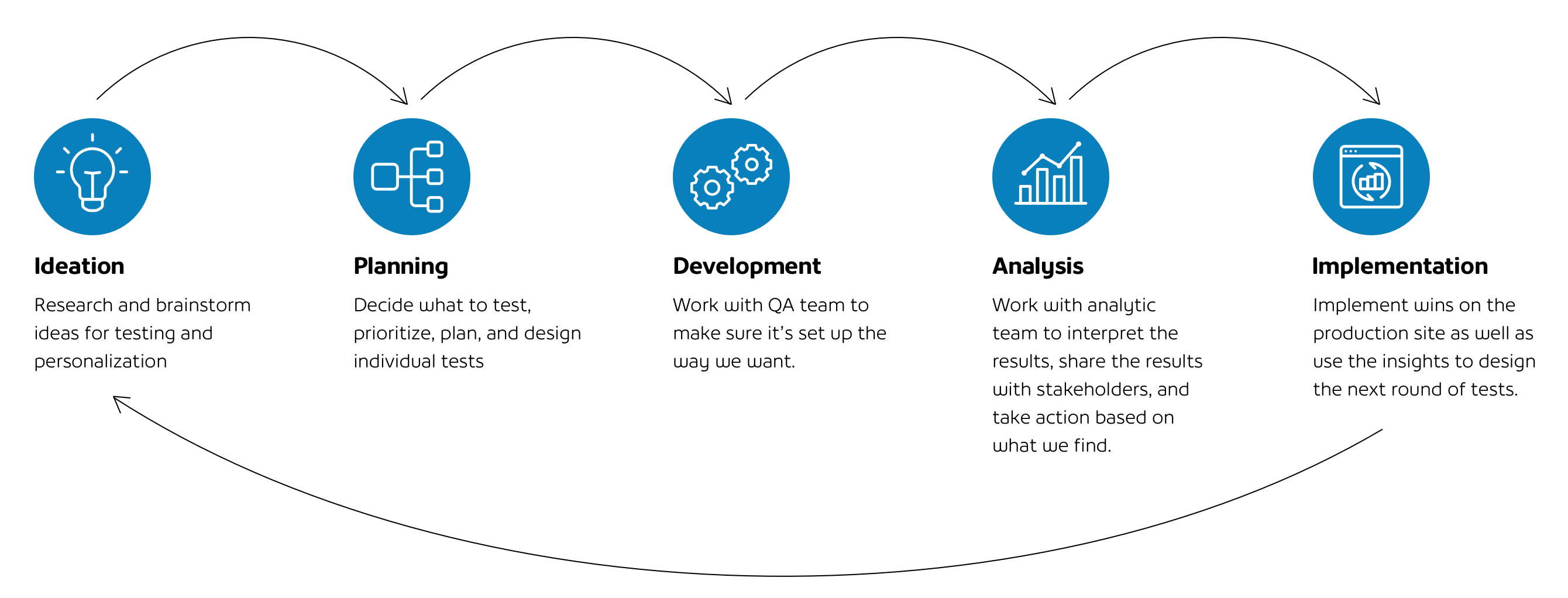
Test Exemple: Plan Card Study
Plan Cards/Pages are some of the hot components and pages to be tested and analyzed during the feature prioritization exercise. They are the key indicators of conversion rate. From 2018–2020, we ran frequent and multiple A/B testings on the old and New Shaw.ca sites. The results allowed us to understand how certain page layouts or Plan Card elements helped increase cart start rate and digital sales.
Vertical vs. Horizontal Plan Cards/ Layouts
Plan cards can be presented in either a horizontal or vertical fashion and both look elegant. We wanted to find out which one can drive a higher cart start rate and orders. From the results, we saw that Vertical Plan Cards overall had better performance in conversion rate, and we assumed that it allowed easy comparison of the different products.
 (Vertical cards performed better than horizontal cards possibly because users can easily compare the information on the cards.)
Plan Card Combinations
After learning that the Vertical Plan Card was the winning option. We then wanted to look at how the Plan Card arrangement has a direct impact on click-through and conversion rate. We used Multivariate Testing to see how descriptions, bullet points, and "View More Detail" CTA perform.
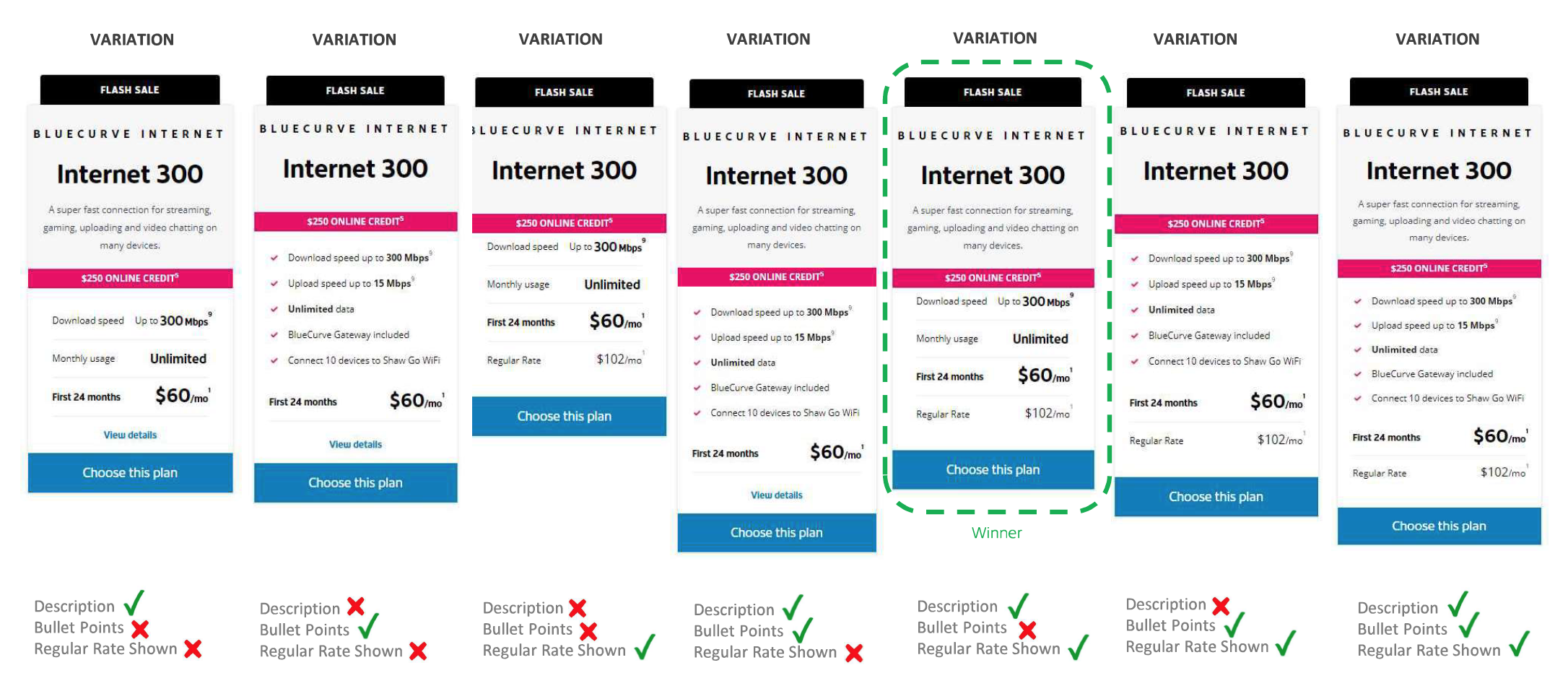 (Winning combination drive +11% increase in cart start, which translates into +500 submitted RGU per month.)
Exploring New Designs
As the site evolved, we did further iteration on the Plan Cards by adding various design elements to test efficacy. Adding icons and brief descriptions significantly increased the RGU conversation rate by +18%. However, the click-through decrease by 7%. It implied the icons and description educated the users leading to a decrease in clicks, but when they did click they were more likely to go ahead with the purchase.

(We did the test on various plan cards including Internet, Bundle and TV plans.)
Outcome
July 2019 Release: New Shaw.ca
For the first week post-launch, the new site achieved 26% of the monthly Internet Posted Sales target.
Oct 2019 Release: BlueCurve Total (Bundle)
For the first 2 weeks post-launch, the distribution of
Bundle RGU orders has increased by +52% of total
RGU orders. Pages per visit have increased
+35% vs benchmark.
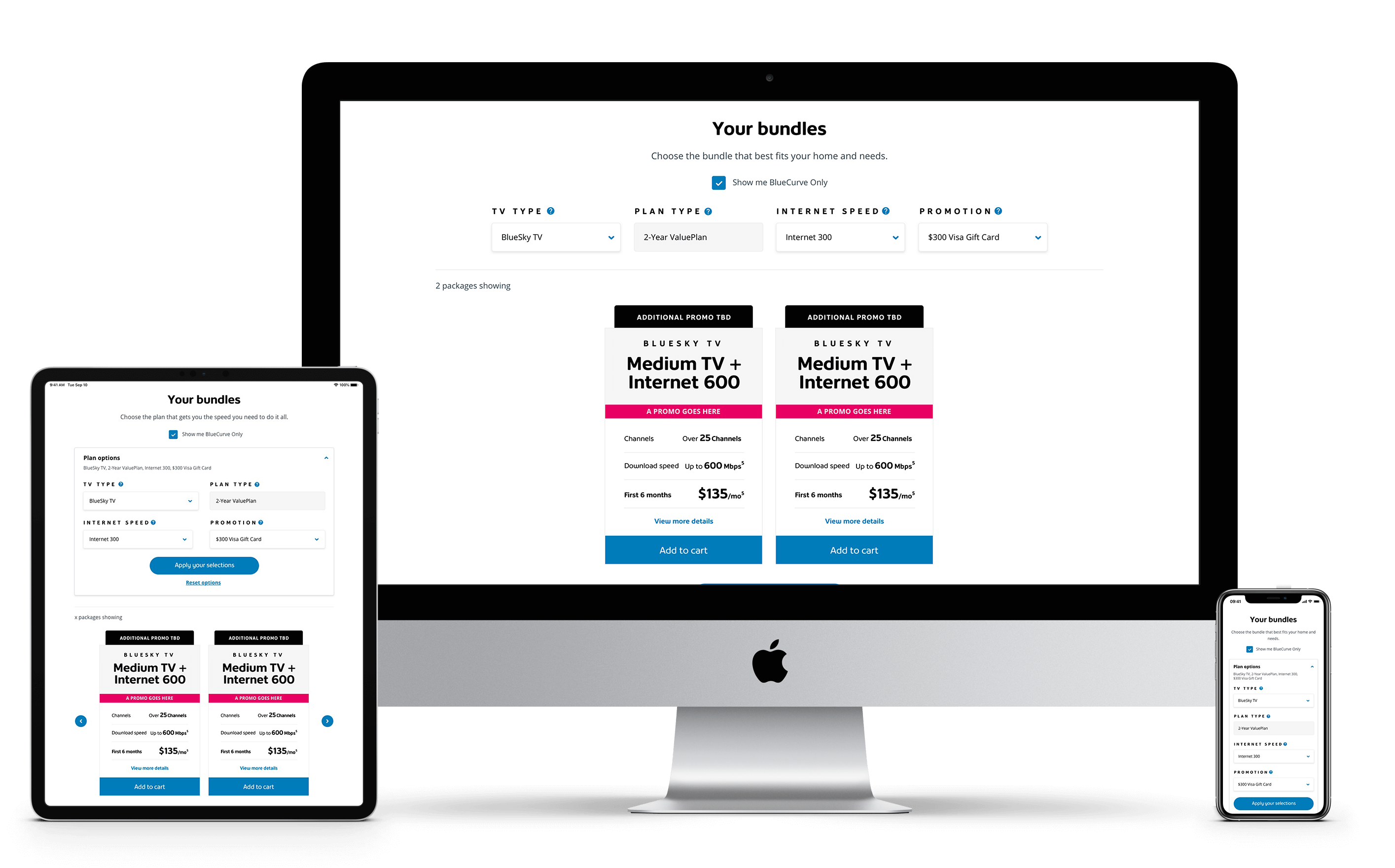
Scalabe & Responsive
The new Shaw.ca renders well on a variety of devices and window. All the components and modules are fluid and adapts to the size of the screen.
The design output of the new Shaw.ca is backed by a flexible design system that focuses on providing a mobile-friendly, responsive, personalized and accessible user experience.
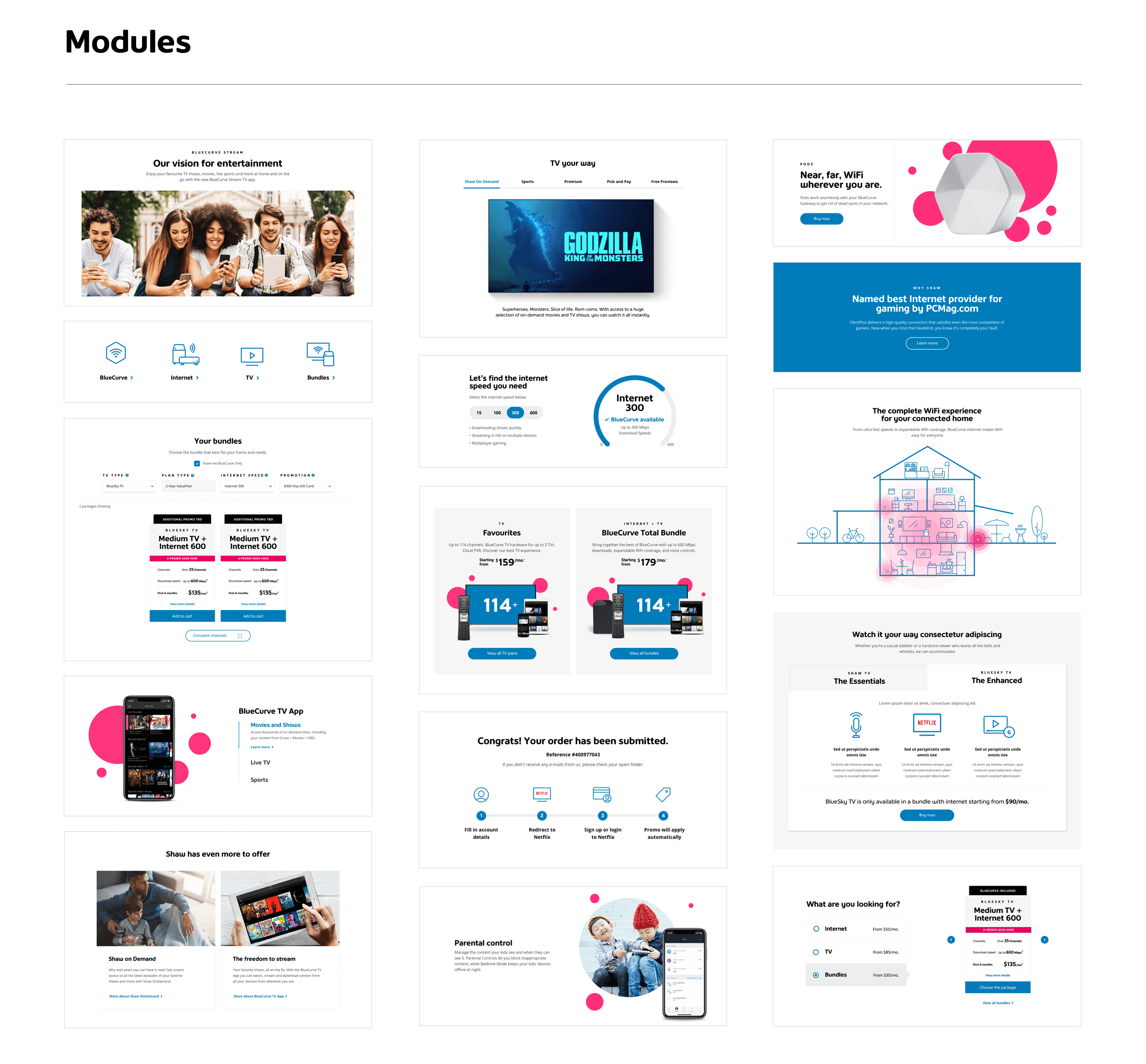
Design System
To ensure the new look and feel properly applies to the digital space in a beautiful and meaningful way, we did multiple rounds of visual exploration, creating numerous new design components and modules. Eventually, we’ve upgraded the design system to be flexible, rich and comprehensive.

Design Management
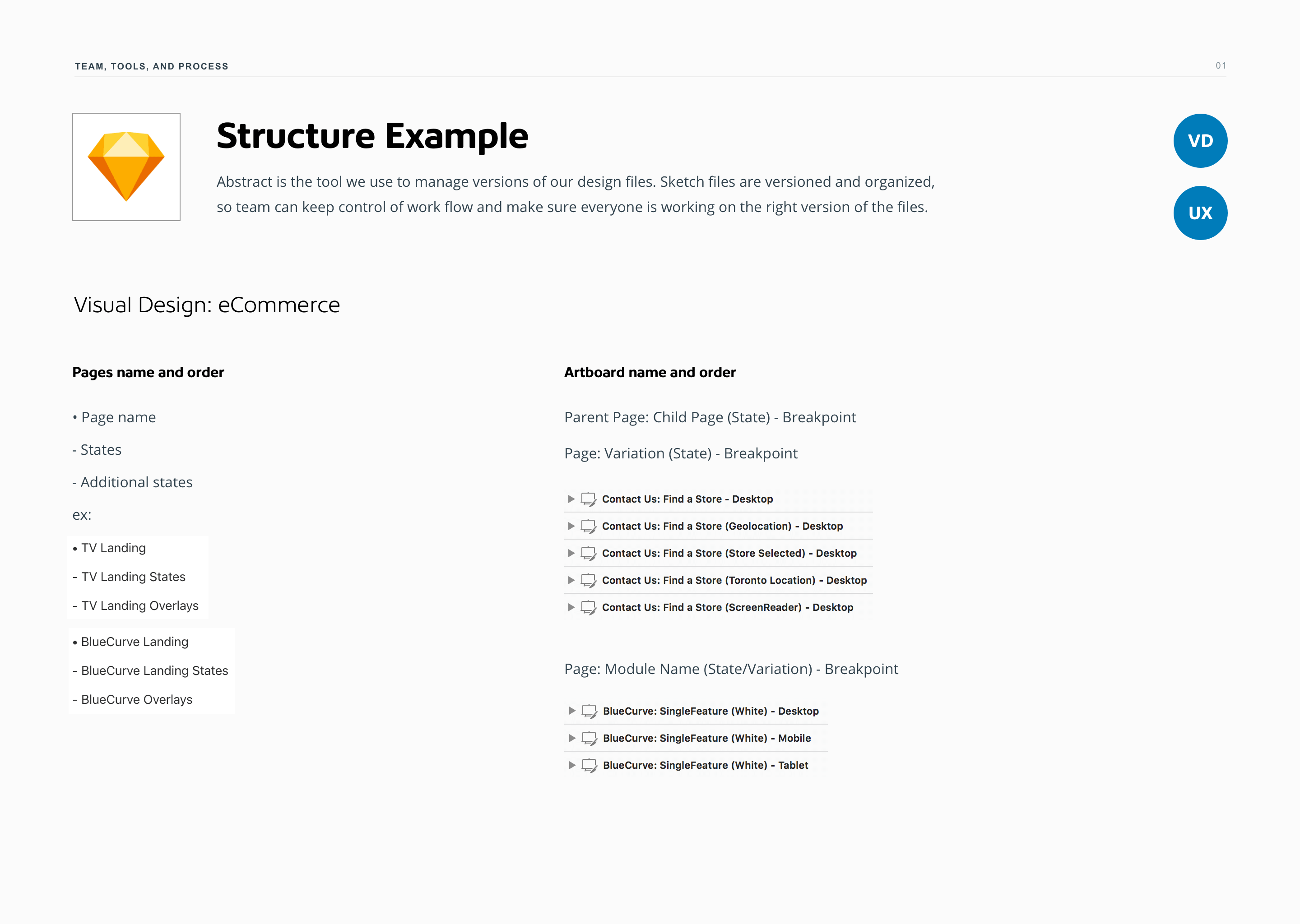
Establishing a meaningful design process is a crucial part of the design management for this project. As the business expanded, the project also became more complex. The design process then needs to change to be more adaptable and flexible to encompass future growth and complication.
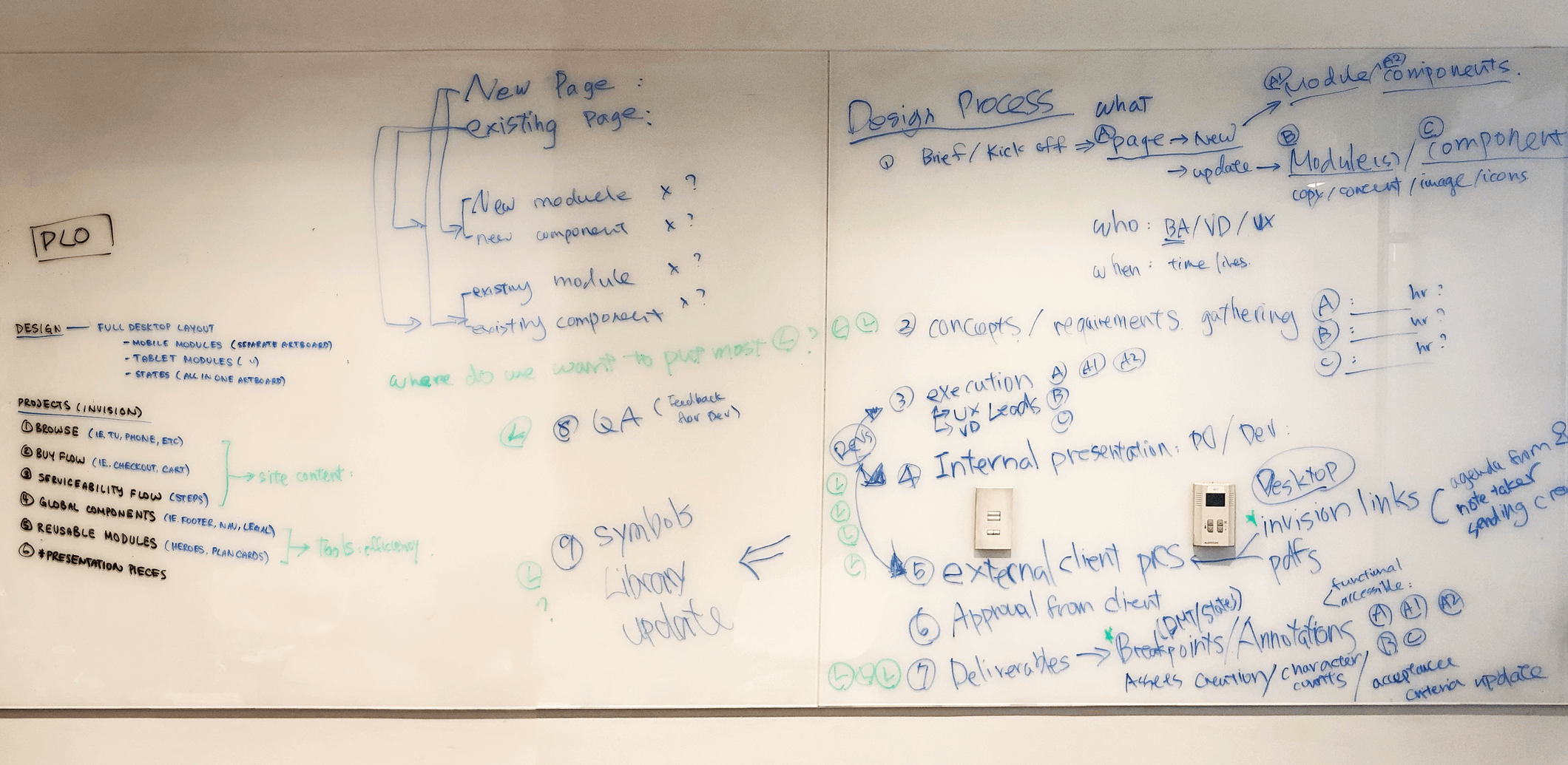
I got the team together to share their experiences, discuss each step of the process, and documented our findings. We found that the process in place was too limiting and rigid. There were gaps and grey areas which cause unnecessary redundancy and confusion. Some tasks that can be streamlined were too intricate, causing the roles that can be more powerful to spend too much energy caused by distraction.

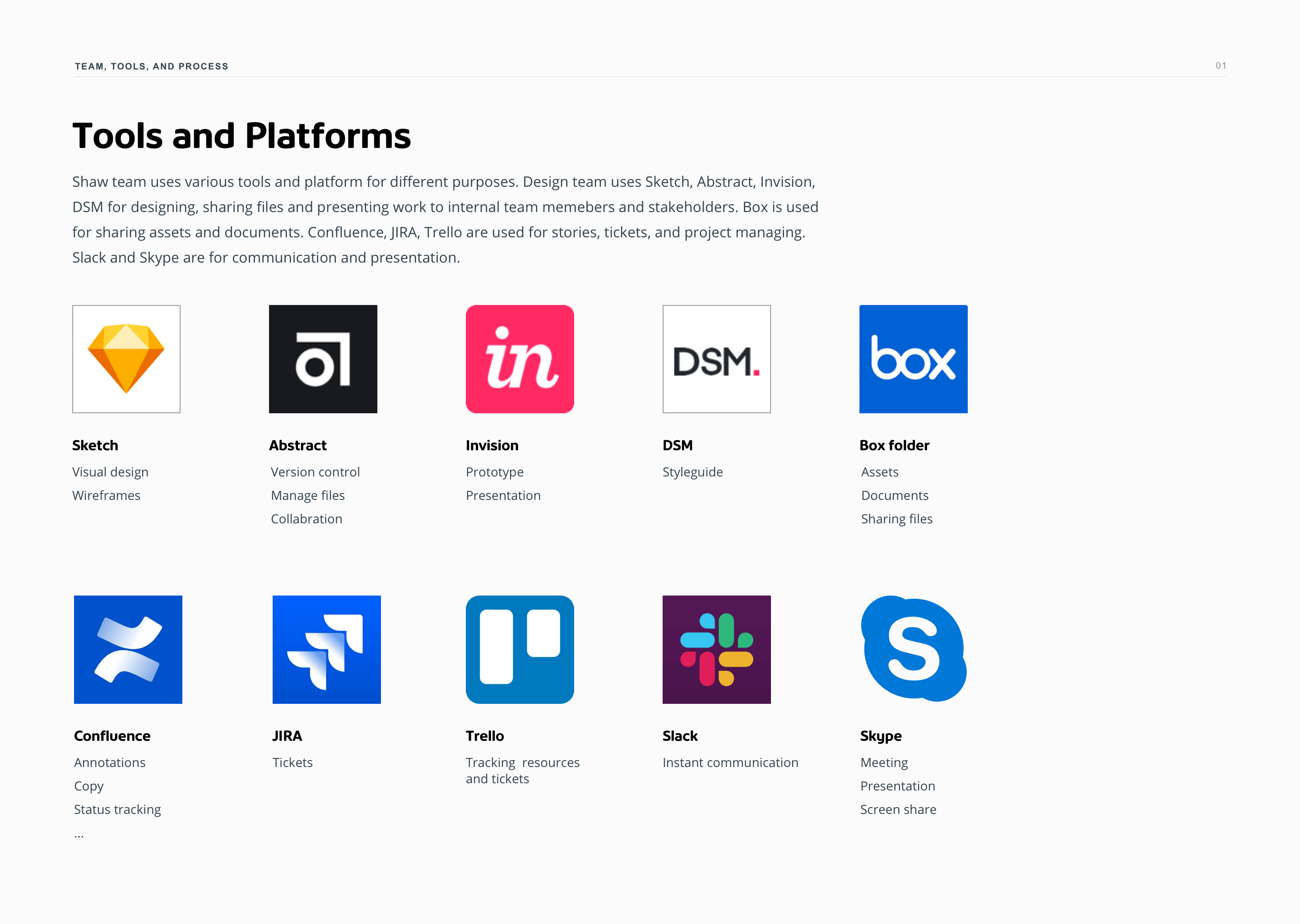
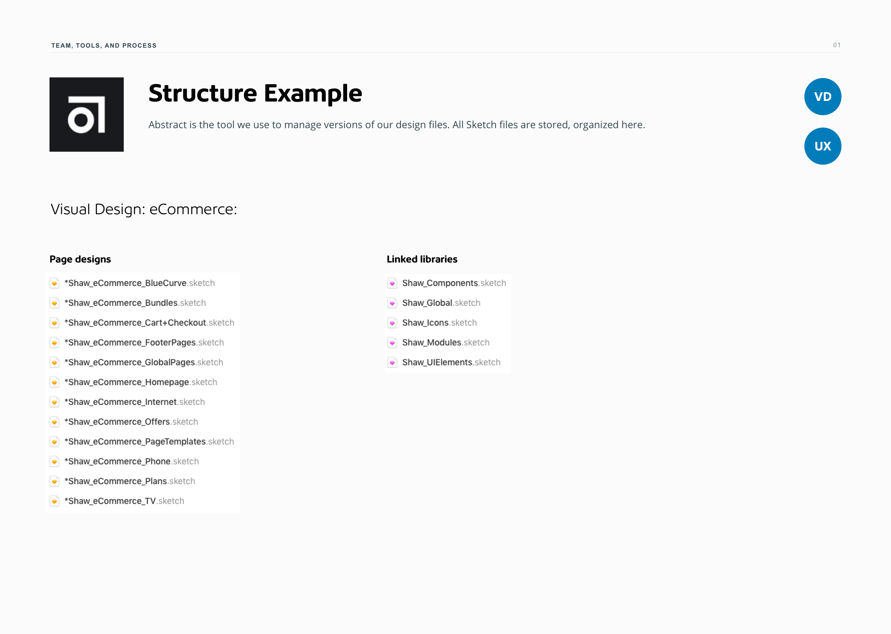
To help guide team members to maximize their capabilities and minimize overlapping resources, a design process document was created and continuously updated. It outlines three key things: the team, the tools, and the process — and what they mean to each other. It provides both an overview as well as detailed context to our evolving project and team structure.
Role: UX/UI Design, Design Management
–
Creative Leads: Karen Hawkins, Marcelo Mariano Dias
Experience Designers: Kimberly Wright, Natasha Johnson, Cheryl Wong, Iris Wu
Agency: Publicis Sapient
Client: Shaw Communications
Year: 2018—2020
Acura.ca – a digitalized luxury selling experience


Overall Objectives
A new responsive automotive website created to deliver inspiring content and premium product positioning. Compelling visuals are used throughout the site to reinforce the brand spirit and elevate its emotional engagement and appeal.
Quick Glance of the New Design
Demonstrating the new homepage and model pages in 120 sec.
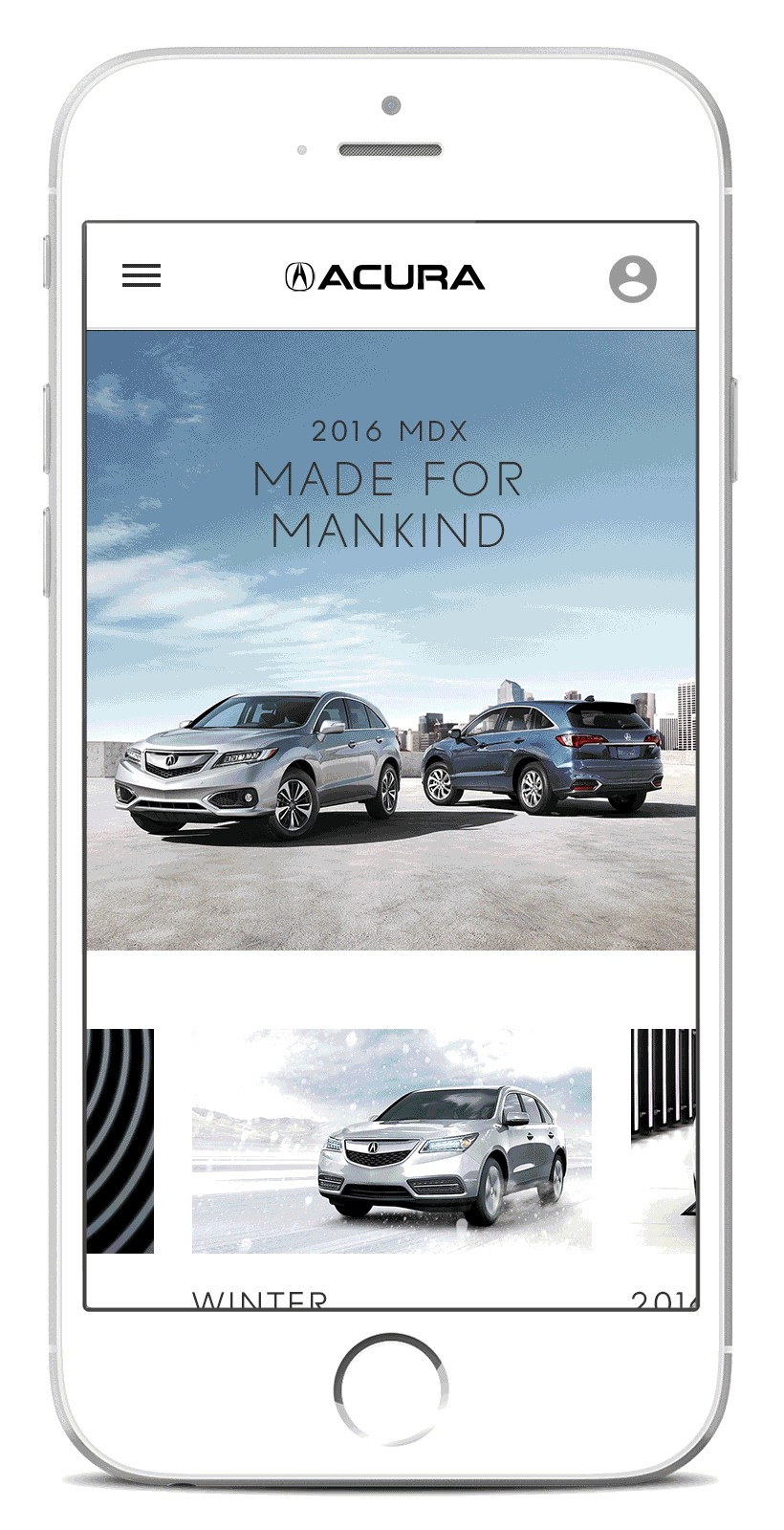
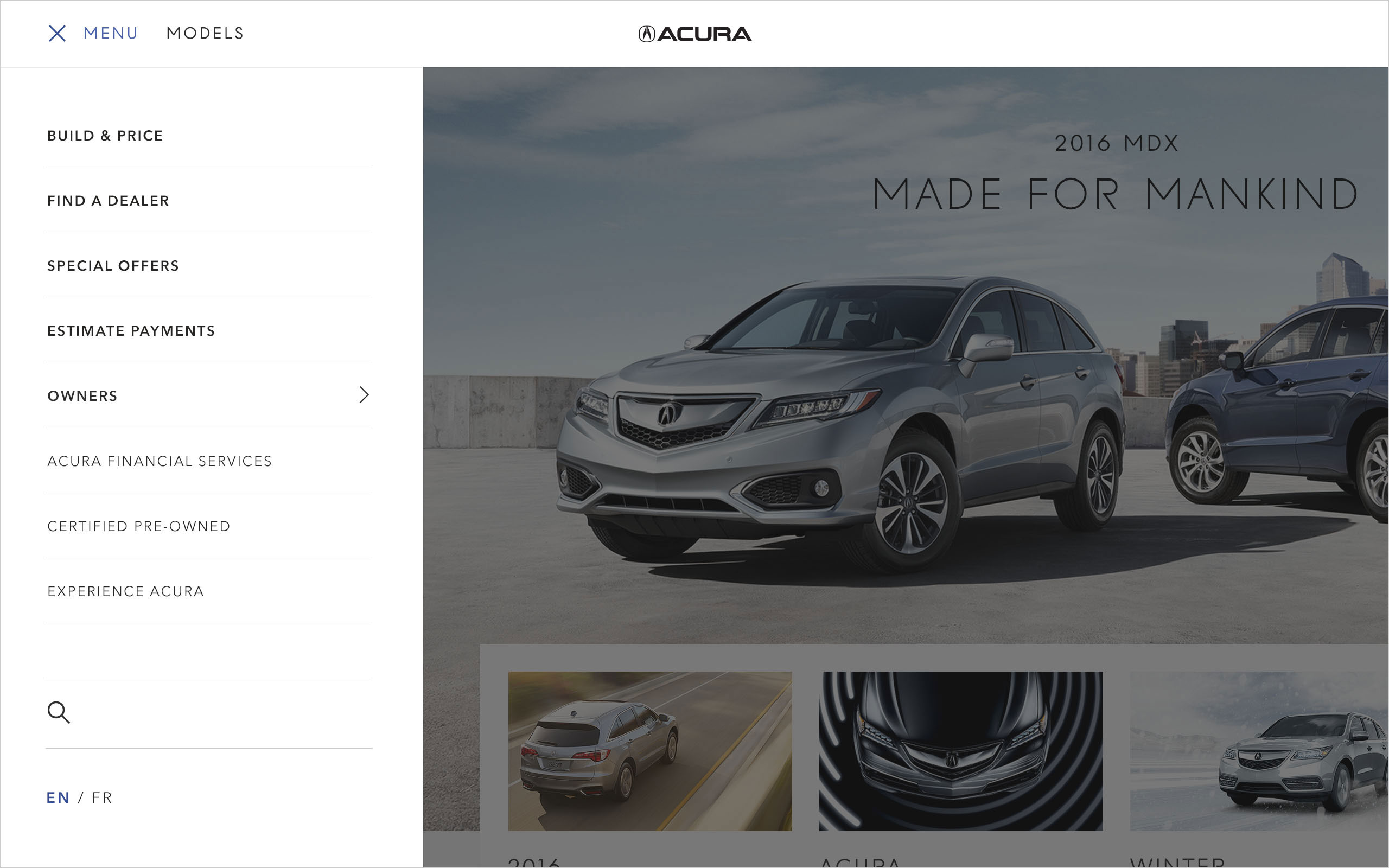
The Radically Simplified Homepage
The new homepage leverages elegant design and large images to emphasize the thrill of driving and the spirited harmony between man and machine. All touts can display distinct and useful content to different users based on their site activities.

Planning and optimizing the page flow is an important part of the process before jumping into the visual design stage. To ensure the same visual impact of the desktop experience is brought to the mobile environment, the team and I created the wireframes to explore possible ways of user interaction.

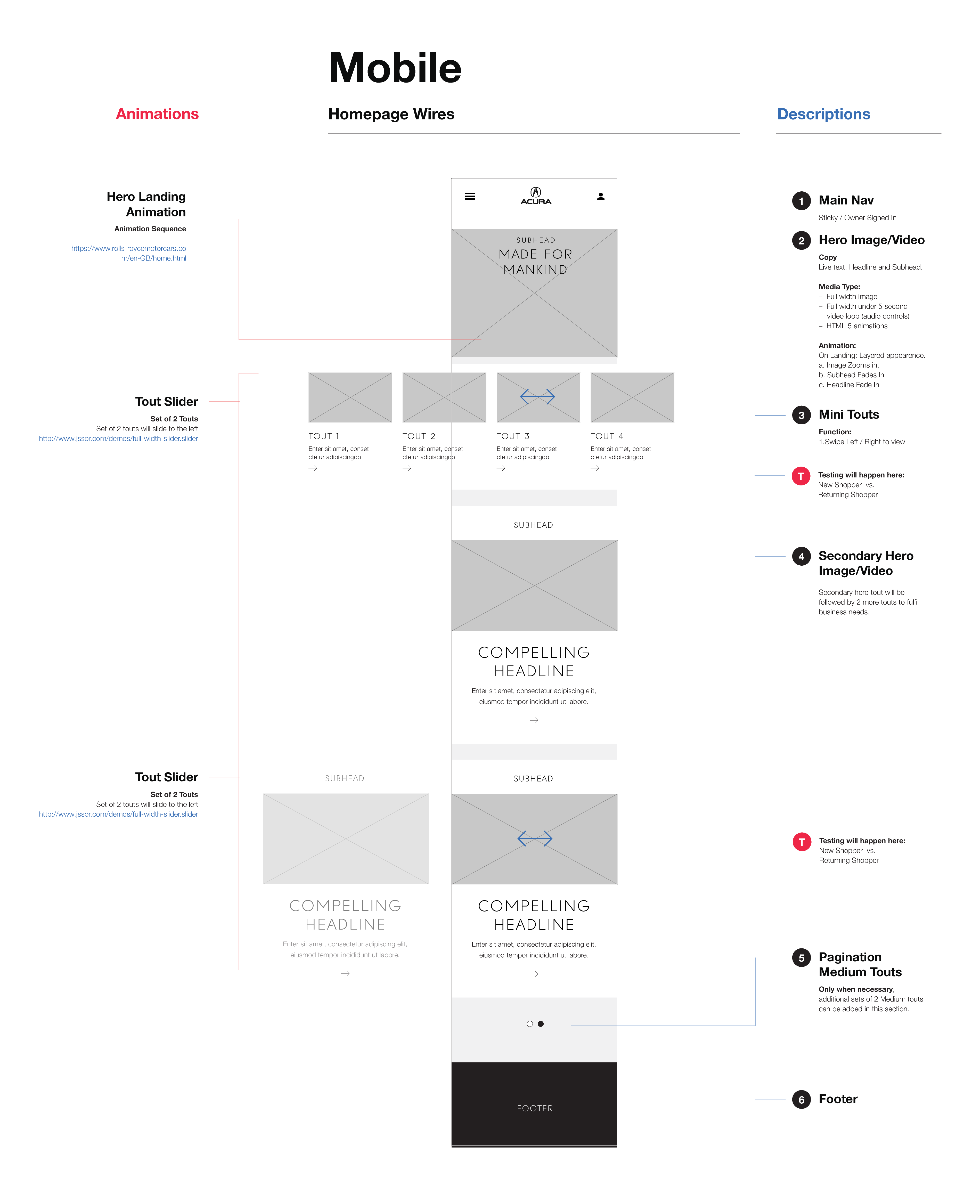
Site assessment enabled us to prioritize Acura services and products and organize the navigation items. We created a large side drawer menu to allow for generous size and spacing.
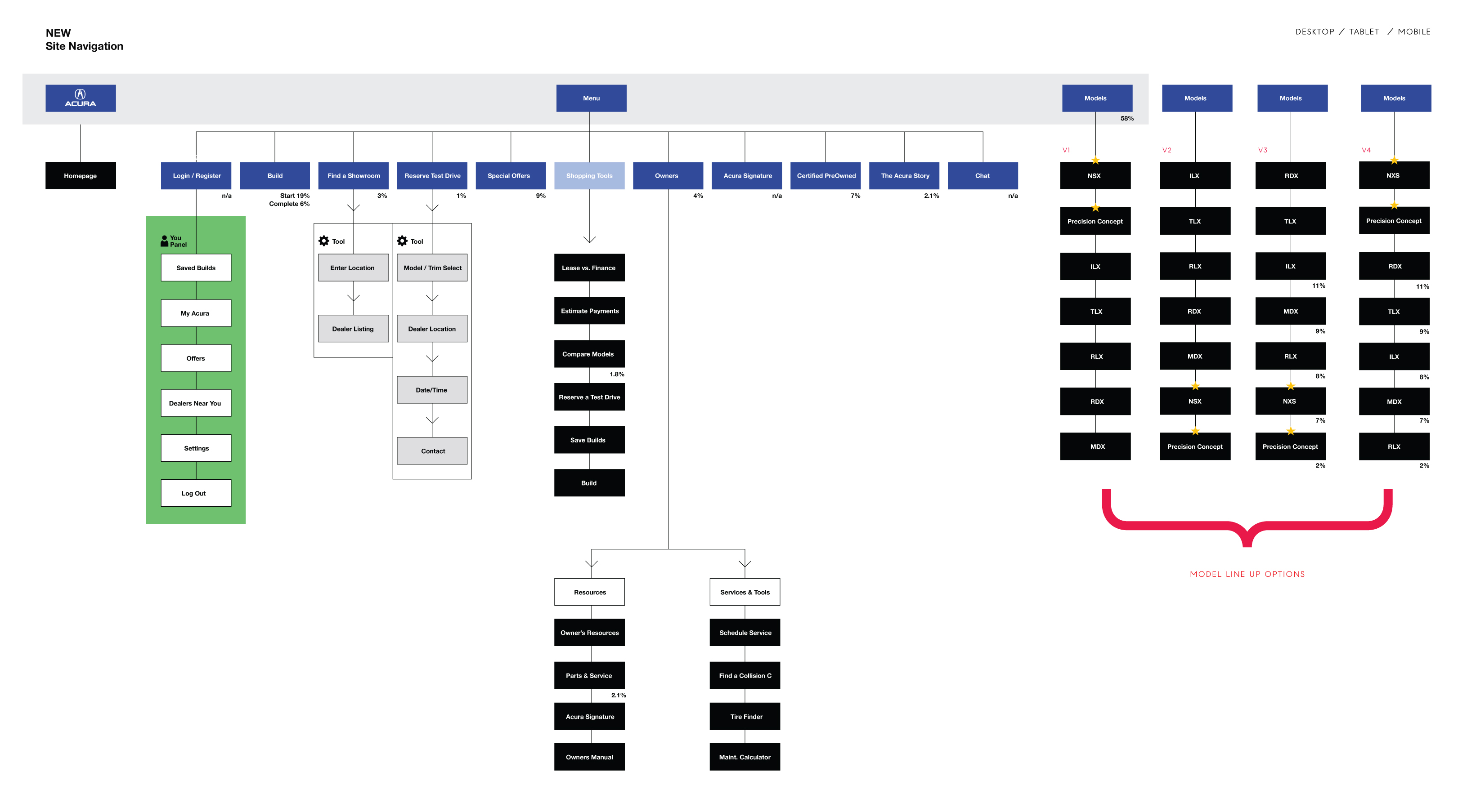
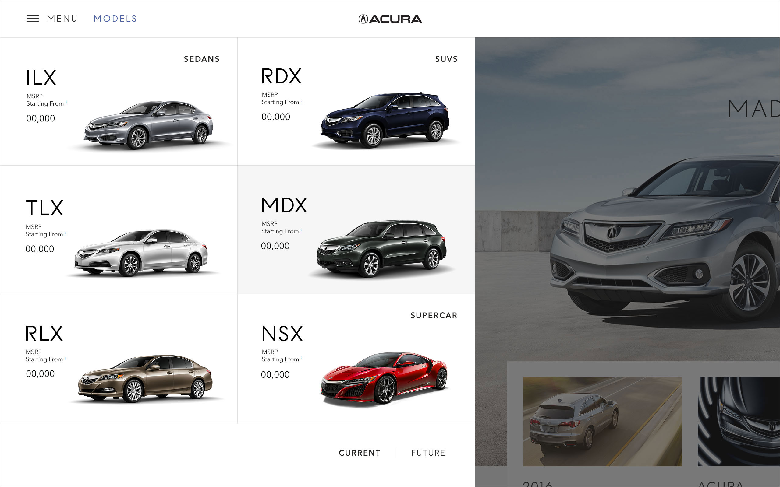
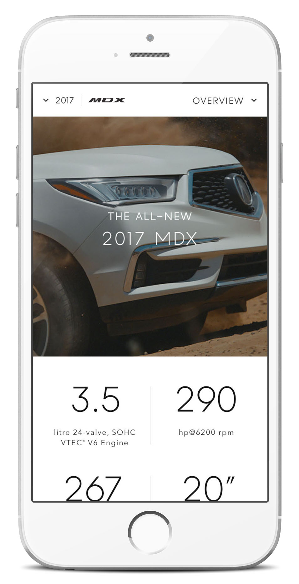
The Modular Model Pages
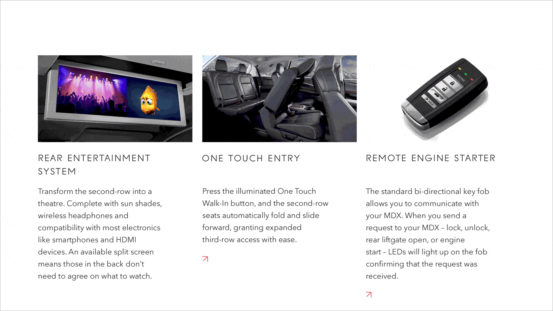
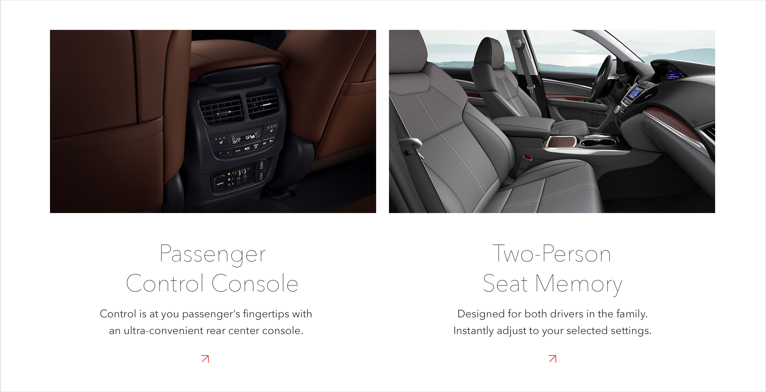
The model pages consist of 6 sections. The 2 key sections are the Overview and the Features pages, which are designed in a highly versatile and flexible modular structure. To distinguish each model’s personality, the pages are comprised of interchangeable module components that can vary in order for each model.

Various modules are created to encompass different model highlights and to encourage users to discover performance and luxury features. The interactive modules showcase various modes or types of features.


Certain modules allow users to view details in the overlay or in the drawer which provides richer content to the model and supports the brand’s position in the market.


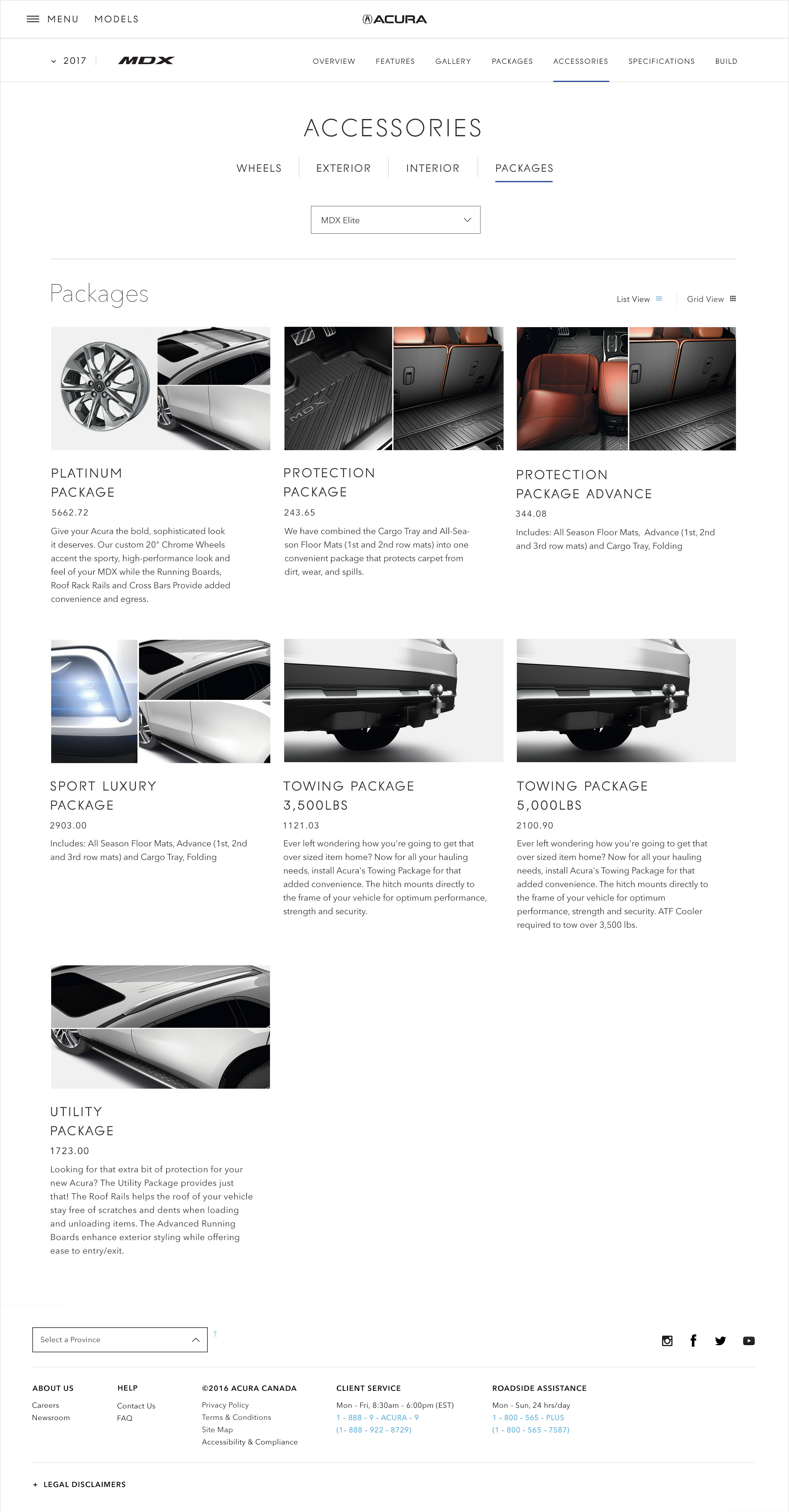
Gallery, Packages, Accessories and Specifications pages are non-modular, yet can be easily updated and maintained.


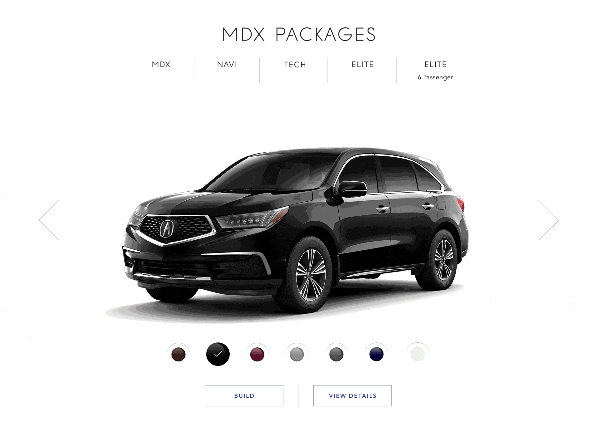
Build and Price
Lead generation and conversion is the main objective of this tool. Our goal is to provide a compelling and intuitive user experience with a clear path for the target audience to understand, to test drive, and to purchase.
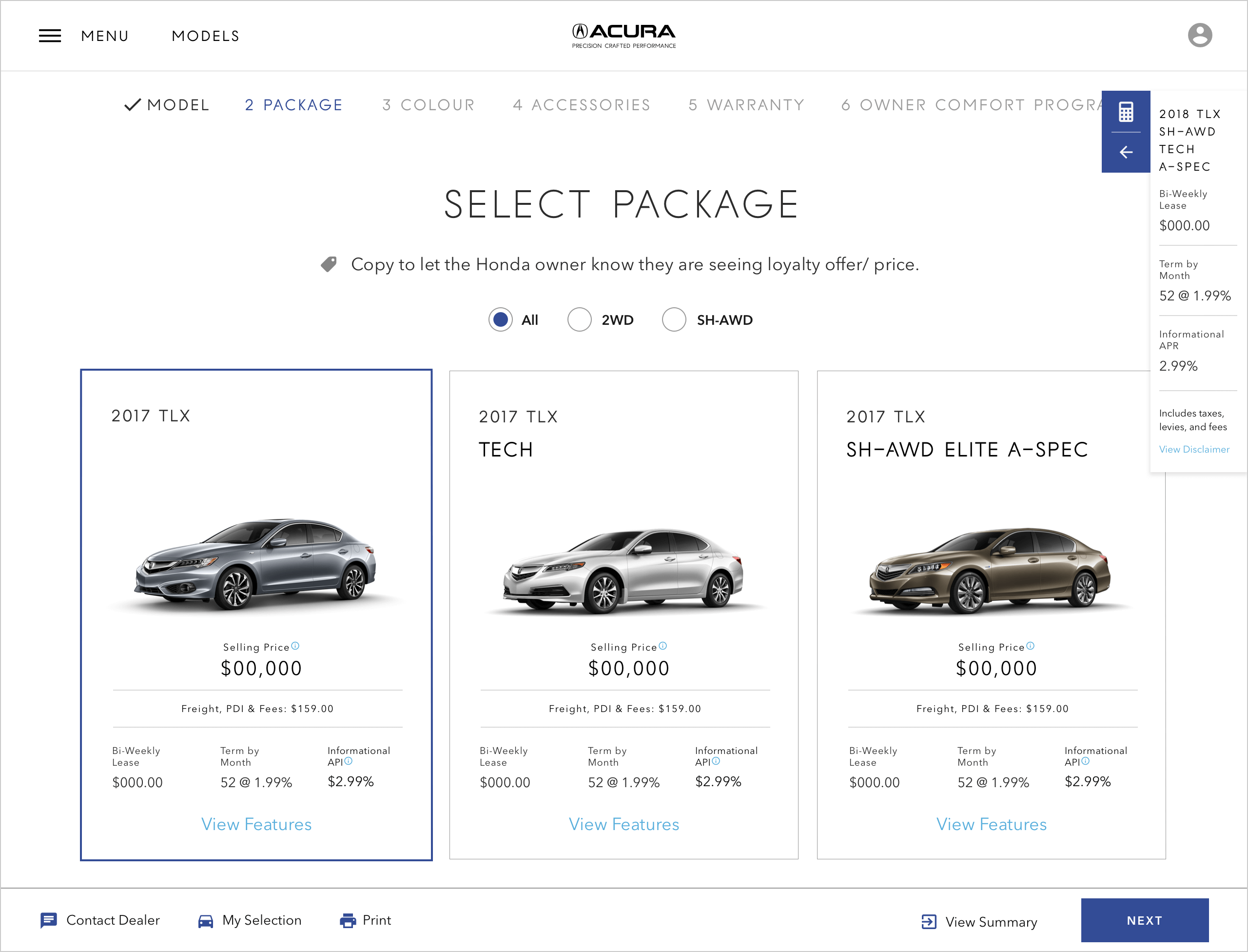
We wanted this tool to help reduce research time for customers, empower them to self discovery, and less hand holding required by the dealers. In order to incorporate the data properly – we worked closely with the back-end developers, the product owners, and the UX researchers to facilitate both functional and business requirements.


Find a Showroom
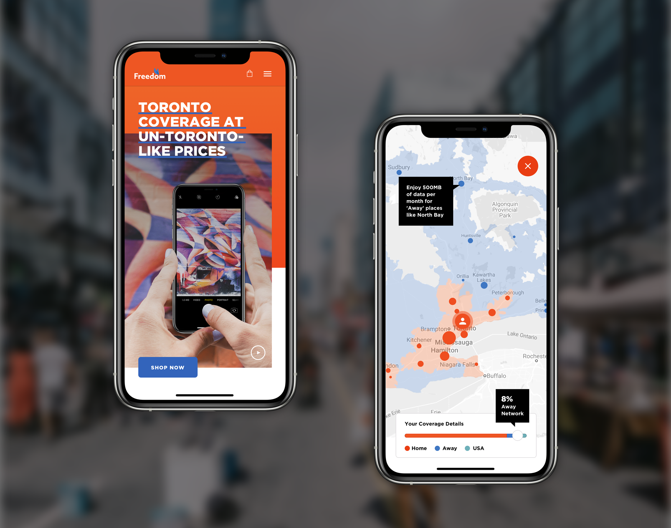
Find a Showroom a.k.a. Dealer Locator is a key section that connects the digital experience with the physical transaction and conversion. With the idea that the majority of the users are using this tool on the go – we tackled this tool with a mobile-first approach.


To ensure the dealer locator supports the conversion and help to lead the potential customers to the physical dealerships, we created the user flows and see how this tool connects with all the necessary dots and pages.

Knowing that Google Map is one of the most popular mapping apps, we decided to incorporate the Google Map functionality to create a frictionless and familiar searching experience for the users. We established a List vs. Map View filtering option for easy navigation of the search results.


For the desktop dealerships search results, we leveraged a similar experience from Google Maps. We kept the interactive map easy to navigate and had the listing portion easy to browse by distance.

On the showroom details pages, we included information that adds value – such as a showroom photo that helps users visualize the surroundings, the contact information, the associated collision centre partners, and the key CTAs that drive users to connect with the point-of-sale.

Styleguide Extracts
Acura’s UI simplifies the design to let the vehicle images become the hero of the site. Every element across the site was made to follow these guidelines.

Role: Art Direction, UX/UI
–
Creative Director: Colin Craig
Designers: Nancy Ng, Yuko Brown, Iris Wu
Studio Designers: Jason Pearl, Teegan Skals
Agency: Grip Limited
Client: Acura Canada
Year: 2015—2018
RBC Youth Hub
Background and Objective
As one of the largest bank and most respected corporation in Canada, RBC wants to ensure their commitments and support to the youth community get utilized and recognized by their existing and potential young customers.
Challenges and Oppurtunities
Our client had rich and in-depth resources to support this online community site. However, there were business stakeholders who had different expectations towards this website. Some focused on product KPI, and some cared for long-term customer engagement. The Experience team's challenges were to find the balance between meeting the business objectives vs. the consumers' needs. In the meantime, there were also opportunities for the design to shape the user experience and journey.
Process
Defining User Experience
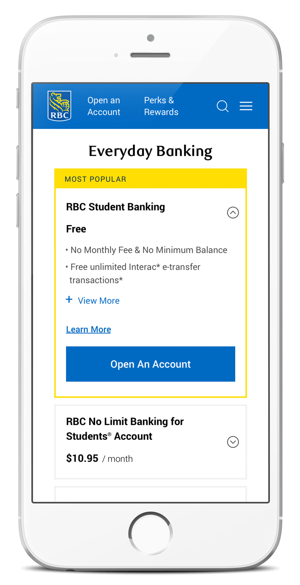
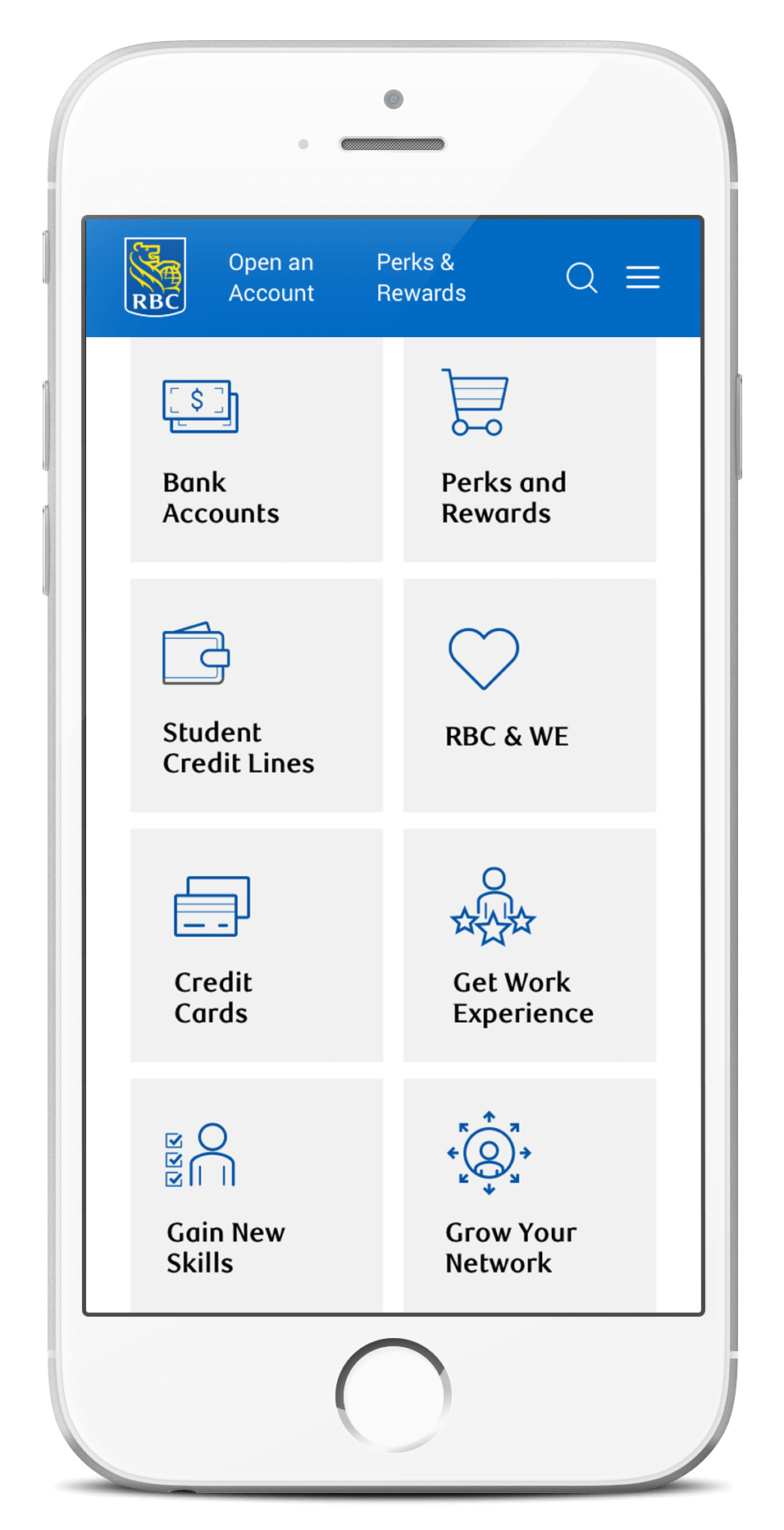
The purpose of this Youth Hub is to consolidate all the youth-related reward programs, resources, and banking products throughout the current site in this one new destination. Based on the predetermined sitemap, our main UX challenge is to create a platform that is easy to navigate and connect all content and tools in a meaningful way.

Homepage and AB Testing
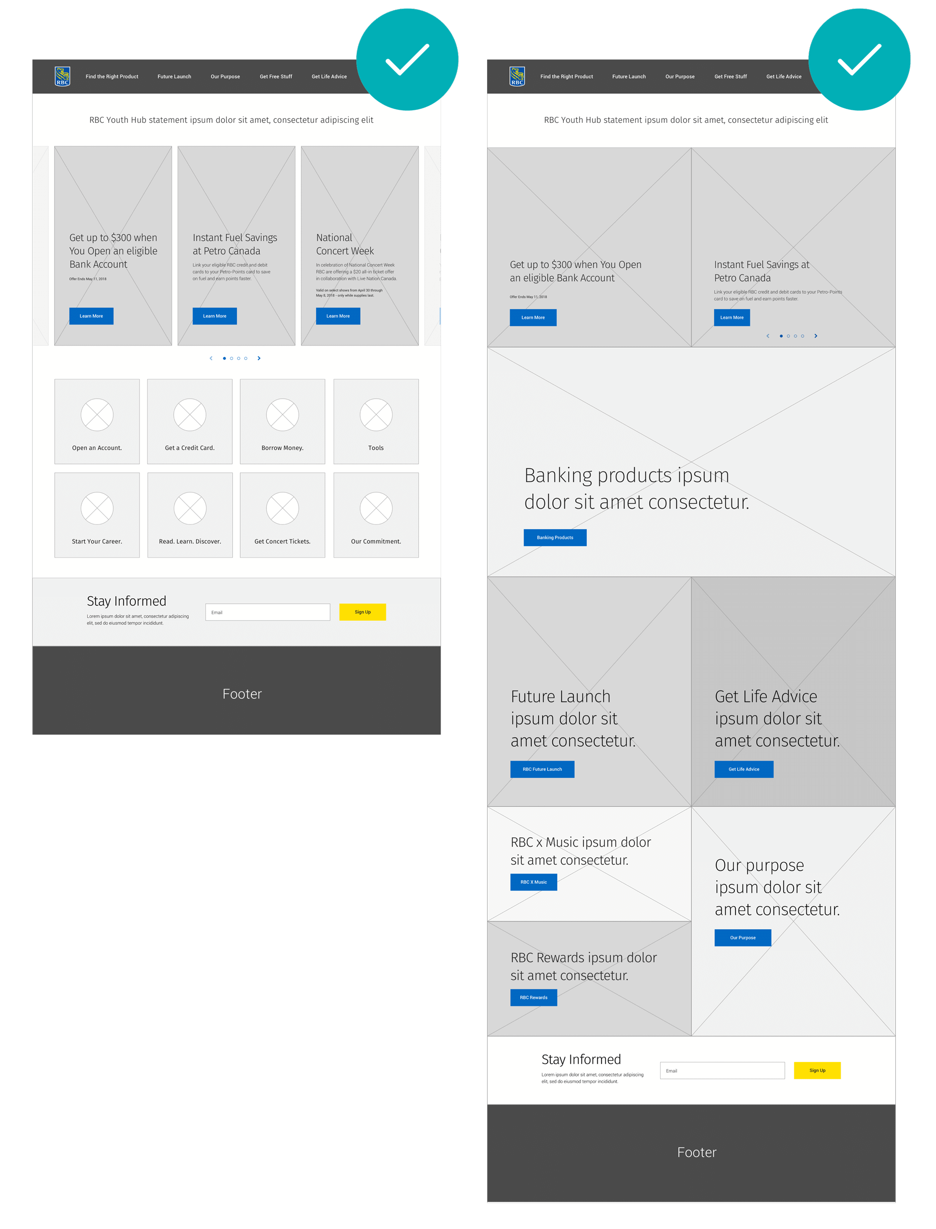
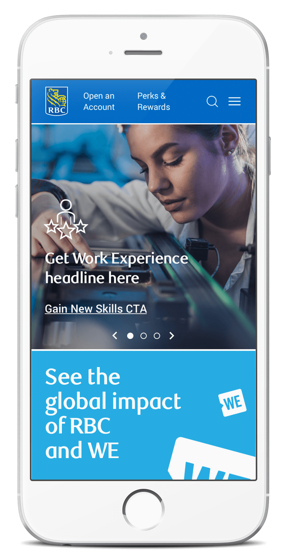
With the idea of surfacing the most interesting and helpful content to the users, we explored many different ways of prioritizing and presenting information – functional, utilitarian or organic layouts.

In the end, we landed on two approaches: the straightforward navigational option where users can get to the info as soon as they land on the page; the exploratory option that allows users to get a sense of the overall site purpose before diving into the details. Both options will be built out and put into the market for AB testing.
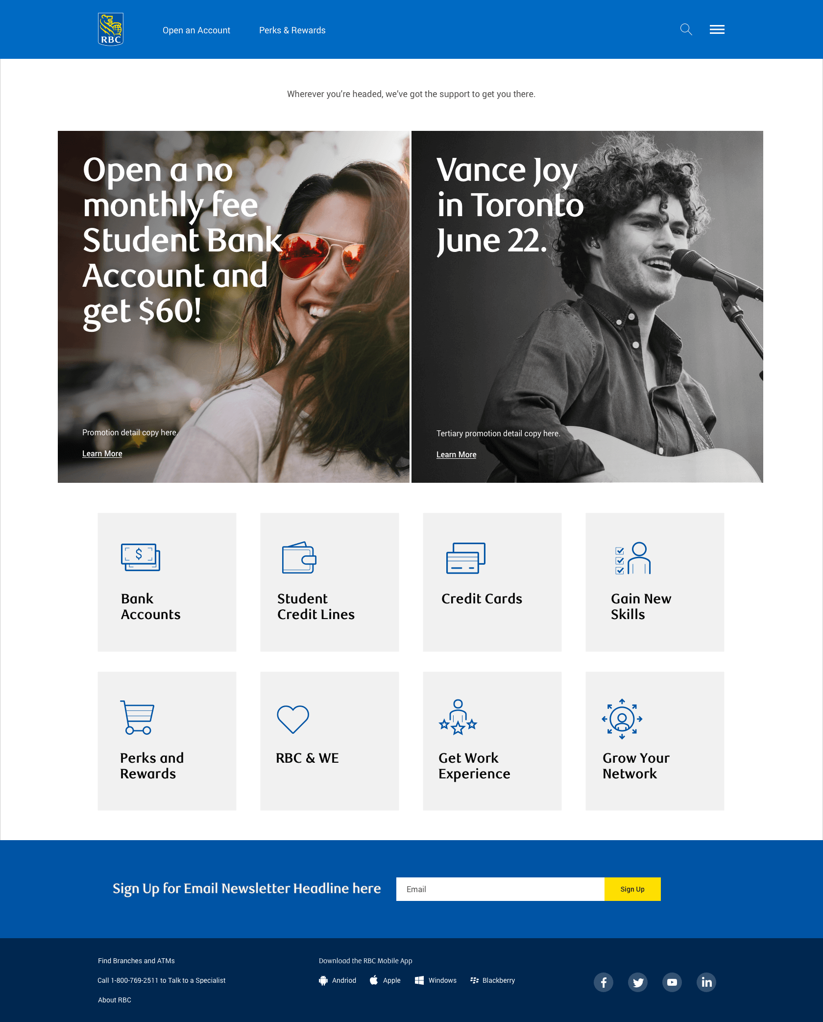
Mobile Product Cards Exploration
As the most important and complex section of this hub, we took a mobile-first approach and experimented with various ways of displaying product information. Our goal was to create a frictionless experience for users to compare and choose between multiple products.

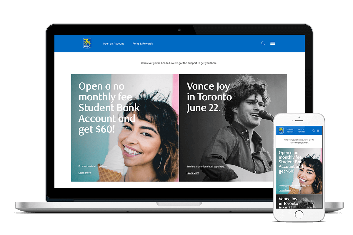
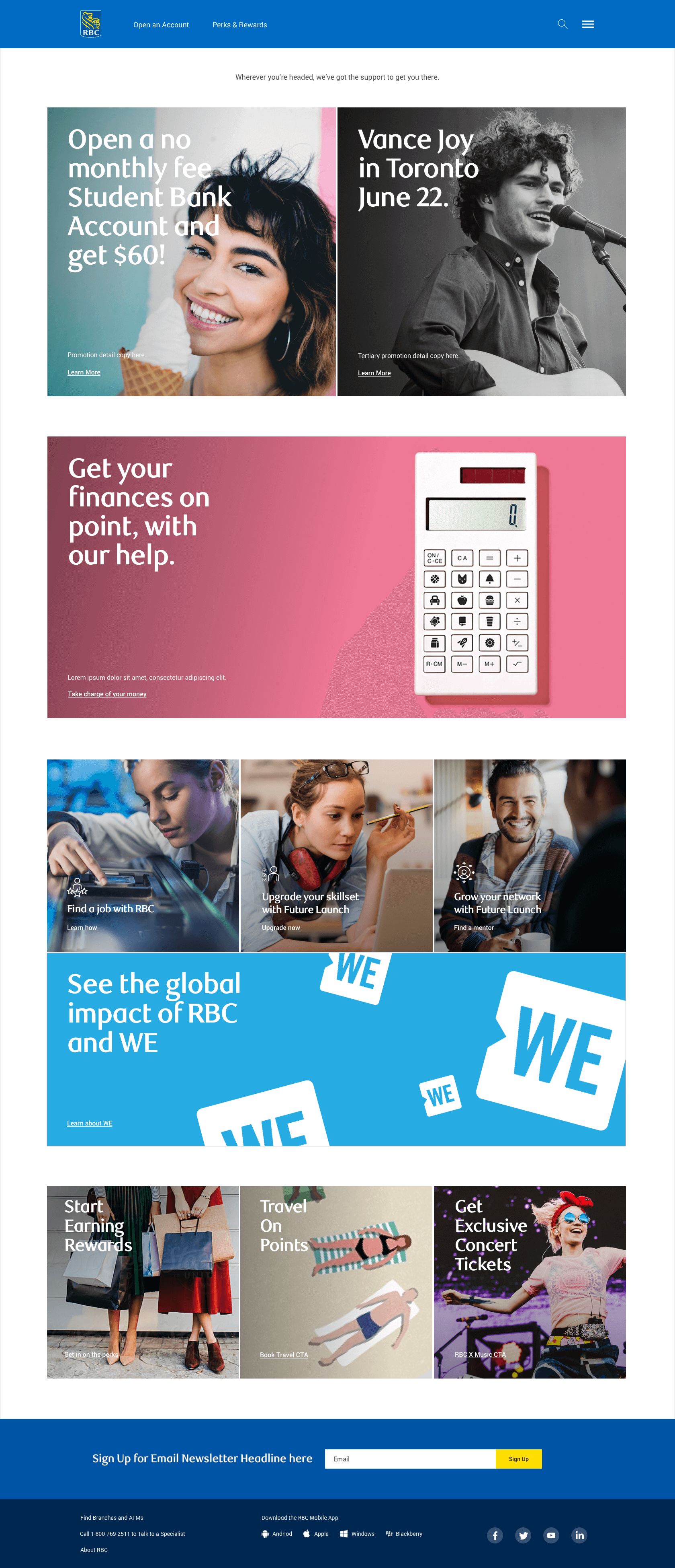
Design Outcome
Our design mission is to create a visually compelling and engaging portal that millennials can identify with while keeping the RBC brand essence. Large typography along with a mixture of lifestyle, close-up portraits, and stylistic illustrations are used to resonate with the eventful and energetic millennial lifestyle.
Role: Art Direction, UX/UI
–
Creative Director: Colin Craig
Designer: Iris Wu
Copywriter: Jackson Byrne
Account Managers: Dustin Norwood, James Rutledge
Project Manager: Nicole Black
Agency: Grip Limited
Client: Royal Bank of Canada
Year: 2018
Freedom Mobile Pitch
A digital brand platform and product created based on understanding brand’s strengths and users’ behaviours and needs.


Role: Art Direction, Visual Design
–
Creative Director: Eiko Kawano
Creative Leads: Chelsea Watson, Marcelo Mariano Dias
Designers: Iris Wu, Shane Harley
Copywriter: Michael Appleby
Agency: Publicis Sapient
Client: Freedom Mobile
Year: 2018—2019
PEase – Peace and Ease
PEase is a menstrual cycle tracking app that focuses on the core user experience, without the floral patterns. Our goal was to create a simple and intuitive period app that modern women can relate to.
Background
We took a look at the existing apps in the market. We felt that most of them were well-equipped with key features and functions yet lacking of intuitive user interaction and effective visual language.

Mapping the Experience
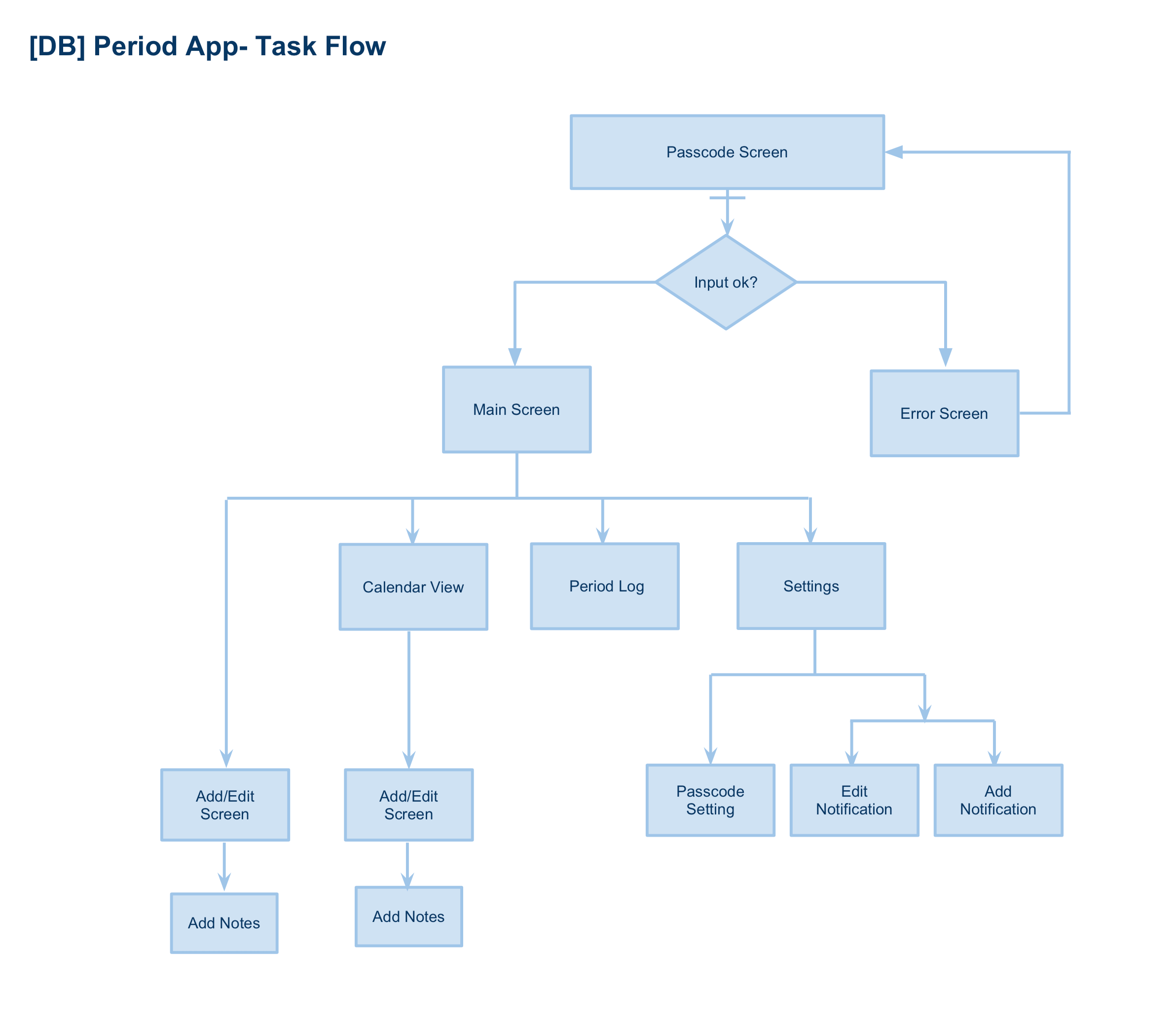
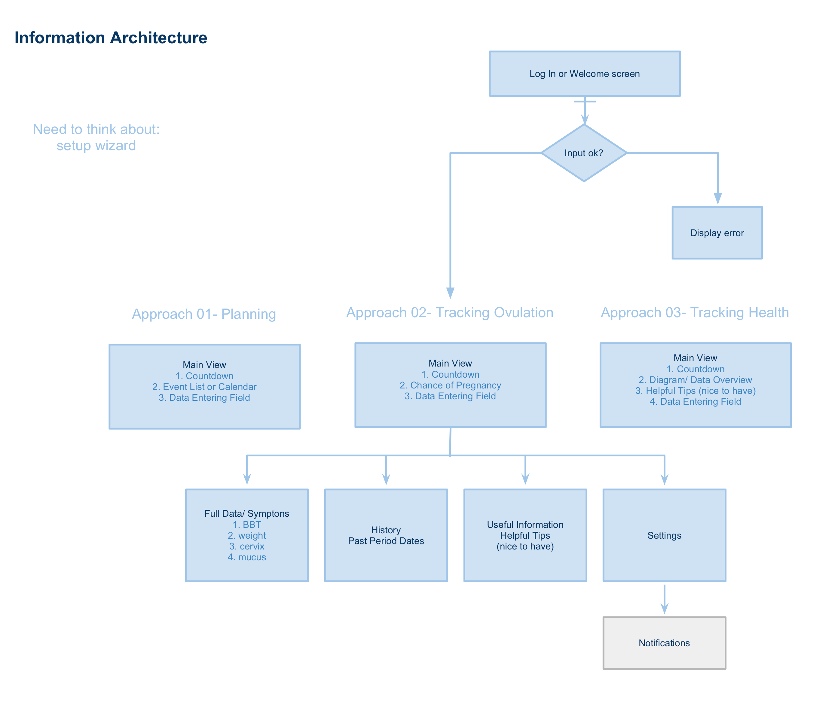
We collaboratively worked through the task flow and IA of recording logs with the attention paid to different type of purposes and approaches. Initial ideas began to form based on these needs.
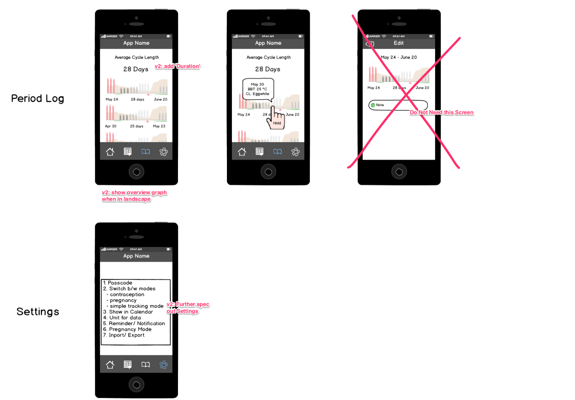
Wireframe Exploration
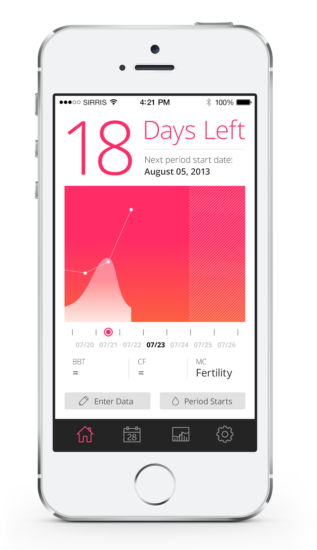
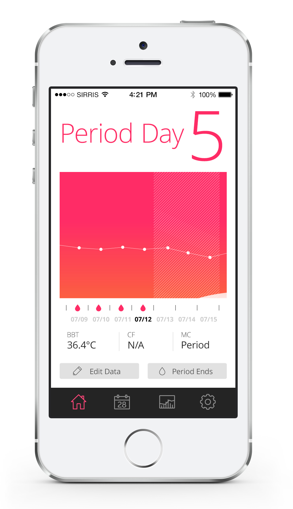
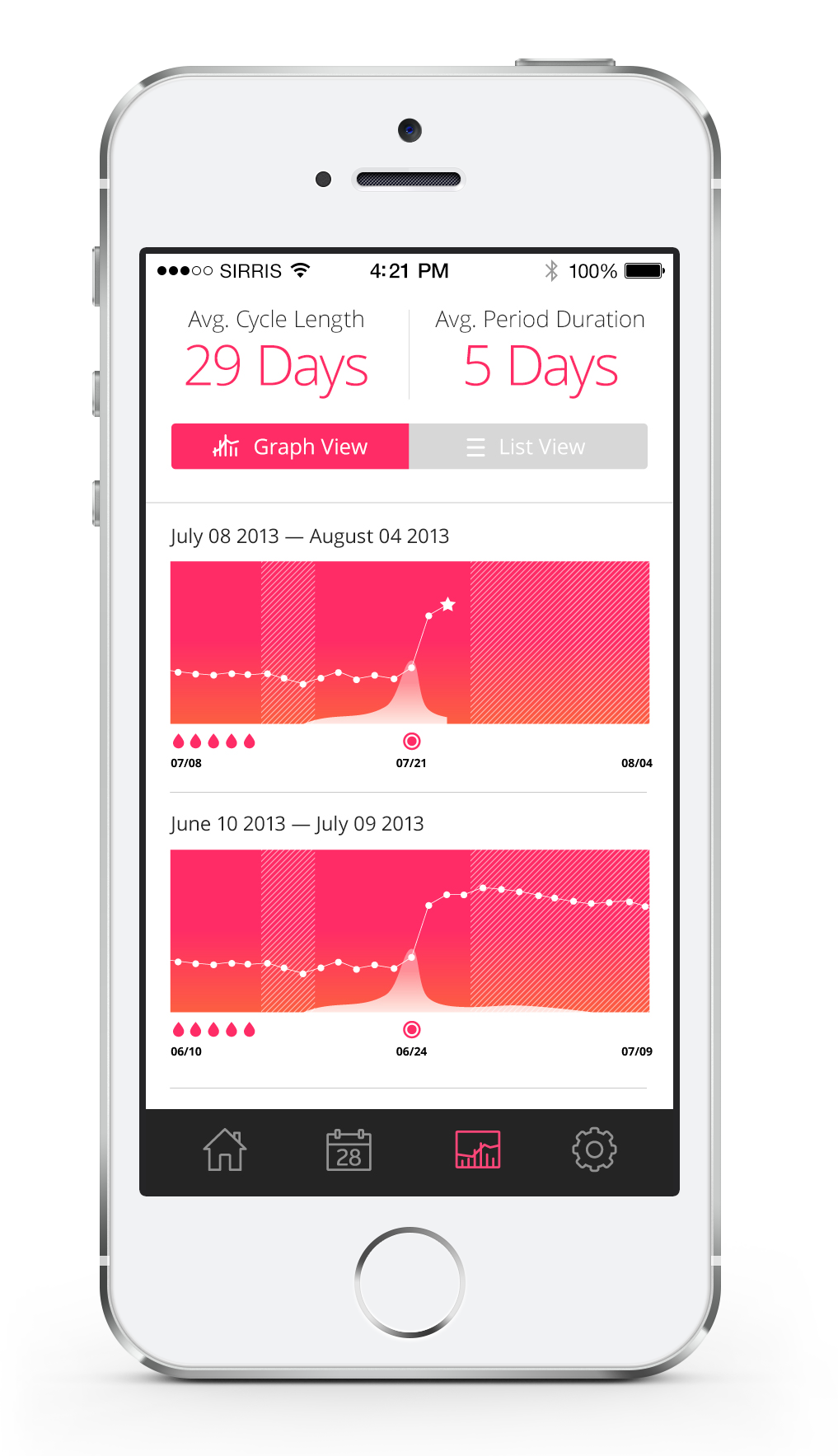
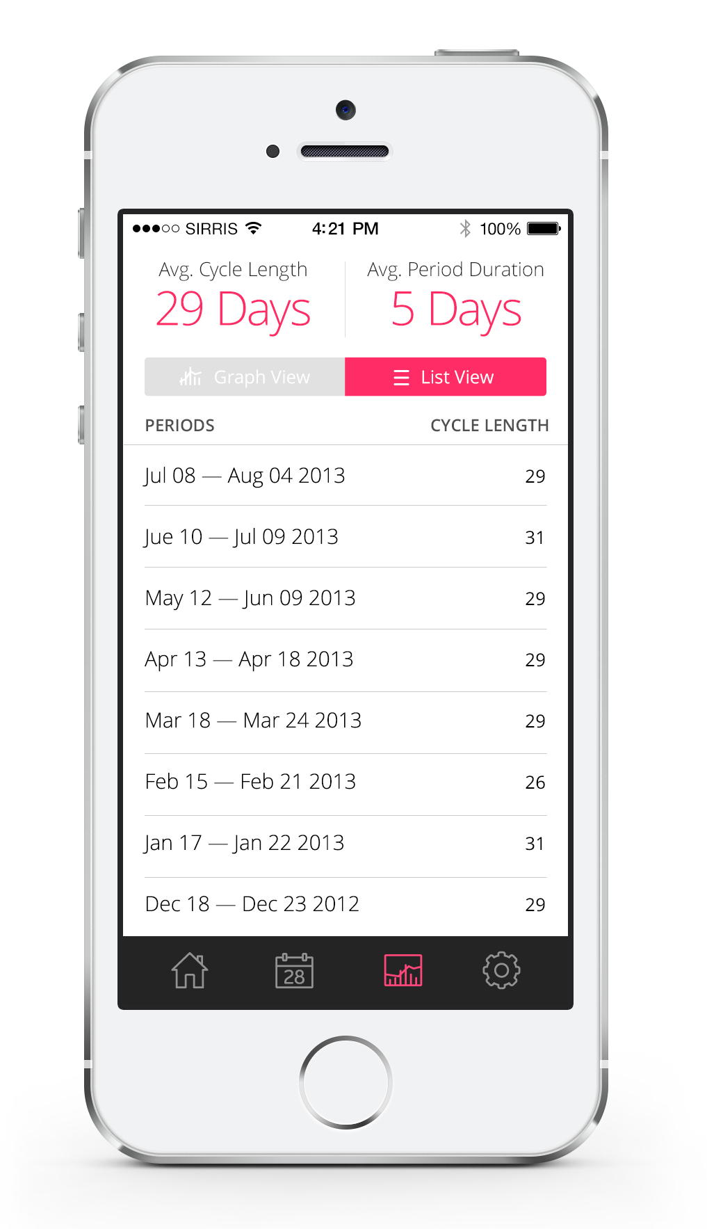
Human beings are visual driven – one of our ideas is to have the log data as the main dashboard where allows users to interact with their information directly.

Visual Inspiration
We wanted our app to feel simple, elevated and refreshing. With the concept of putting the visualized data forefront, we took a look at other inforgraphic applications where the digram takes the lead in visual communication.


Simple and Intuitive
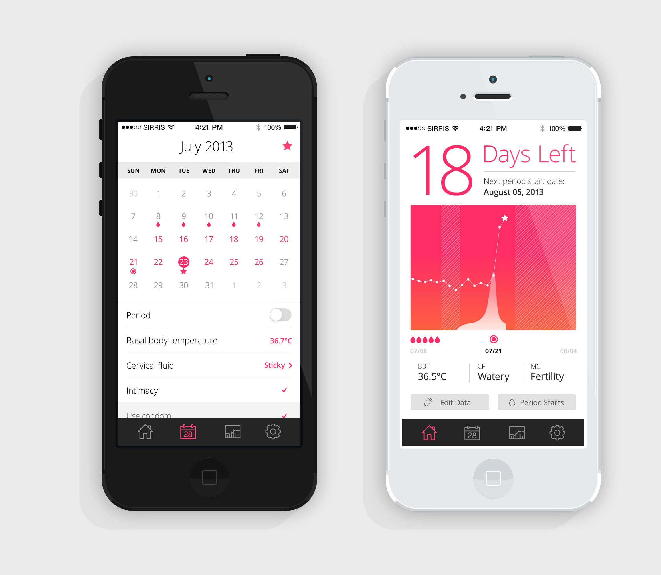
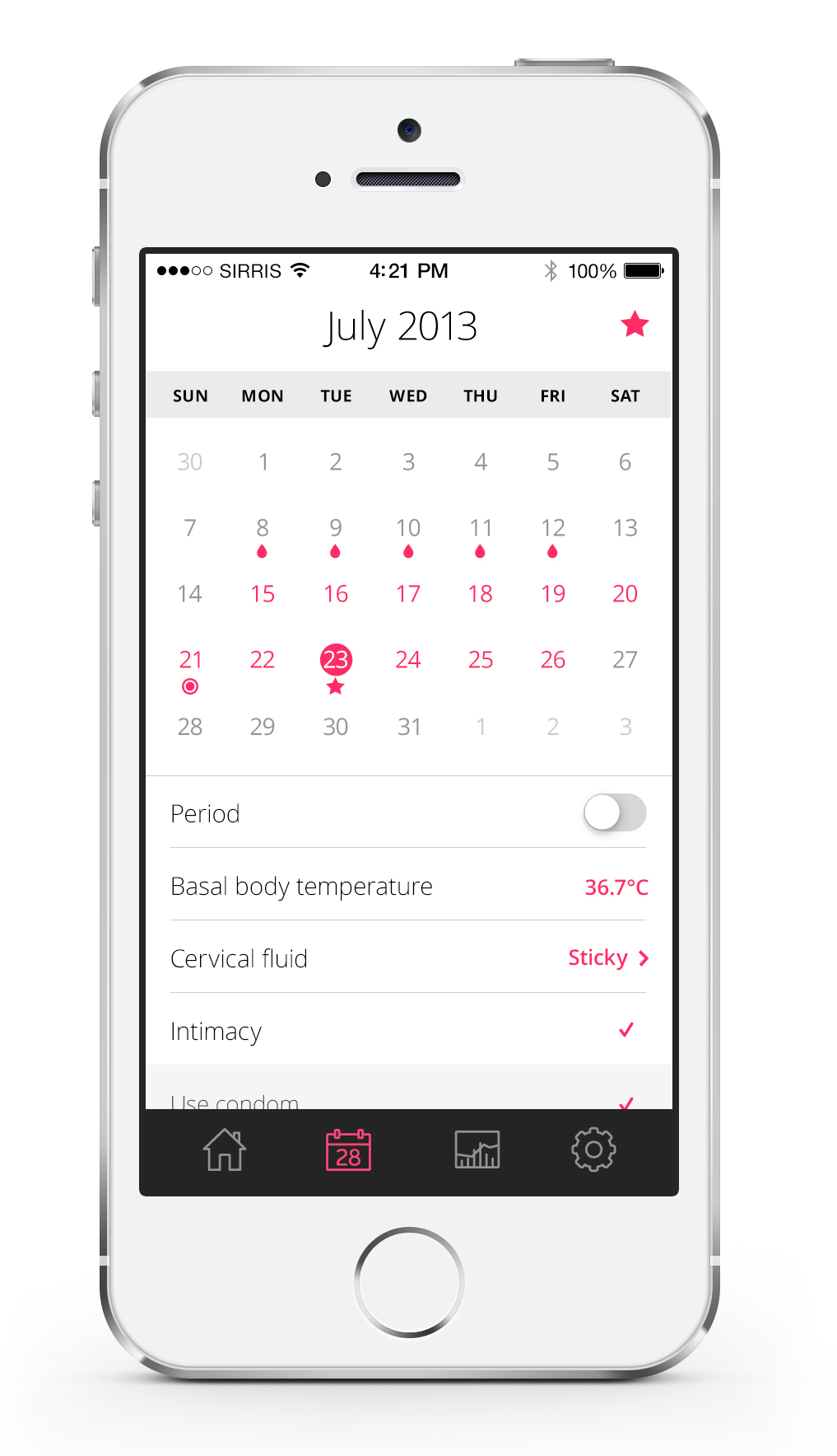
The visual panel allows users to view all their past record at a glance. Users can enter new or edit past logs.
Streamlined Calendar Display
All entered information will appear in both calendar and logs sections.
Modes for Different Needs
Users can choose different mode whether they are trying to get pregnant or need help predicting the irregular period. Passcode can be added to keep it private.